"Little Glutton" 300 mL Pink Lemon Sparkling Water Packaging Design
Beverages and Dairy Products
Packaging Visual Design
Rejuvenation / Shelf Recognition
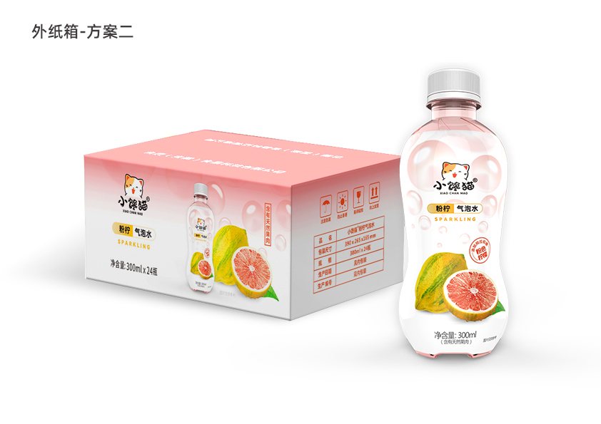
"Little Glutton" 300mL Pink Lemon Sparkling Water Packaging Design Case Study: This project showcases the evolution of the bottle’s visual design—from initial concepts to final approval—and extends to the outer carton for 24 bottles and a 6-bottle multipack.
Visual Design for Bottles, Multi-Packs, and Outer Cartons
A 300-milliliter bottle of sparkling water—the packaging needs to be easy to understand at a glance
Little Glutton Pink Lime Sparkling Water comes in 300 mL bottles. This project covers the visual design of the bottle packaging and extends to the outer carton for 24 bottles and the 6-bottle multipack.
The front of the small bottle has limited space, yet it needs to accommodate the brand name, product name, flavor, and fruit information all at once. Too many design elements would make it look cluttered; leaving only the product name, however, would risk losing the “Little Glutton” brand identity. The focus of this project is to ensure that consumers first recognize the brand and then quickly understand that it is a pink lemon sparkling water.
Three Directions: More Than Just a Change in Layout
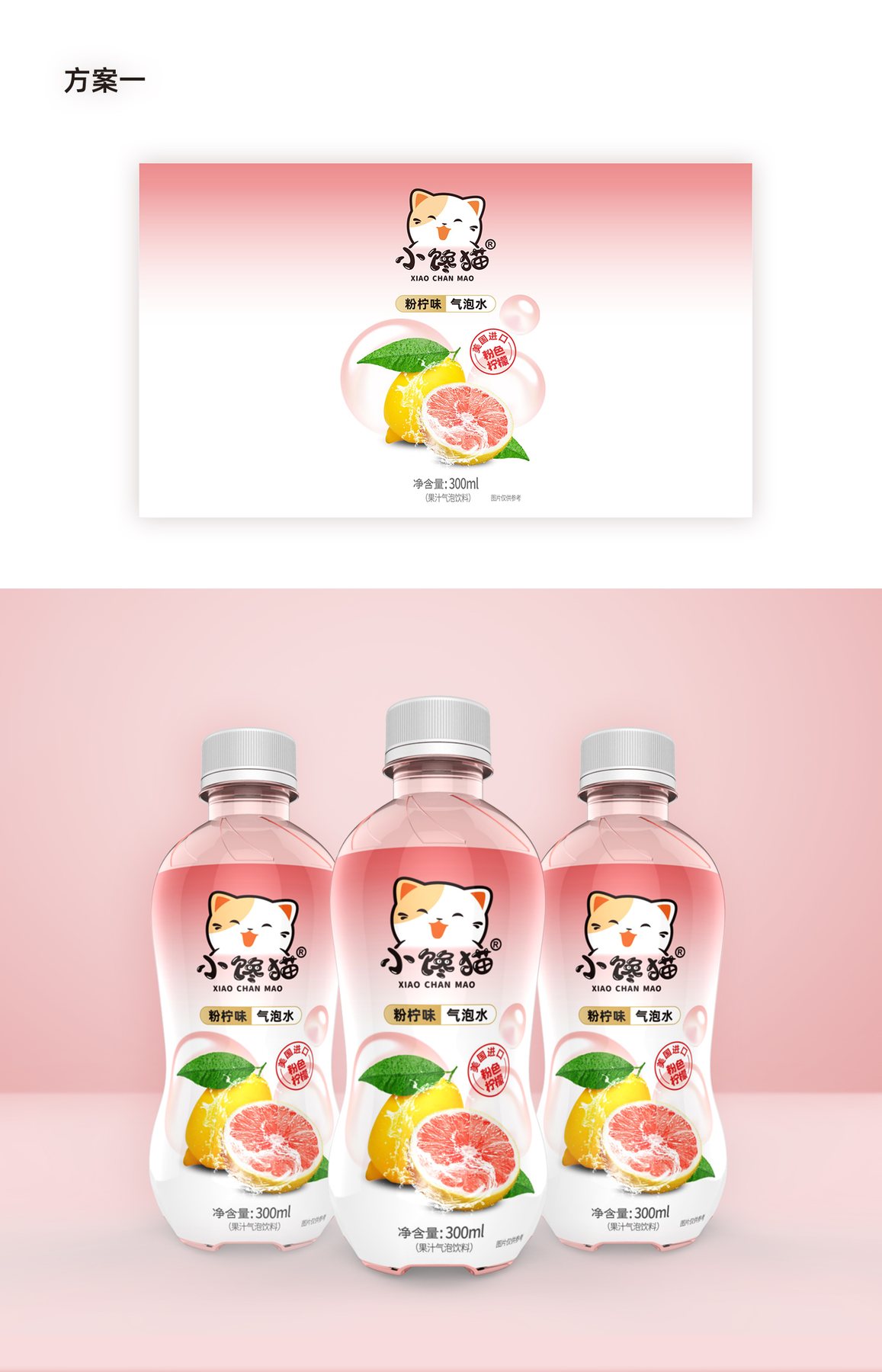
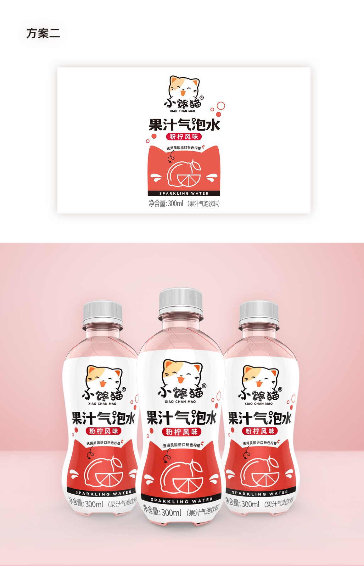
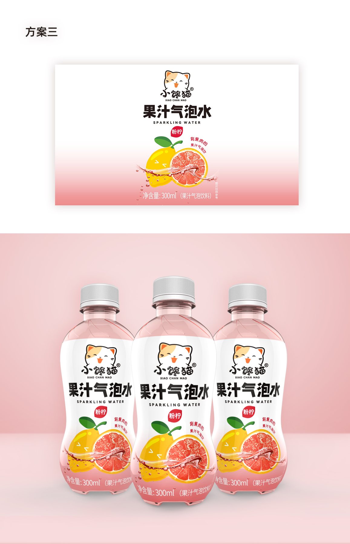
The initial design phase compared three sets of bottle visuals. Approach 1 used large fruit images and soft pink tones to evoke flavor associations; Approach 2 emphasized black-and-red text and a cat-shaped graphic to make the category name stand out; Approach 3 highlighted “Fruit-Flavored Sparkling Water” and incorporated an image of splashing fruit juice to convey the message more directly.
The three design concepts are essentially comparing which one catches the eye first. A large image of the fruit can hint at the flavor right away, but it takes up space on the small bottle that could be used for branding; enlarging the text and the cat-shaped logo makes the brand stand out more, but it’s also important to avoid making the design look too cluttered. The final mockup places the "Little Greedy Cat" logo at the top, the product name in the center, and the fruit illustration at the bottom, ensuring that the three layers of information each have their own designated space. Before launching the project, you may also want to refer toWhat materials are needed to prepare for a new product design?。
The presentation focuses attention on the brand, product name, and flavor
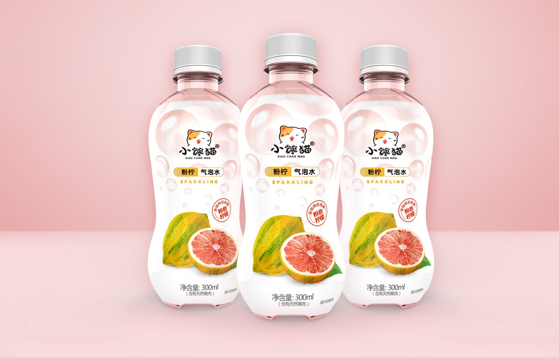
Confirm that the mockup does not include any additional decorative elements, but instead organizes the information into three layers. The “Little Glutton” logo is at the top; “Pink Lime Sparkling Water” is in the middle; and the citrus fruit is at the bottom. As consumers look from top to bottom, they can sequentially identify the brand, product category, and flavor.
The light pink color and translucent bubbles create a lighthearted atmosphere without overshadowing the brand and product names. The large areas of white maintain a sense of breathing, making the 300 mL bottle easy to read even when it contains a lot of information. This is alsoPackaging Visual DesignThe order of the information needs to be resolved first.
The curved lines of the bottle give the image a light and airy feel.
The design tapers along the narrower waist of the bottle and then widens at the shoulders and base. The label information is not spread evenly across the entire bottle; instead, the brand name, bubbles, and fruit are placed in positions that are easy to read.
The fruit is concentrated in the lower half, allowing the flavor to be highlighted without obscuring the brand; the bubbles are concentrated in the upper half, creating a sense of continuity with the transparent, light-pink bottle. This approach makes it easier to focus on the key points than if all the selling points were listed in the same size, and it also responds toHow to Create Shelf Appeal for Beverage PackagingThe issue.
From single bottles to multipacks, the key is to rearrange them.
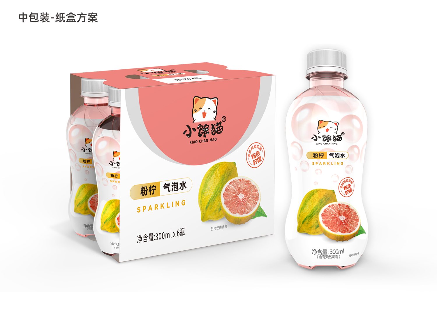
As packaging sizes increase, it is not enough to simply enlarge the bottle labels. The outer carton must allow the brand and product to be visible from a distance, while the 6-bottle carton must balance the carrying structure, front-facing display, and visibility of individual bottles.
Therefore, the multipack continues to feature the main color of off-white, the brand logo, the product name, and the fruit illustration, but their sizes and positions have been rearranged. The single-bottle, 6-bottle, and outer carton packages retain the same set of identifying elements and are clearly legible based on their respective display areas. See also similar projectsPackaging Design for the "Little Foreigner" Dairy Product Series和Fanglei Rose Beverage Packaging Design。
Establish a clear product identity through a powdery white color palette, a bubble-like texture, and citrus-inspired graphics.
Direction 1 highlights the citrus fruit and uses a soft pink hue to convey a sense of lightness.
Approach 2: Emphasize the text and red graphics to make the product name stand out more.
Approach 3: Enlarge the product name and the image of the juice to convey the message more directly.
The outer carton for the 24 bottles retains the main color scheme of off-white, the brand logo, and the product imagery.
Rearrange the brand name, product name, and fruit images on the 6-bottle carton to accommodate a larger display area.
For this type of beverage packaging, first determine what will remain the same
When designing beverage packaging for single bottles, multipacks, and shipping cartons, you can first establish consistent elements—such as the brand logo, primary color, and flavor graphics—and then adjust the layout according to the different display surfaces. This approach maintains consistency across the product line while ensuring that larger packages don’t simply appear as mechanically enlarged versions of the label.
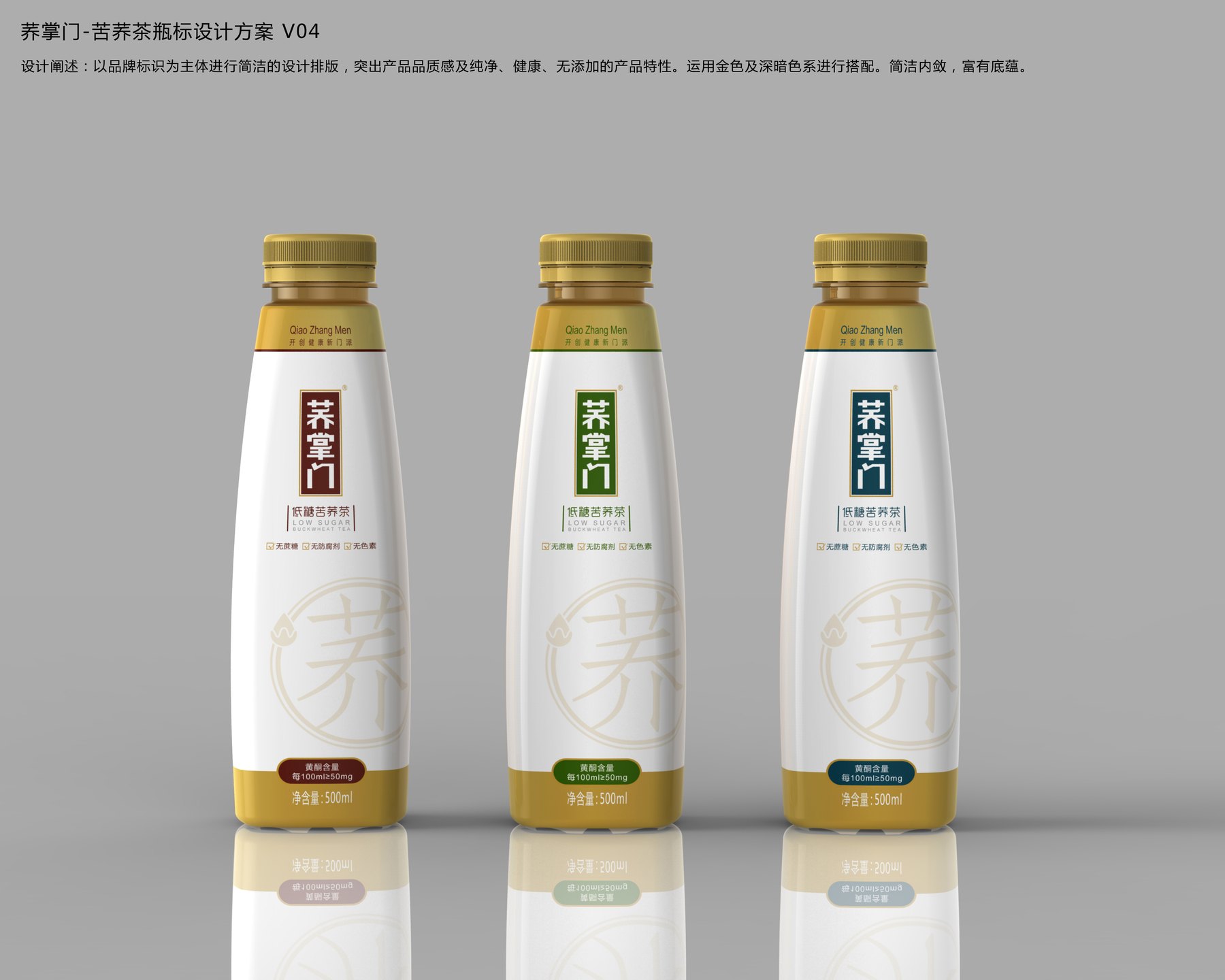
The design for Qiao Zhangmen’s 500mL Bitter Buckwheat Tea—from the three bottle shapes to the negative space around the seal and the dark-colored label—establishes a cohesive relationship between the brand, the tea’s color, and the series’ color palette, ensuring that the container and packaging together create a distinct and memorable impression.
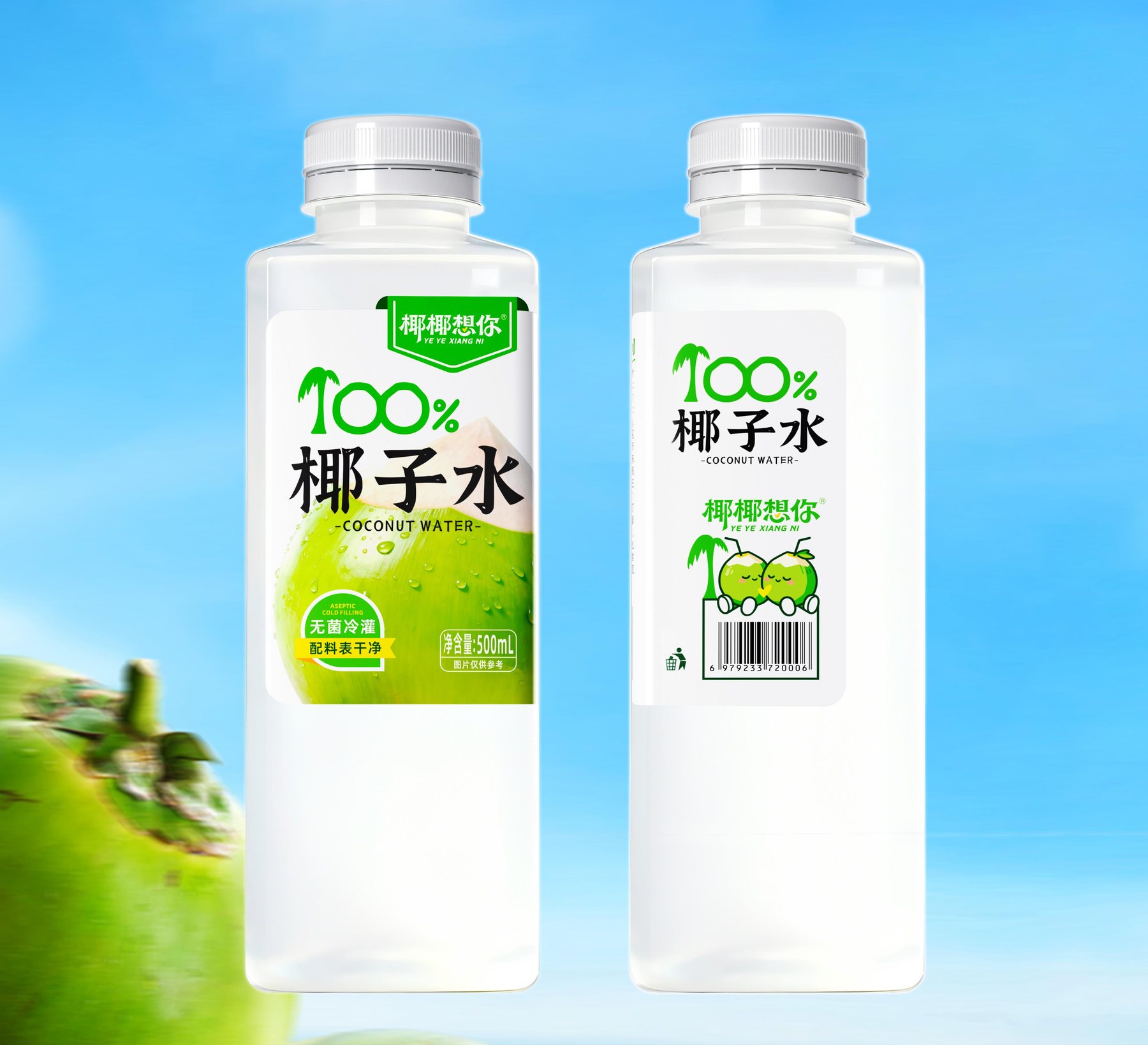
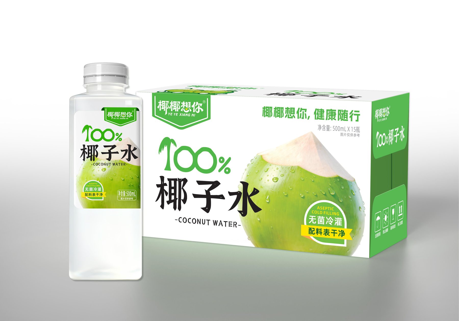
“The visual design for the ”Yeyey Misses You” 500 mL coconut water packaging uses a green-and-white color scheme, eye-catching category text, and an image of a green coconut to establish a clear reading path from top to bottom.