
PROJECT CASE
Fanglei Rose Beverage Packaging Design
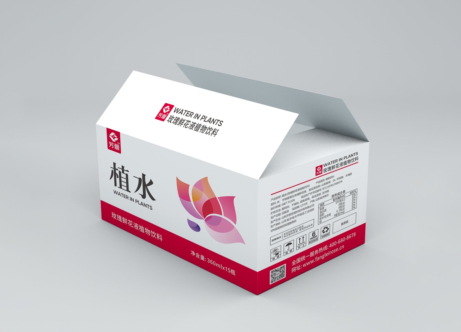
Project Overview
A Bottle of Rose-Flavored Drink: How to Make It Stand Out from Plain Water
Fanglei’s “Zhi Shui” is a 360mL rose-infused plant-based beverage. The bottle is transparent, with very little text on the front. The design challenge was straightforward: from a distance, the rose theme should be immediately apparent, while the product name should be clearly legible up close.
If you simply stick a flower on a common water bottle, the cap and body will still look ordinary. Meilin shifted her focus to the silhouette of the entire bottle, allowing the theme to emerge from its shape.
From Standard White Caps to Bud-Shaped Bottle Caps
The project renderings show a standard white screw cap alongside a white bud-shaped cap. The former has a clean, sleek look but relies primarily on the label to identify the product category; the latter features overlapping curves that frame the bottle opening, resembling an unopened flower bud.
This change did not add any information to the label, yet it evokes associations with roses even from a distance. The bud-shaped cap has become an integral part of the bottle’s design, rather than a mere decoration affixed to the bottle.
Why are the textures on the bottle limited to the lower half?
The upper half of the bottle features a clearly legible area for the label, while the lower half is adorned with continuous vertical stripes. This design ensures that the characters “植水” remain prominent, and the bottle retains its visual detail without relying on blank space.
The slender bottle tapers slightly at the middle, with the texture at the base fanning out downward. The cap, the middle section of the bottle, and the texture create a rhythmic flow from top to bottom, demonstrating that a floral aesthetic doesn’t require large-scale prints.
By streamlining the labels, the image of the rose becomes clearer
The front features “Plant Water” as the largest text. The Fanglei logo and the English category abbreviation are scaled down and placed above, with gradient petals positioned below. The brand name, product name, and graphic each have their own designated space, so the first impression isn’t interrupted by multiple layers of slogans.
Since the bottle cap already features distinctive design elements, the label can be more understated. Together, they convey the concept of a rose-flavored beverage, rather than having the artwork and the shape compete for attention.
What kind of reference does the orientation of the flower bud cap provide for similar beverages?
This approach highlights the division of roles between the bottle shape and the packaging: the cap and bottle body establish the outline first, while the label clarifies the brand and product. When designing new plant-based or floral beverages, you can start by identifying the most memorable element, then determine the balance between graphics and text.
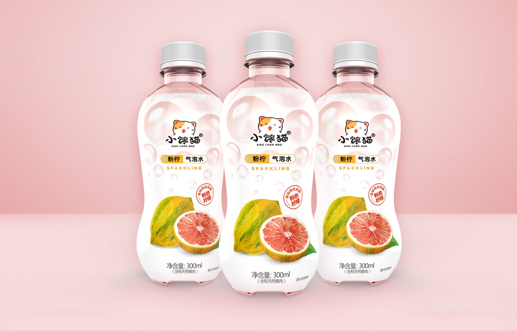
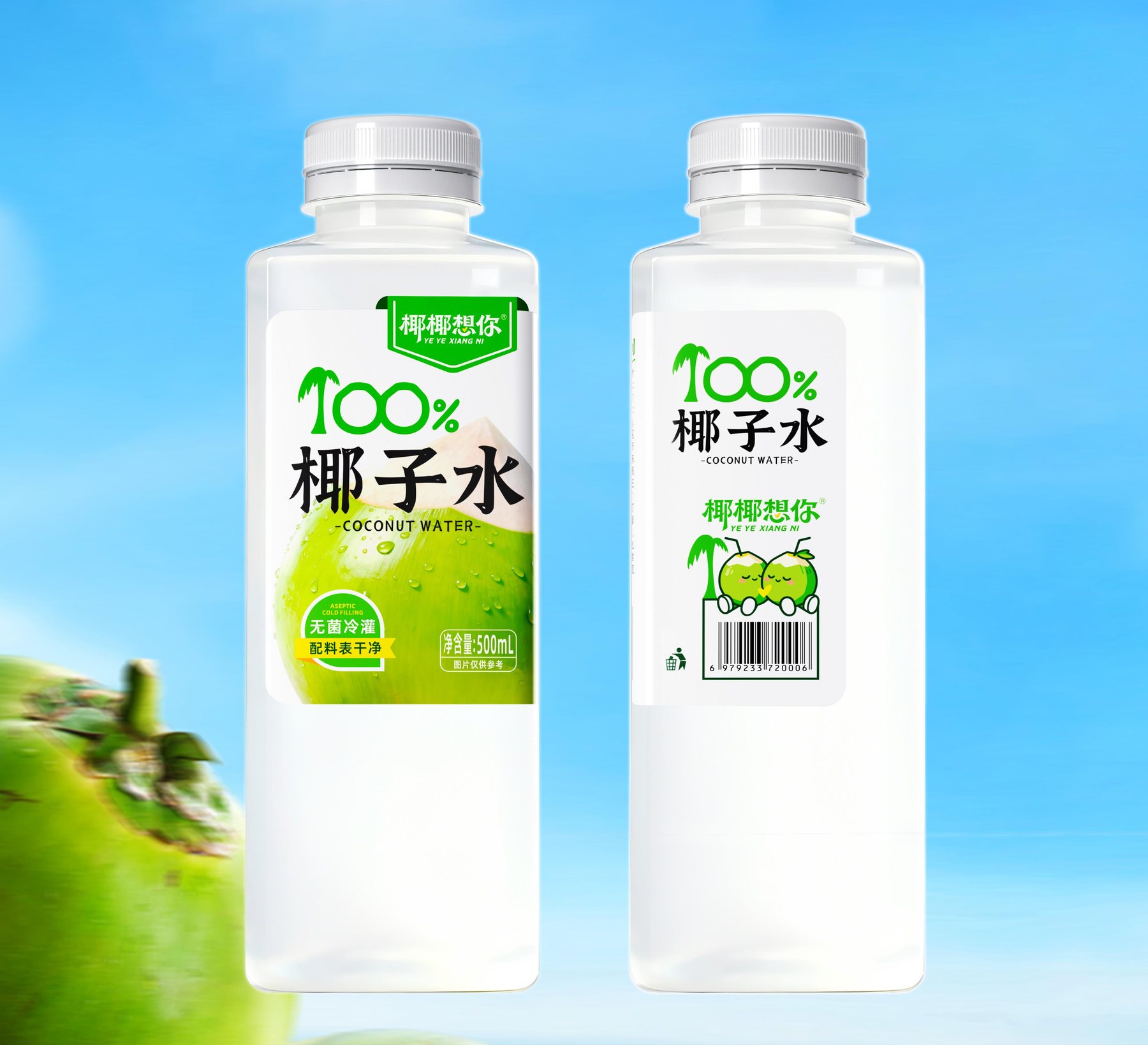
You can learn aboutPackaging Visual Design Services, then take a lookHow Bottle Shapes Can Enhance Shelf Visibility与What needs to be prepared before the project begins?. See similar projects for reference"Yeyue Misses You" Coconut Water Packaging和"Little Glutton" Sparkling Water Packaging. If you'd like to discuss your beverage packaging, you canContact Meilin Design。
MORE CASES
More Related Cases
Do you have a clear plan for new products? Start with a project assessment.
Please submit information on the product category, capacity, material, filling method, launch date, and reference materials. Meilin will discuss suitable bottle designs, packaging, and implementation strategies based on the specifics of your project.

Shenzhen Meilin Industrial Design Co., Ltd.
Establish brand identity through the aesthetics of original bottle designs,
Ensure the successful implementation of designs through engineering expertise.
We specialize in innovative bottle and packaging design for mineral water, fruit juices, alcoholic beverages, cooking oil, personal care products, and household cleaning products.
Design Services
Industry Solutions
© 2026 Shenzhen Meilin Industrial Design Co., Ltd.