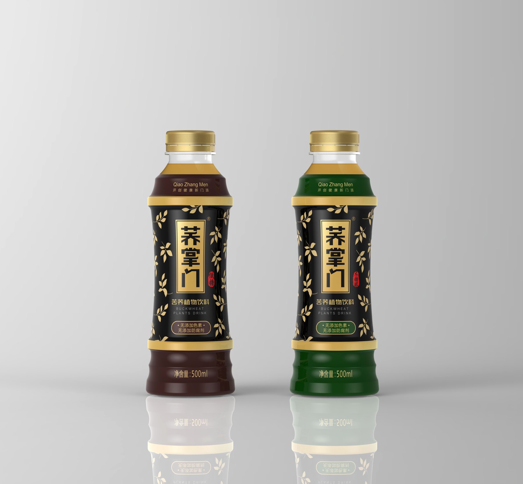
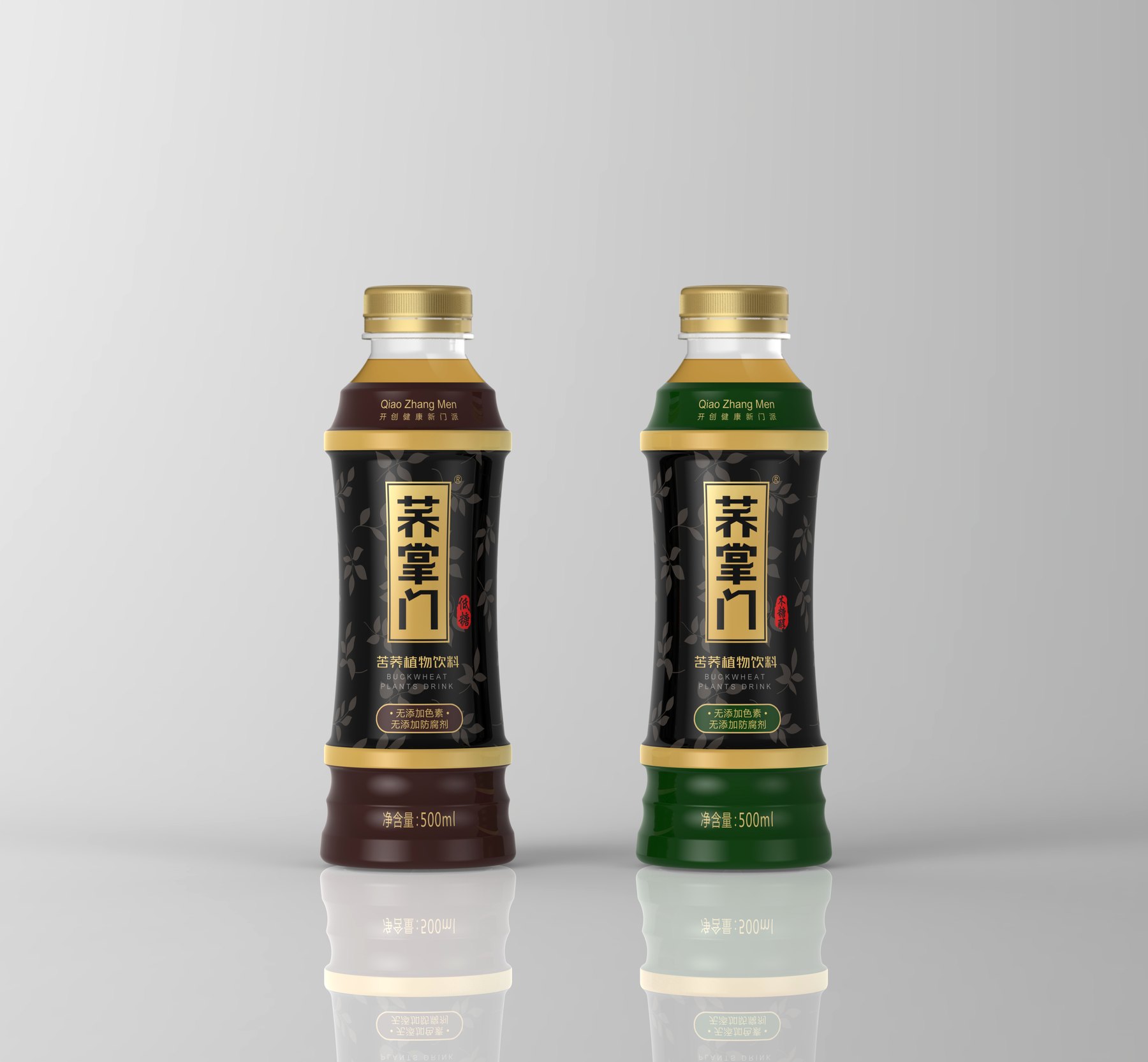
The design for Qiao Zhangmen’s 500mL Bitter Buckwheat Tea—from the three bottle shapes to the negative space around the seal and the dark-colored label—establishes a cohesive relationship between the brand, the tea’s color, and the series’ color palette, ensuring that the container and packaging together create a distinct and memorable impression.
A name carries weight—how can packaging convey that?
“The name ”Master Qiao” conveys a distinct brand personality. However, if the bottle and label merely present it as an ordinary beverage, the name is unlikely to leave a lasting first impression. The goal of the 500mL bitter buckwheat tea project is to incorporate both the brand’s identity and the characteristics of the grain-based beverage into the packaging.
Meilin is simultaneously developing the bottle design and label, comparing three different container concepts, and exploring visual designs with both dark and white backgrounds. The focus is not on constantly adding elements, but on ensuring that the bottle’s silhouette, brand name, and series variations each have a distinct and clear position.
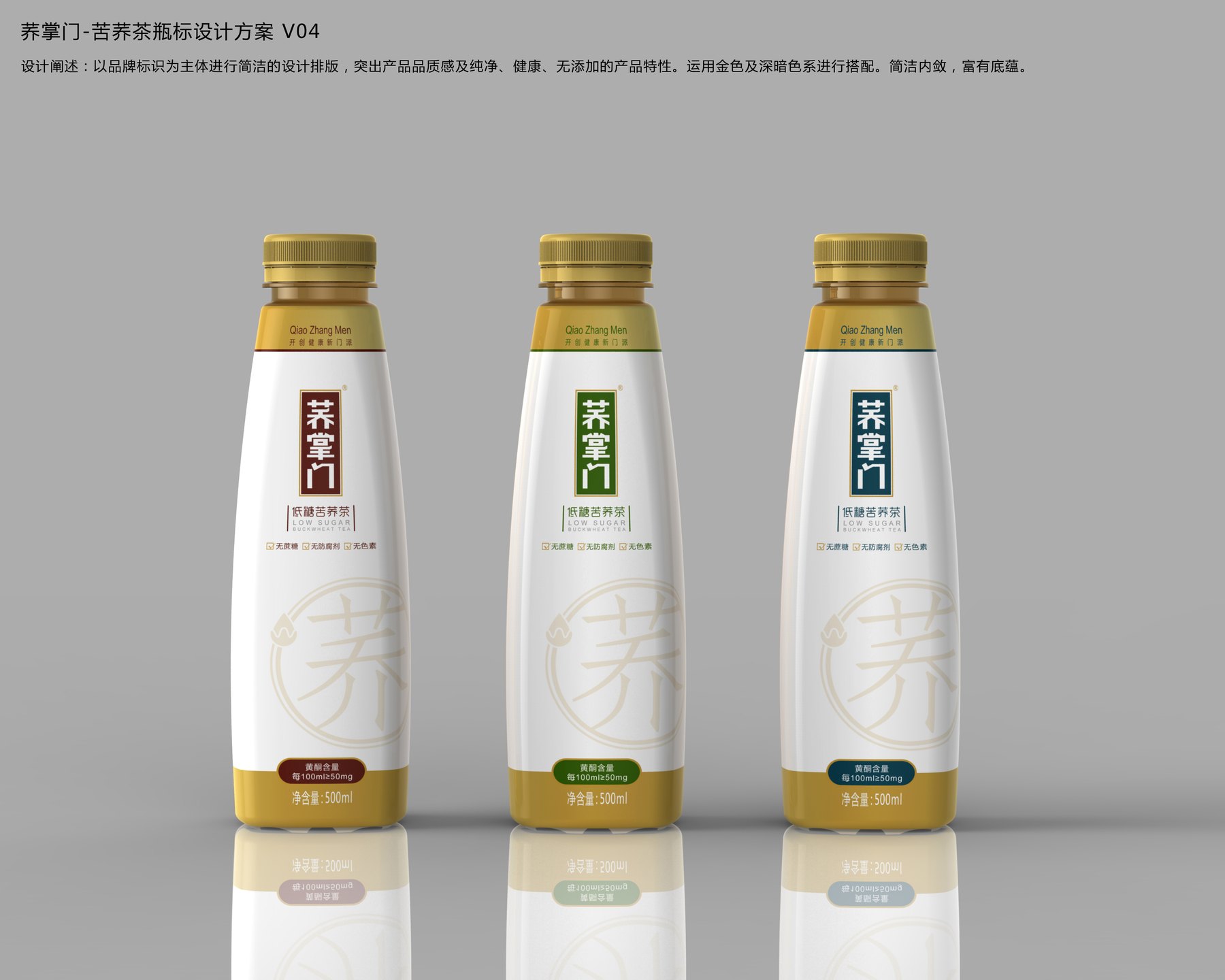
Compare the color schemes of the brown, green, and blue series on white-background bottle labels using a uniform layout.
Three Bottle Shapes, Each Drawing Attention to a Different Feature
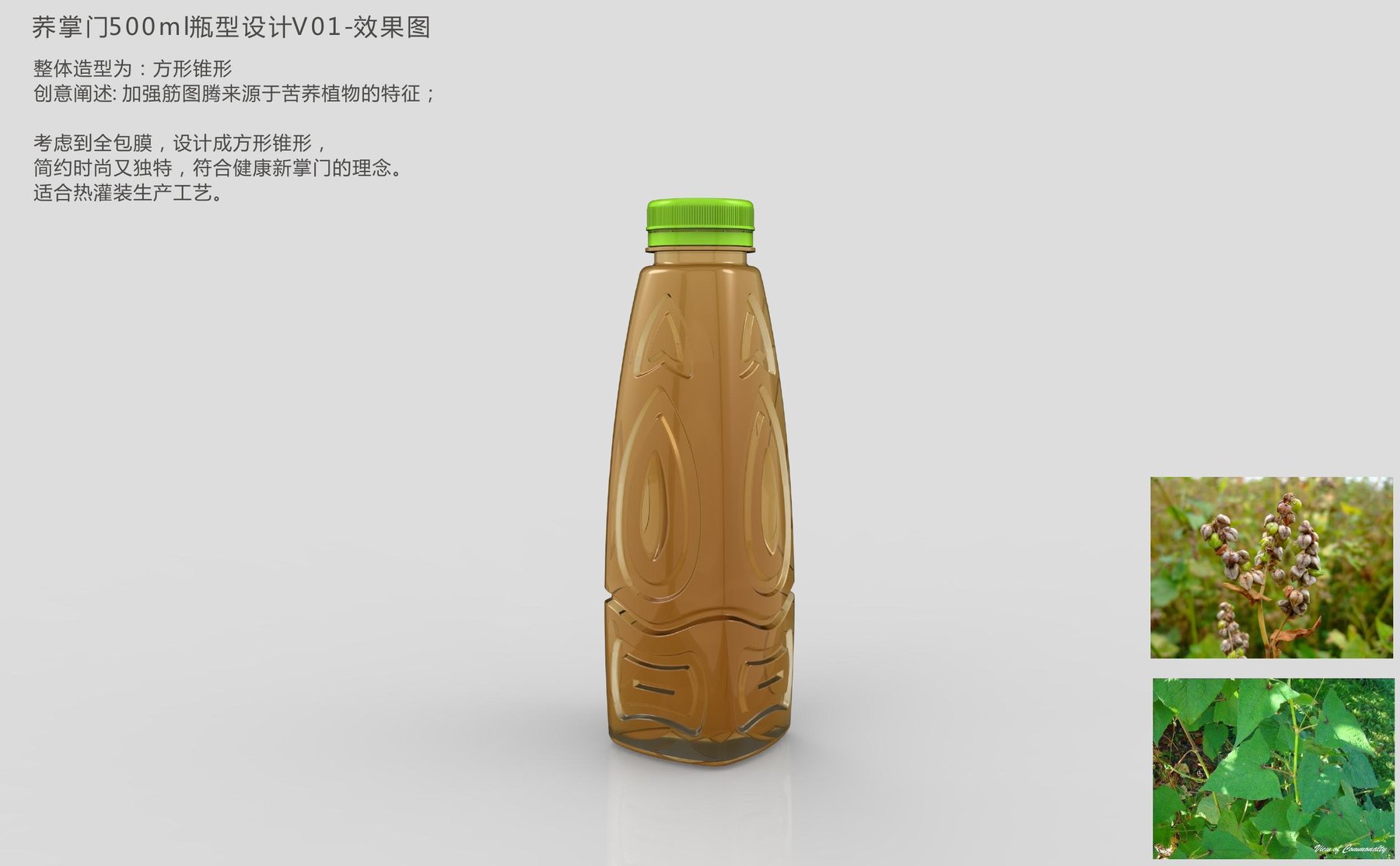
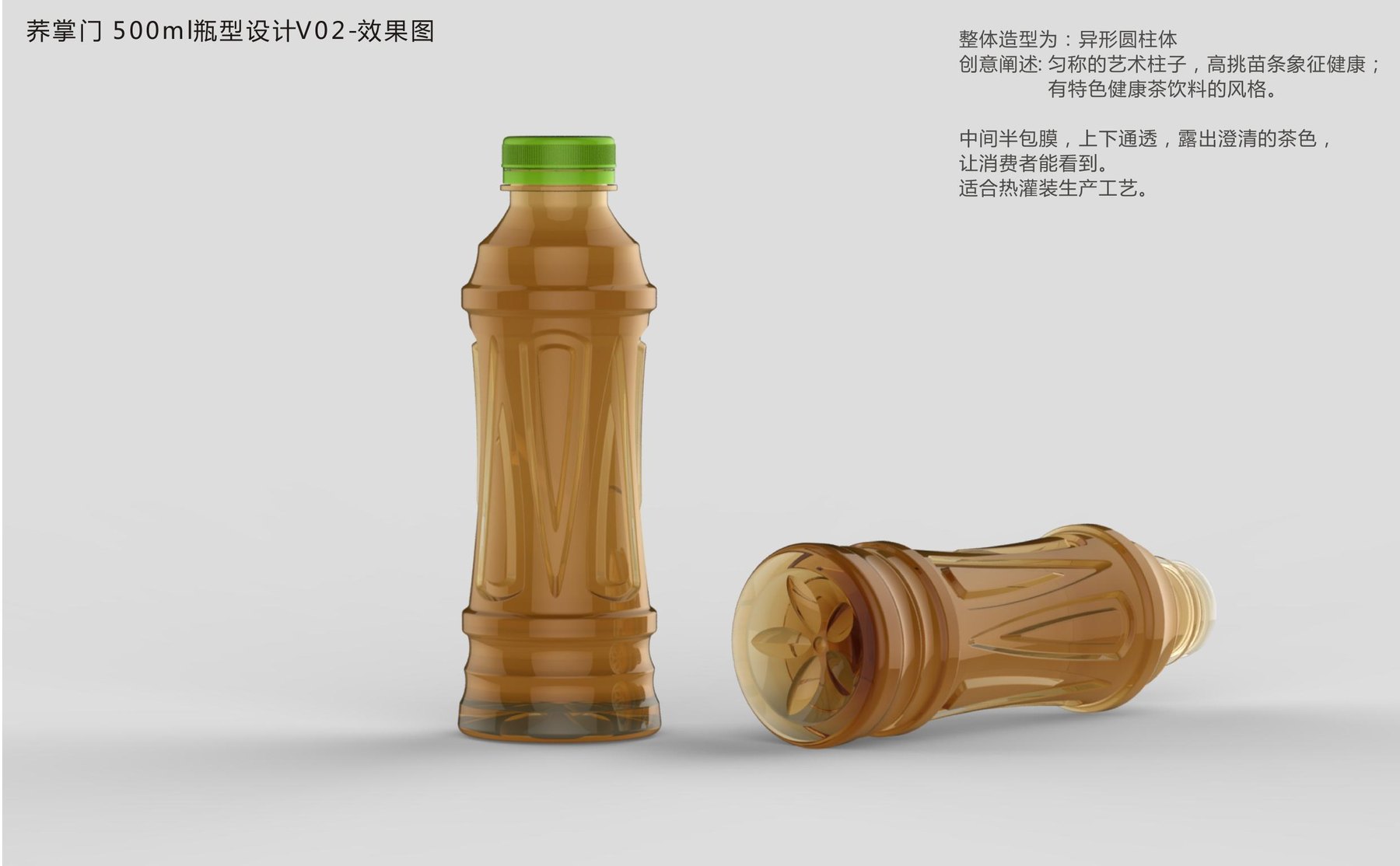
The proposal compares three 500-mL bottle designs. The square-conical design incorporates the buckwheat leaves into the silhouette, allowing the plant’s characteristics to be recognized even without a label; since the bottle’s shape varies significantly, the front label should be kept minimal. The irregular cylindrical design positions the label in the middle section, exposing the tea-colored body above and below, making the product more visually intuitive; brand recognition, however, relies more heavily on the label.
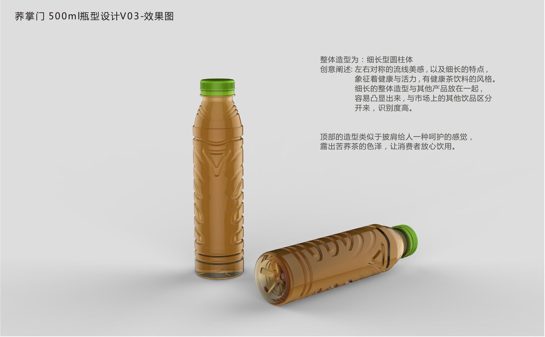
For slender cylindrical bottles, the shoulder curve and vertical proportions create a distinctive look, resulting in a lighter visual impression; the label position must align with the shoulder line. The comparison of these three orientations isn’t about which is more flashy, but rather about whether the viewer’s memory is anchored to the bottle shape, the amber color, or the brand name.
Direction 1 features a square, tapered profile, with continuous ribs forming the front design.
Approach 2 uses an irregularly shaped cylinder and a label area in the middle section to create a layered effect on the bottle.
Bottle shape and label cannot be evaluated separately.
The project’s bottle labels use heat-shrinkable film. Since the design unfolds along the bottle’s surface, the shoulder curve, texture, and label area must be considered together. If the design is too fragmented, the text and graphics will be interrupted; if the label covers too much of the surface, the contour features will easily be lost.
Each of the three bottle designs features a clearly defined area for text. The shoulder and lower sections of the bottle serve as design elements, while the middle section displays the brand and product information. With this arrangement, the packaging isn’t reduced to a single image, and the bottle doesn’t have to rely on intricate textures to draw attention.
Direction 3 uses slender proportions, shoulder breaks, and vertical seam lines to establish the silhouette.
From botanical motifs to stamps, putting the brand front and center
Early bottle labels used botanical motifs and bold color schemes to represent the bitter buckwheat product line. Subsequent designs with a white background reduced the number of visual elements, allowing the vertically arranged text “Qiao Zhangmen” to appear within a rounded seal, making it the first thing the viewer notices.
Why choose negative space? The brand name itself already has its own character. If the plants, selling points, and decorations are all equally eye-catching, readers may actually have a harder time remembering the main focus. By reducing the background elements, the relationship between the logo and the product name becomes more direct.
Different versions use the same layout, with variations in colors such as brown, green, and blue to distinguish them. By standardizing the bottle caps and brand placement, the series maintains a cohesive look even as new variations are added.
A Darker Aesthetic: A Different Take on the Same Brand
The dark bottle label places “Qiao Zhangmen” vertically in the center of the composition, with golden text and a border organizing the information, while subtle botanical patterns remain in the background. This ensures the brand name isn’t lost amid the full-frame design, and the overall look is more subdued than one with bright colors.
The brown and green versions share the same structure, with color variations concentrated on the shoulders and the bottom. This approach allows for differentiation between flavors or product versions without having to rebuild the brand image every time a new version is launched.
White backgrounds emphasize clarity and restraint, while dark backgrounds emphasize focus and stability. The choice between these two approaches should be based on the brand’s personality and the amount of information to be conveyed, rather than the simplistic assumption that more elements equate to greater value.
The brown version features a black-and-gold main background that prominently displays the brand name and product categories.
The green version uses the same information structure, with colors used to distinguish the series.
What we ended up with was more than just a bottle label
The project presents three variations of the 500 mL bottle design, as well as different interpretations featuring a white background with a stamped logo and a dark-colored label. The bottle, label, and outer box each serve a specific purpose: the silhouette conveys the product category, the brand name takes center stage, and the color scheme distinguishes between versions.
This project demonstrates Meilin’s ability to consider the container, label placement, and product line identification as a unified whole. When developing plant-based beverages, it’s more effective to first decide whether customers should remember the brand, the bottle design, or the tea color—and then arrange the visual elements accordingly—rather than cramming the design with elements from the start.
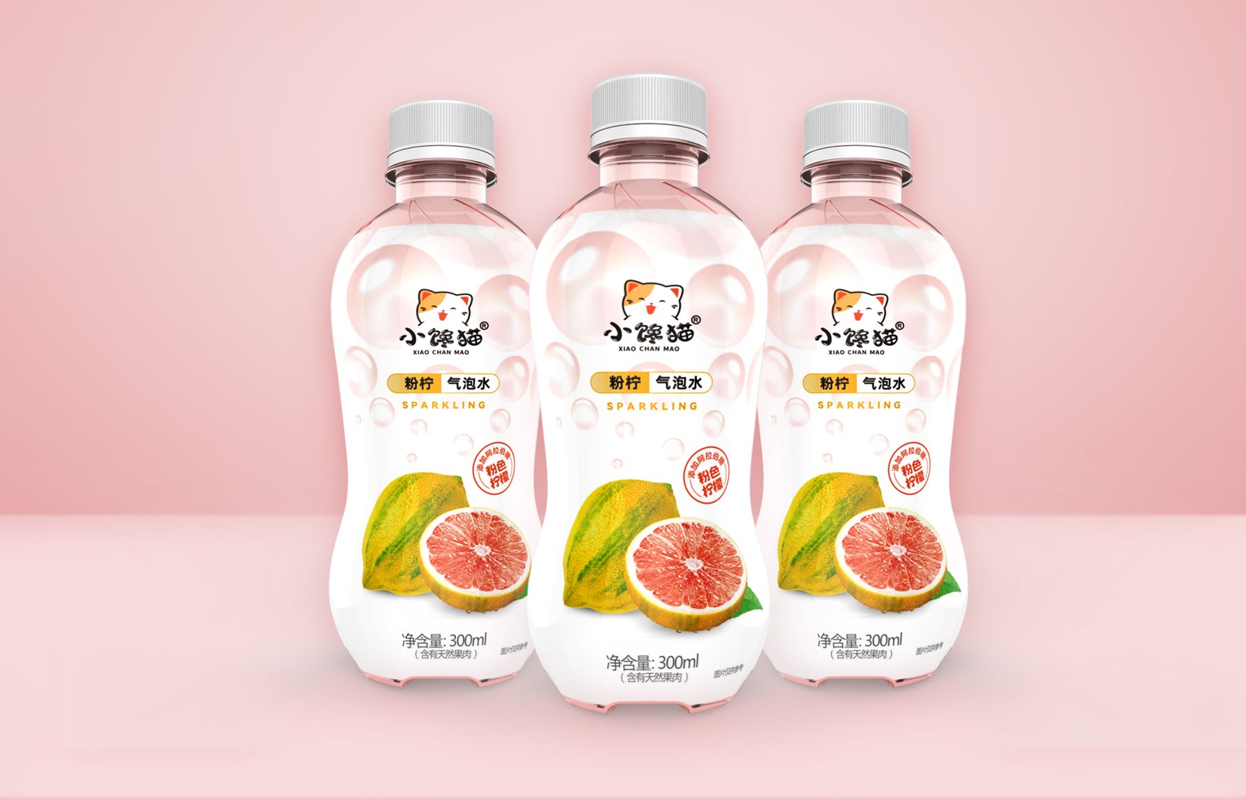
"Little Glutton" 300mL Pink Lemon Sparkling Water Packaging Design Case Study: This project showcases the evolution of the bottle’s visual design—from initial concepts to final approval—and extends to the outer carton for 24 bottles and a 6-bottle multipack.
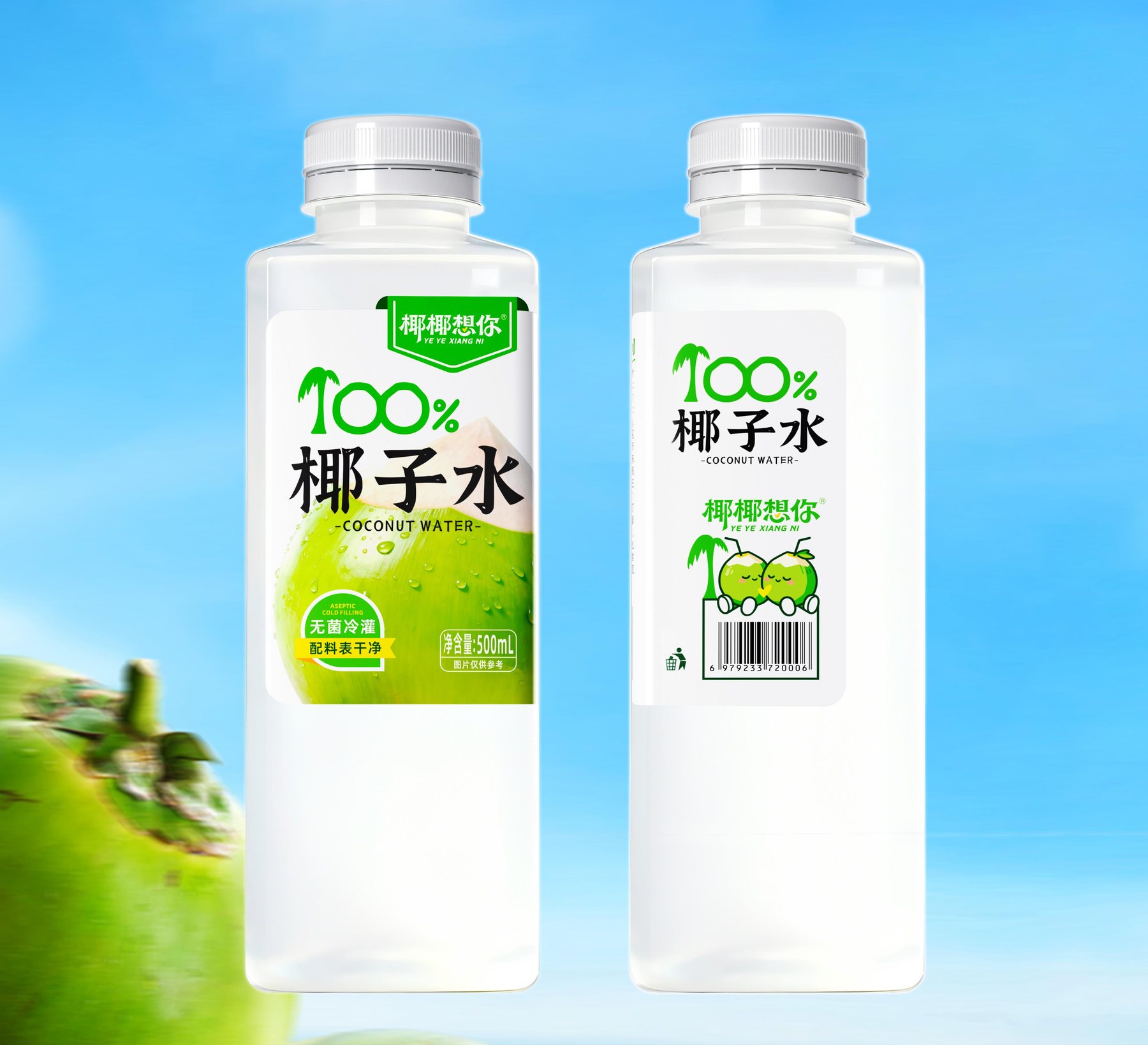
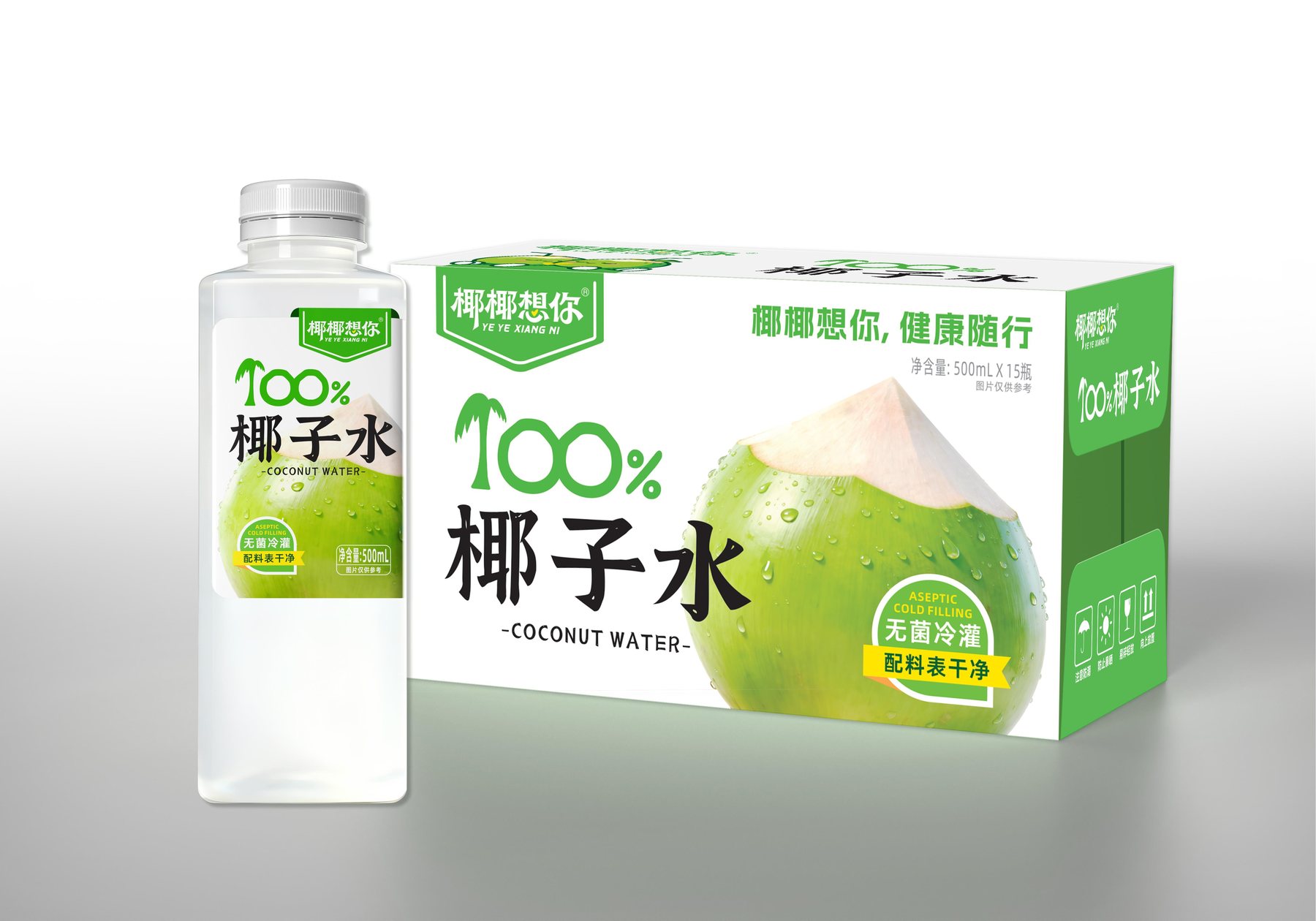
“The visual design for the ”Yeyey Misses You” 500 mL coconut water packaging uses a green-and-white color scheme, eye-catching category text, and an image of a green coconut to establish a clear reading path from top to bottom.