
PROJECT CASE
Packaging Design for the "Little Foreigner" Dairy Product Series
Project Overview
Brand
Little Foreigner
Products
Yogurt Drinks
Specifications
125 mL
Flavors
Strawberry flavor, blueberry flavor
Packaging Extensions
Single box, 16-box carry case, 36-box outer carton
Design Content
Series Packaging Design and Flavor Differentiation
Key Elements
Character designs, fruit illustrations, red and blue color scheme
A 125-mL box—how can we make both the product and its flavors stand out?
This series of 125 mL yogurt drinks from Xiao Yangren comes in strawberry and blueberry flavors and is available in packs of 16 single-box units and 36-box cartons. The front of each individual box is small, yet it must accommodate the brand name, product name, flavor, and character illustration all at once. If every element is given equal prominence, the truly important information will end up crammed together.
The goal of this design is not just to use two colors, but to create a set of easily recognizable guidelines that can be applied to different flavors and package sizes.
First, establish the series rules, then let the colors convey the flavors.
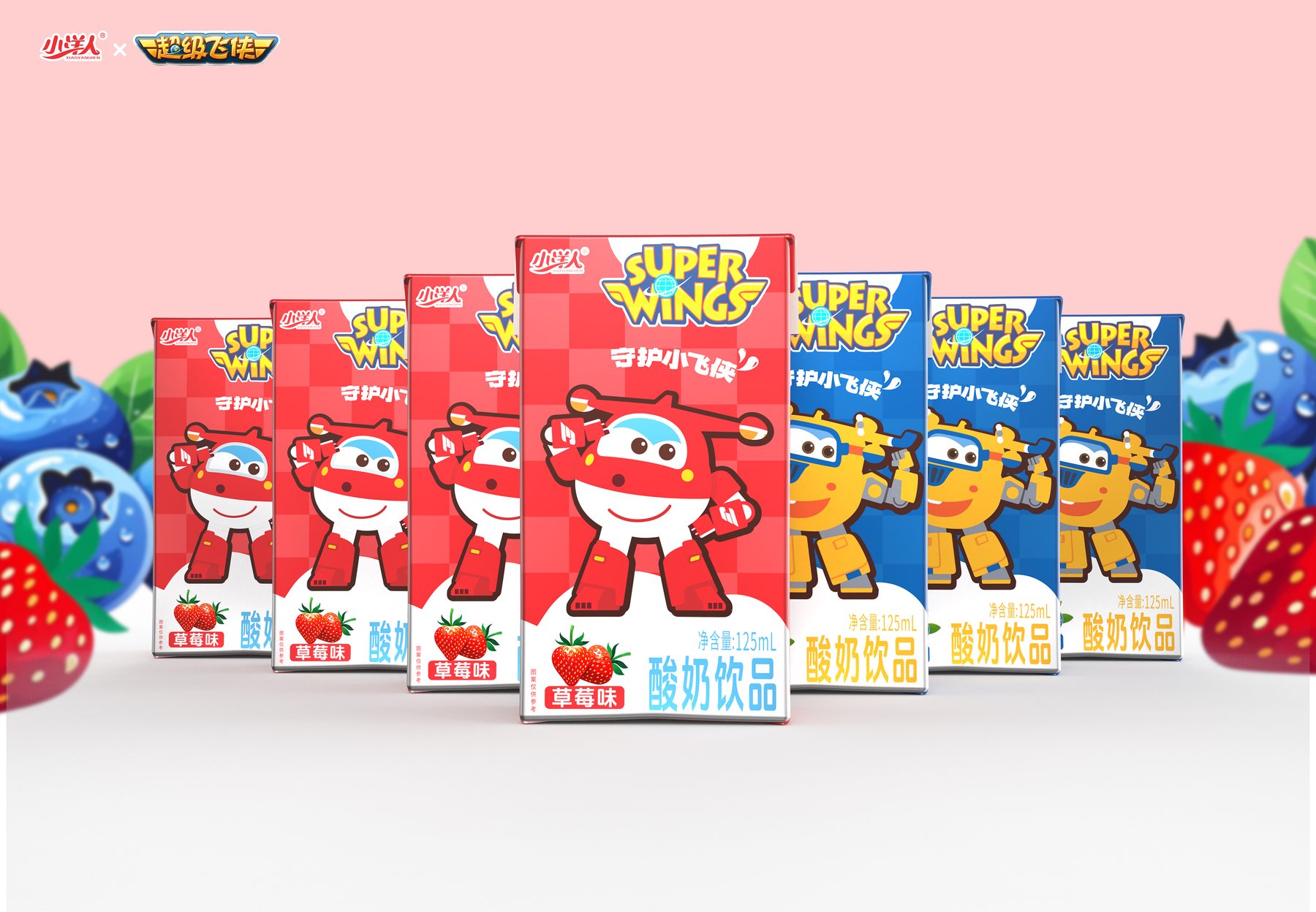
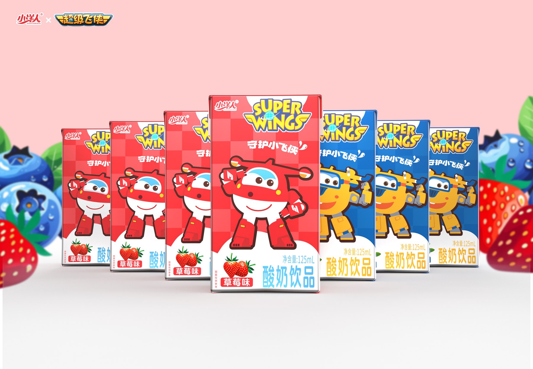
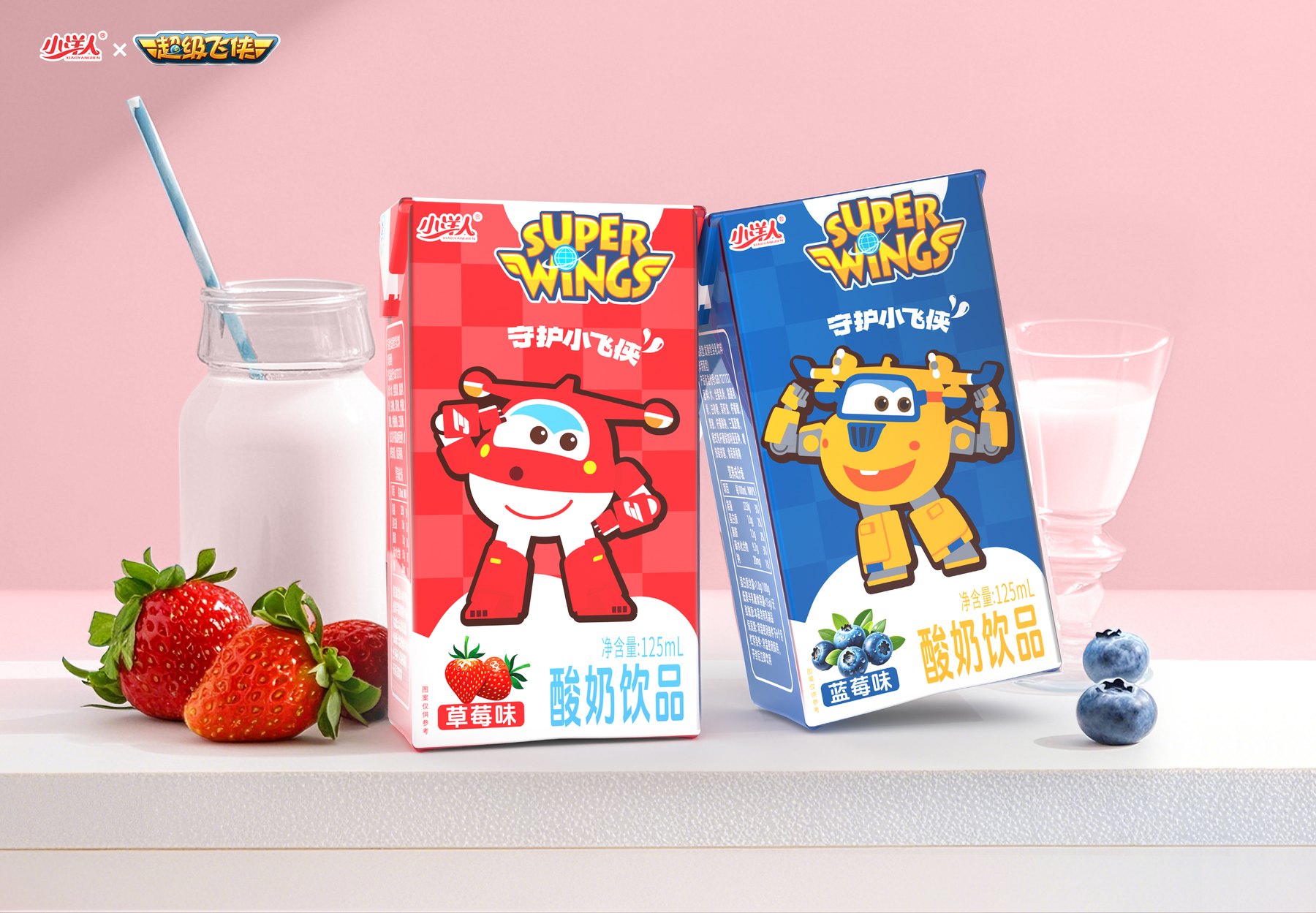
Each box features the brand logo and character at the top of the front, with the fruit, flavor name, and product name arranged at the bottom. The strawberry version is predominantly red, while the blueberry version is predominantly blue; when placed side by side, the flavors are easily distinguishable, but the relative positions within the series remain the same.
The colors help consumers quickly distinguish between the products, and the fruit illustrations associate each color with a specific flavor. This way, there’s no need to design a completely different package for each flavor, and the brand’s consistent visual identity is maintained.
The front of the little box—who should be seen first?
The display space on a 125-mL single-pack is limited. The character illustrations on the packaging are eye-catching; the brand logo and characters are located at the top of the front, while the fruit images, flavor text, and product name are arranged at the bottom. The red and blue backgrounds first help distinguish the elements, and the flavor is confirmed as the viewer’s eyes move down the package.
If the flavor illustration takes up the entire front of the package, there won’t be enough space for the product name; if only text is used, it’s difficult to quickly distinguish between strawberries and blueberries. Balancing this information is more important than simply adding decorative elements.
When the quantities change to 16 boxes and 36 boxes, why can't we just scale it up?
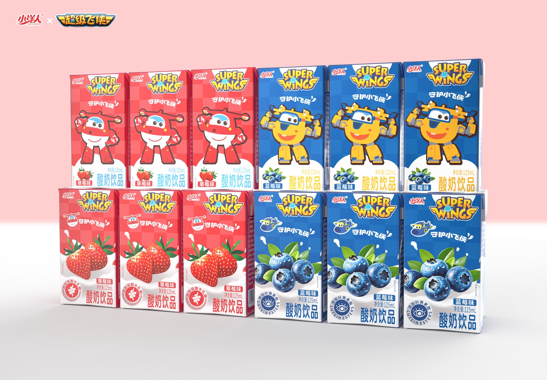
The 125-mL single-pack features a vertical layout. The 16-pack carry case retains the main flavor colors, characters, and fruit illustrations; the 36-pack outer carton now uses a horizontal layout, with the brand, characters, flavors, and quantity rearranged.
If the outer box simply enlarges the single-box design to scale, the reading order along the long side will be inappropriate. Therefore, while the red-and-blue color scheme, the characters, and the white dairy product area are retained, the size and placement of the elements are rearranged to fit the packaging dimensions.
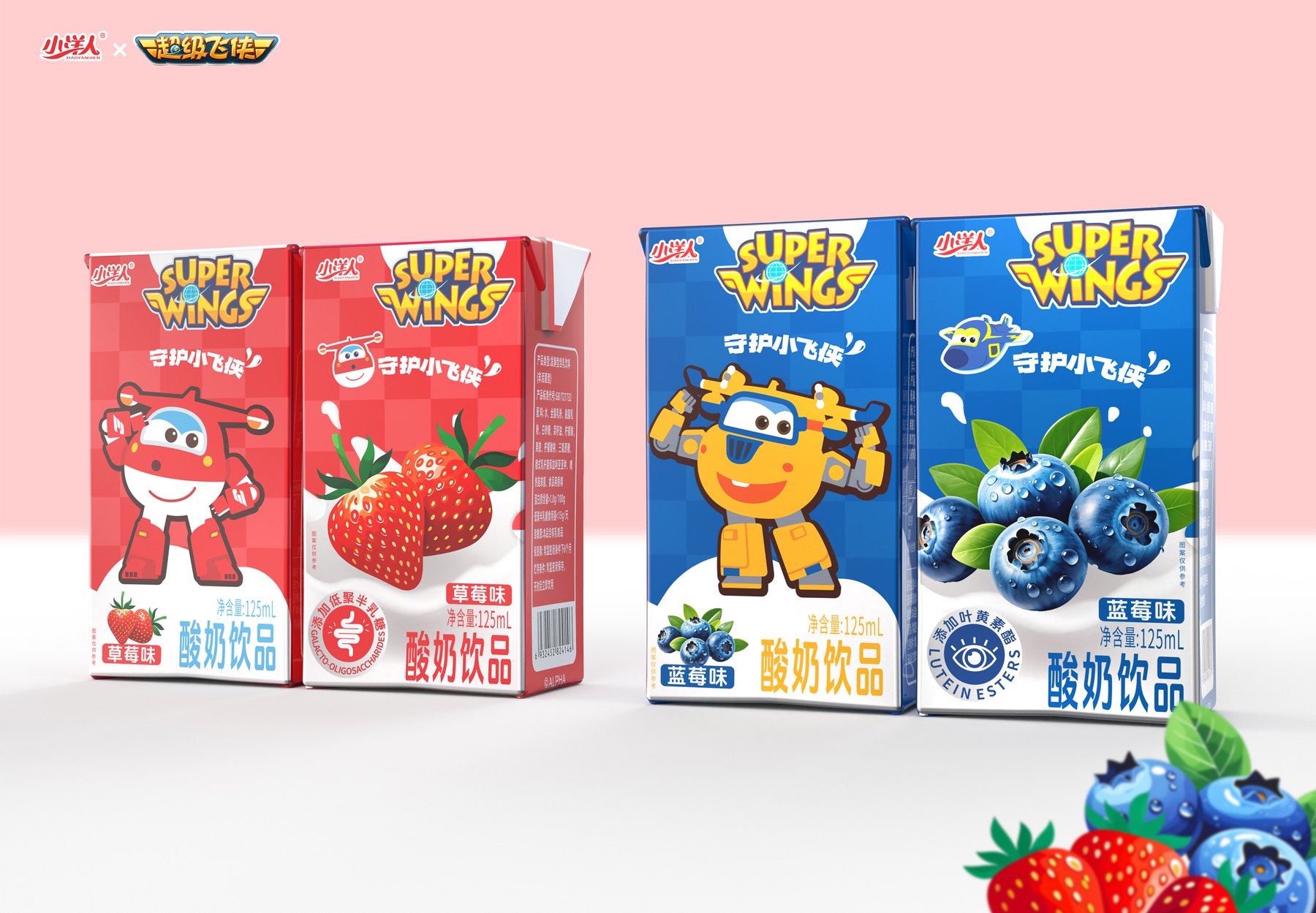
What ultimately remains is a set of adaptable rules
The project features visual designs for a series of packaging options, including 125 mL single boxes in strawberry and blueberry flavors, as well as 16-box carry cases and 36-box master cases. Each flavor has its own primary color, and different package sizes have their own layout designs.
What ties them all together are the same character relationships and flavor identification methods. This project demonstrates Meilin’s ability to first prioritize and refine information when dealing with multiple flavors and package sizes, and then expand the product line.
When creating multi-flavor packaging, first decide what will remain the same
For dairy-related projects, you can first establish the brand positioning, product names, and layout framework, and then let the flavor colors, fruit illustrations, and flavor text provide the variation. The layout for individual boxes, carry-home packs, and outer cartons should be designed separately; simply scaling them up is not recommended.
You can start by learning about itPackaging Visual Design Services. Before launching the project, you may refer toWhat materials need to be prepared before designing a new product?和How to Choose Between Custom Bottle Designs and Original Concepts。
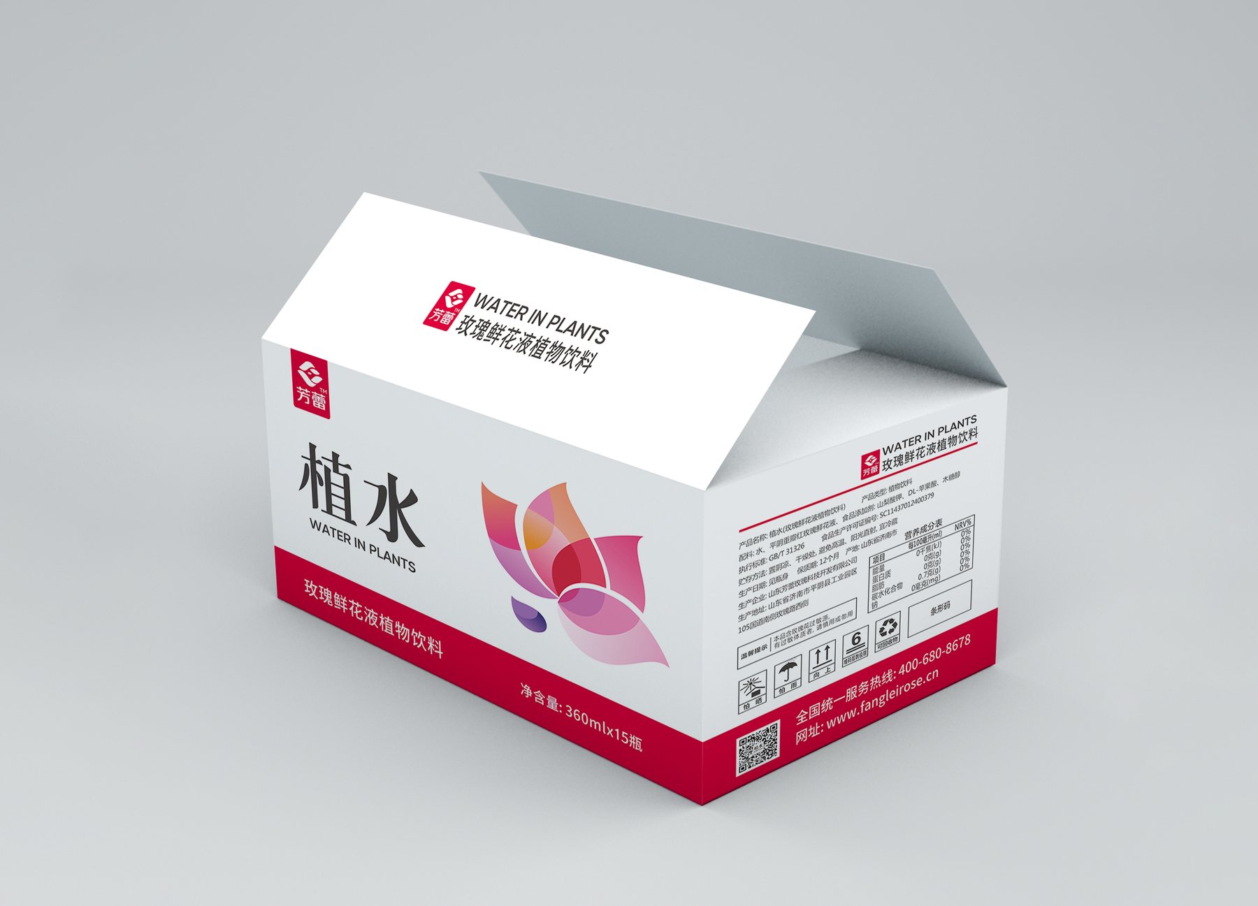
You can also viewFanglei Rose Beverage Packaging Design与Mingyuexin Beverage Packaging Design Project. If you would like to discuss multi-flavor and multi-size packaging options, pleaseContact Meilin Design。
PROJECT GALLERY
More Project Photos
MORE CASES
More Related Cases
Do you have a clear plan for new products? Start with a project assessment.
Please submit information on the product category, capacity, material, filling method, launch date, and reference materials. Meilin will discuss suitable bottle designs, packaging, and implementation strategies based on the specifics of your project.

Shenzhen Meilin Industrial Design Co., Ltd.
Establish brand identity through the aesthetics of original bottle designs,
Ensure the successful implementation of designs through engineering expertise.
We specialize in innovative bottle and packaging design for mineral water, fruit juices, alcoholic beverages, cooking oil, personal care products, and household cleaning products.
Design Services
Industry Solutions
© 2026 Shenzhen Meilin Industrial Design Co., Ltd.