
PROJECT CASE
Mingyuexin Beverage Packaging Design Project
Project Overview
A bottle of coconut water: Should you identify the product category first, or remember the brand?
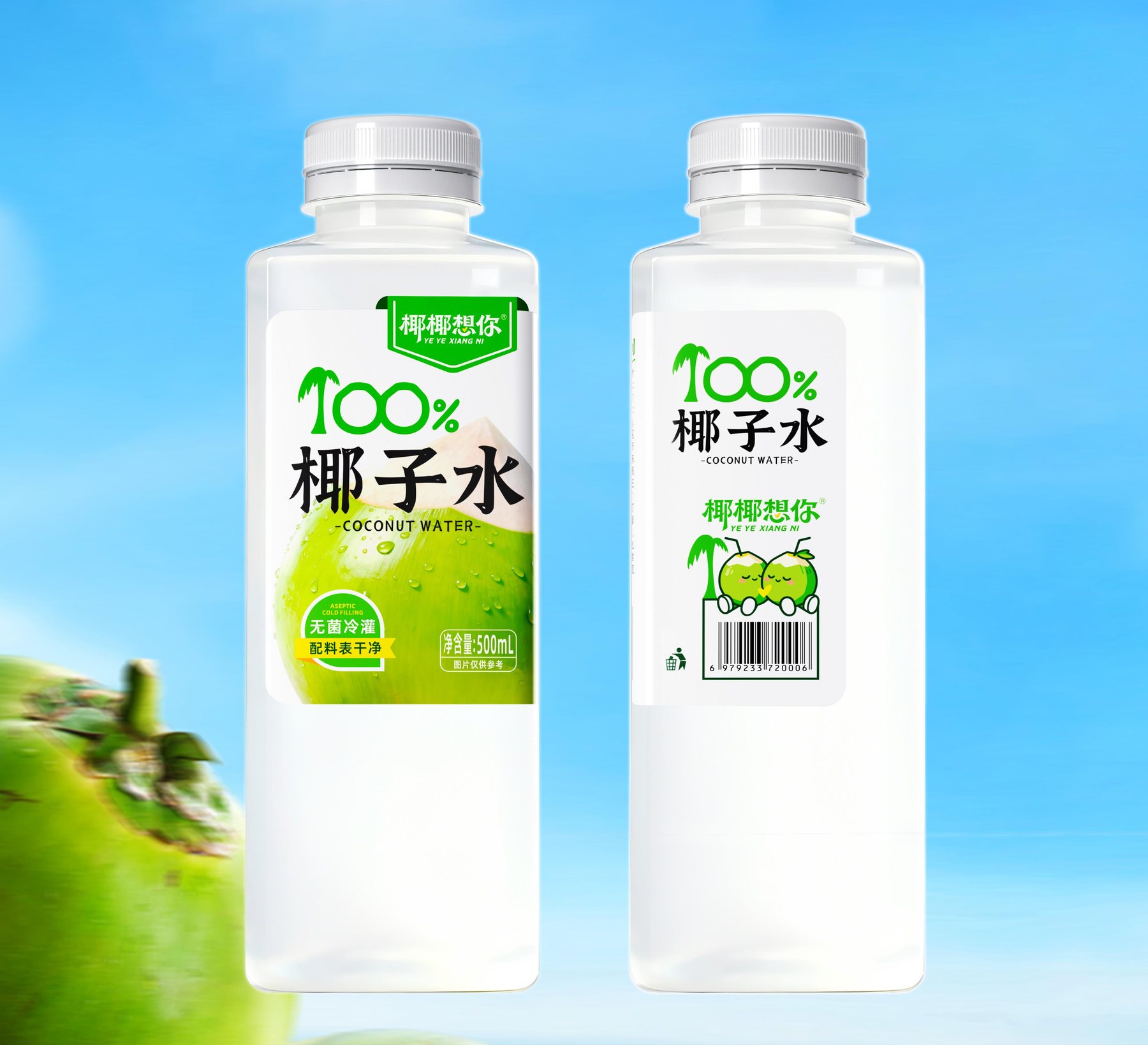
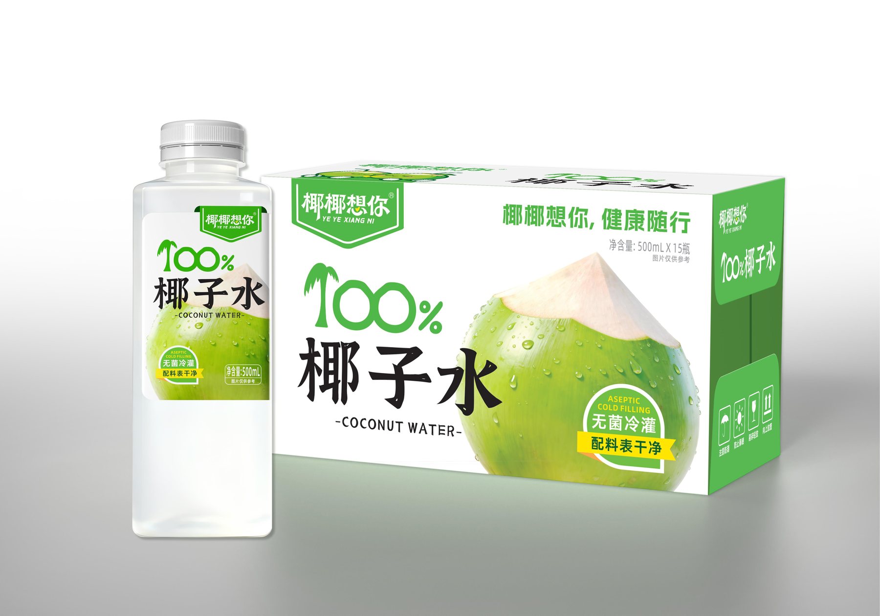
“For this set of 500mL coconut water packaging renderings titled ”Yeyey Misses You,“ the front must feature the brand, product category, and an image of a green coconut all at once. If all three elements are enlarged, it becomes unclear at first glance where to focus. The key to this design is to ensure consumers first recognize ”coconut water“ and then remember ”Yeyey Misses You” within the same visual.”
Put the most important words where they're most visible
The packaging features the words “Coconut Water” in large black letters in the center of the front, with “100%” highlighted in green above it. The product category is noticed first, and the brand makes an impression through the green label. This layout has a practical benefit: viewers don’t have to lean in to read a row of small print to figure out what it is.
The label isn’t cluttered with palm trees, ocean waves, and slogans. The white space highlights the black category text, while the green is reserved for the brand name, numbers, and the green coconut. The colors are used sparingly so that the green coconut image isn’t overshadowed by other graphics.
Two Layouts: How Does the Information Appear in Sequence?
The project visuals present two bottle layout designs side by side. One places the brand name at the top, with “Qingye” occupying the bottom half; the other centers the product category name, with two cartoon coconuts and a barcode added below. While the two designs have different focal points, they both retain the green color, the product category name, and the coconut symbol.
They illustrate the same point: While a brand can be expressed in different ways, its core message must remain consistent.
Keep the bottle simple—what will be left in the end?
In the rendering, the bottle’s shoulders and body have a somewhat boxy shape, with rounded corners. The relatively uncluttered front area leaves space for the large text and the green coconut, so there is no need to add dense textures to the bottle itself.
The key to making the packaging memorable lies in the order in which the information is presented, rather than having every element compete for the viewer’s first glance.
How Can Coconut Water Packaging Make the Information Clearer?
This design concept presents a clear coconut water packaging solution: first, it helps consumers identify the product category; second, it helps them remember the brand; and finally, it reinforces the product’s image through the depiction of a green coconut. What Meilin has addressed here goes beyond just a label design; it also involves how the bottle’s display surface, text size, and image prominence work together. If a new beverage product faces the challenge of having “selling points that are hard to articulate,” the discussion can begin with the sequence of information presented on the front of the package.
You can learn aboutPackaging Visual Design Services, then take a lookHow Bottle Shapes Can Enhance Shelf Visibility与What needs to be prepared before the project begins?. See similar projects for referenceFanglei Rose Beverage Packaging和"Little Foreigner" Dairy Product Series Packaging. If you want to organize your beverage packaging, you canContact Meilin Design。
MORE CASES
More Related Cases
Do you have a clear plan for new products? Start with a project assessment.
Please submit information on the product category, capacity, material, filling method, launch date, and reference materials. Meilin will discuss suitable bottle designs, packaging, and implementation strategies based on the specifics of your project.

Shenzhen Meilin Industrial Design Co., Ltd.
Establish brand identity through the aesthetics of original bottle designs,
Ensure the successful implementation of designs through engineering expertise.
We specialize in innovative bottle and packaging design for mineral water, fruit juices, alcoholic beverages, cooking oil, personal care products, and household cleaning products.
Design Services
Industry Solutions
© 2026 Shenzhen Meilin Industrial Design Co., Ltd.