

Many mineral water bottles look alike, usually not because they lack design elements, but because they fail to establish a clear, distinctive identity. If the bottle’s shoulder, overall width, structural rhythm, and label placement all follow common industry practices, the individual bottle may look harmonious in a rendering, but once placed on a shelf, in a cooler, or as an e-commerce thumbnail, it can easily get lost among similar products.
First, here’s the conclusion:The recognizability of a mineral water bottle design stems first and foremost from its outer contours and proportions, which are visible from a distance, and secondarily from details such as the ribbing, label, and cap. The design should allow consumers to recognize the brand from the bottle’s shoulder, the contours of the body, or the rhythm of the series—without having to read all the text—while also meeting practical constraints such as capacity, grip, labeling, filling, and packaging.
Why Do So Many Bottles of Mineral Water Look So Similar?
Drinking water bottles typically share transparent materials, standard bottle openings, portable sizes, and similar display methods; these common features are not the problem in and of themselves. What truly leads to homogenization is design that focuses solely on minor variations in local patterns without reorganizing the relationships between the bottle’s shoulders, the width of the body, the visual center of gravity, and the label display area.
Another common reason is to first create an “attractive front view,” and then add the cap, label, and structural requirements. As these elements are gradually incorporated, the original distinguishing features may be compressed or obscured, leaving only the standard outline commonly seen in the industry. ConductingBottle Industrial DesignWhen designing, you should first determine which features serve brand recognition and which structural elements support handling, labeling, or placement, to avoid having all elements compete for attention.
When identifying shelving units, look at the outline first, not the decorations.
When consumers view shelves from a distance, they typically first take in the height, width, curve of the bottle’s shoulder, and overall rhythm of the design; only upon getting closer do they read the brand name, product category, and selling points. If a design requires zooming in to distinguish it from others, it suggests that its recognizability may rely too heavily on fine textures or rendering details.
During design reviews, you can scale down the bottle design, remove complex backgrounds, and compare it side-by-side with products in the same category. If the differences remain visible even after retaining only the outer contours, the primary distinguishing features are generally more stable; if the contours are nearly identical, it is necessary to reassess the visual focal points of the bottle shoulder, cross-section, waistline, or base, rather than continuing to add surface decorations.
The design of mineral water bottle shapes can establish brand recognition on five levels
- Overall Proportions:First, determine whether the volume should be tall and slender, compact, solid, or light and airy, so that the outer contours align with the product's positioning.
- Bottle Shoulder and Neck:The shoulder of the bottle is one of the areas where the contours change most noticeably, and the way it curves directly affects the brand’s image as seen from the front and the side.
- Rhythm of the Bottle's Structure:Ribs, recesses, and curved surfaces should form a cohesive design language, while also taking into account grip, display surfaces, and considerations for subsequent manufacturing processes.
- The Bottom of the Bottle and the Visual Center of Gravity:The base of the bottle not only serves a structural purpose but also affects how stable the bottle appears and whether it complements the upper half.
- Relationship Between Labels and Bottle Caps:Labels are designed to quickly convey brand and product information, and the color, proportions, and opening mechanism of the bottle cap also contribute to the overall brand identity.
Efforts should not be distributed evenly across these five aspects. A more prudent approach is to select one or two primary identifying features and ensure that the other elements complement them. Whether the design is structurally feasible must be determined based on the specific bottle neck, preform, filling, transportation, and production conditions; conclusions cannot be drawn solely from renderings.
The bottle design and label should be designed together.
The bottle shape defines the three-dimensional contours, while the label conveys brand information. If these two elements are developed separately, common issues include the texture of the bottle’s surface intruding into the text area, the label obscuring key identifying features on the bottle, or the main graphic being positioned where the curvature changes significantly. If the label design is finalized too late, it may also force the already-designed bottle shape to compromise to accommodate the labeling requirements.
Therefore, before finalizing the design, you should first determine the label’s general format, the orientation of the main image, the stable display surface, and the hierarchy of essential information. For more information on how different label formats can influence the bottle design, please refer toWhy is it necessary to determine the label format before designing a mineral water bottle?。
The multi-capacity series cannot maintain consistency through simple scaling alone
When a brand develops portable, household, or large-capacity products simultaneously, it is not recommended to simply scale the same bottle shape up or down in direct proportion. Changes in capacity alter the proportions of the bottle shoulder, the grip, the label area, the relationship to the bottle base, and packaging requirements; mechanical scaling can easily make smaller sizes appear cramped and may cause larger sizes to lack a sense of stability.
A more appropriate approach is to first identify the essential design elements that must be retained—such as the shoulder line, the main curve, the center of gravity of the label, or the structural rhythm—and then recalibrate each size accordingly. This ensures that when placed side by side, the different sizes are recognizable as part of the same series, while still being appropriate for their respective sizes and contexts when used individually.
Different channels have different requirements for brand recognition.
The viewing distance and background vary across convenience store refrigerated display cases, full-row displays in supermarkets, restaurant tabletops, and e-commerce thumbnails. For refrigerated display cases, you need to consider transparent bottles and reflective environments; for full-case displays, you need to determine whether individual bottles and the outer packaging can be recognized together; and for e-commerce pages, you need to assess whether the bottle’s primary contours remain visible when the image is scaled down.
The brand owner should first define the primary distribution channels, capacity mix, price range, and launch plan; based on this, the design team will establish the relationship between the bottle shape and packaging identity and outline the engineering constraints for confirmation. The brand owner must coordinate with relevant packaging material, filling, and production suppliers to confirm compatibility requirements for the bottle neck, cap, filling, case packing, and production processes; the design team will then refine the design based on these confirmed results.
How to Handle “Similar but Not Exactly the Same” in Real-World Projects”
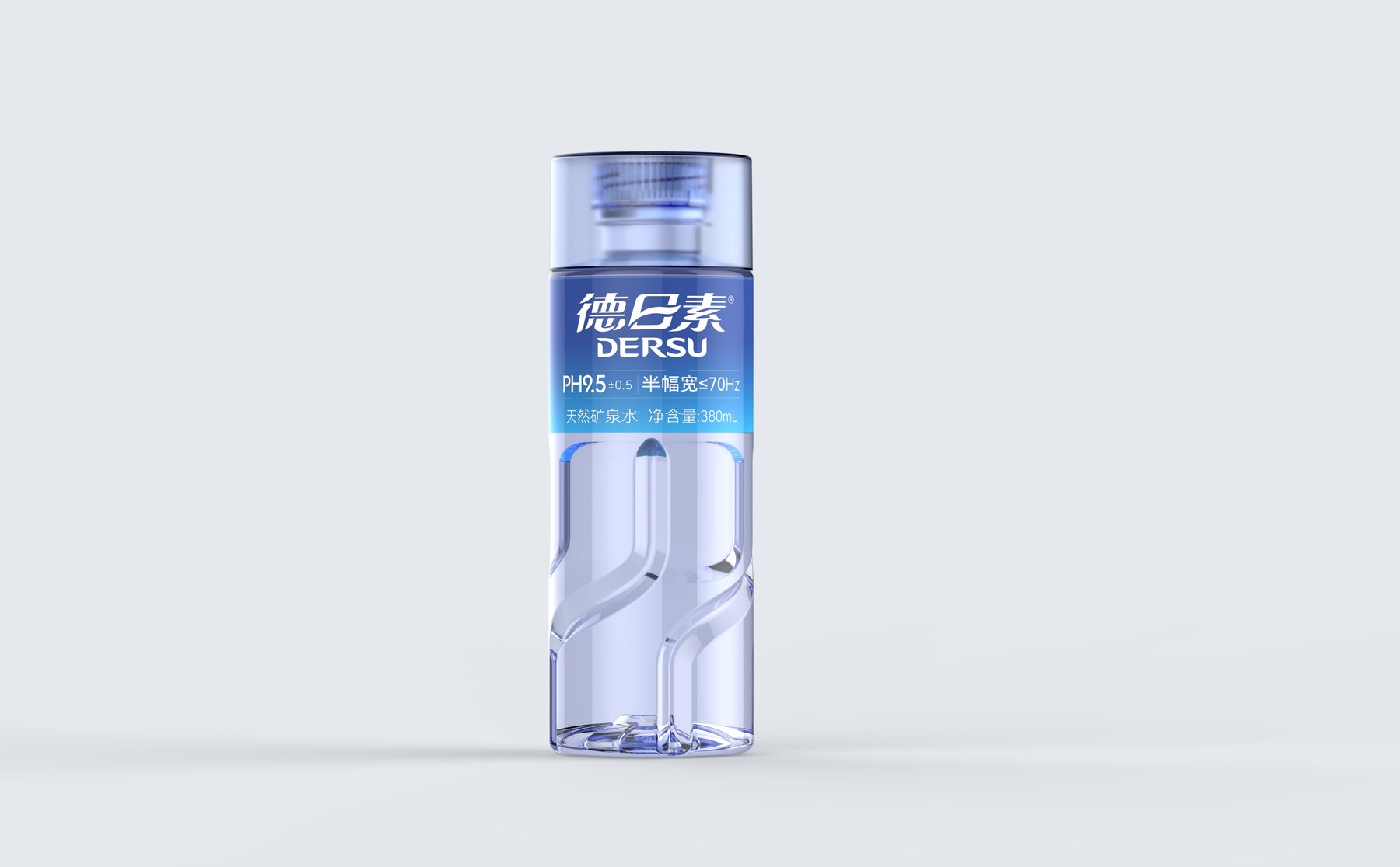
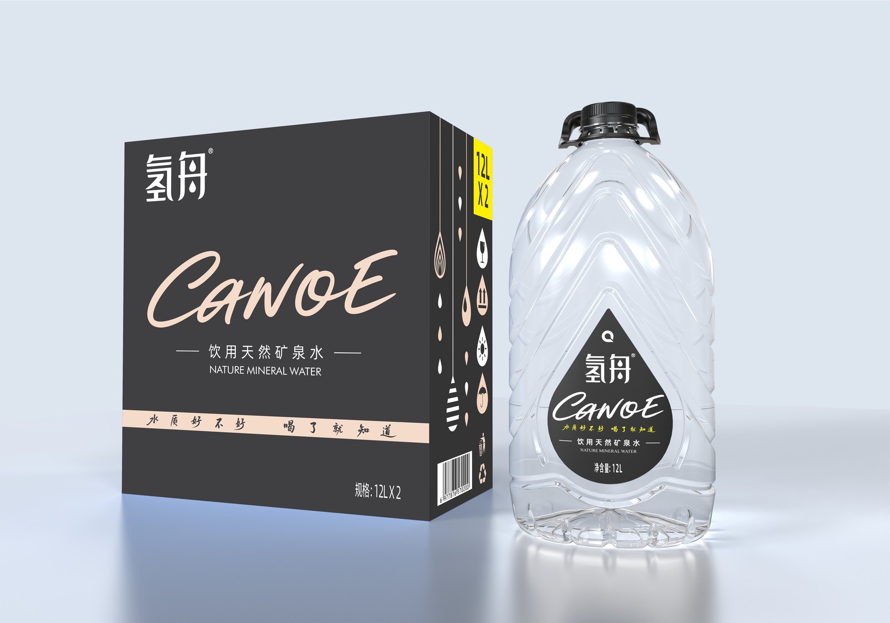
As disclosed by Meilin,Hydrogen Boat Natural Mineral Water ProjectIn this design, the proportions of the portable-sized bottles were not mechanically replicated from those of the 5L and 12L large-capacity versions; instead, the relationships between volume, grip, and labeling were addressed individually, and a sense of series cohesion was established using a common visual language. The De Risu 380mL project, meanwhile, creates a rhythmic composition on the front label through a clear vertical structure, the proportions of the cap, and the labeling zones.
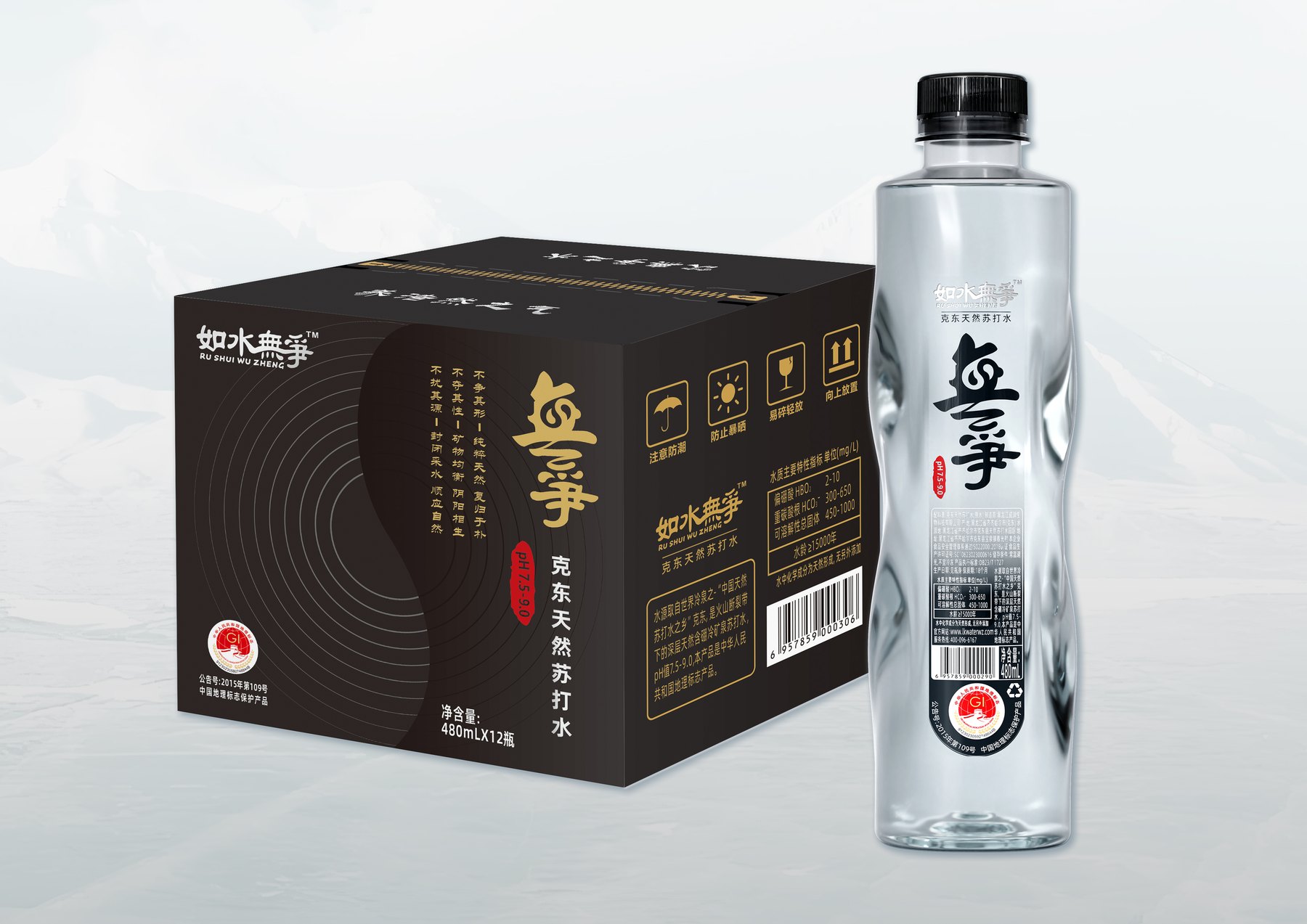
The "Like Water, No Strife" project employs a narrow, elongated form, with the undulating, angled bottle shape working in harmony with the label design; its visual identity stems from the overall composition rather than the mere addition of a set of patterns. These publicly available examples demonstrate that differentiation in mineral water bottle design should be based on a comprehensive assessment of the bottle’s silhouette, the information it conveys, and the practical implementation conditions. Browse more projectsDesign Case Studies for Drinking Water and Mineral Water。
Five Common Misconceptions
- The more textures, the more unique:Excessive detail can obscure the overall outline and label information, and may even make subsequent refinement more difficult.
- Comparison of large images of individual bottles only:If you ignore the shelves, refrigerated display cases, thumbnails, and grouped displays, it’s easy to overestimate the importance of minor details.
- Decide on the bottle shape first, then add the label:When there is a conflict between the display area and the structure, the brand message must be passively condensed.
- Direct scaling for different capacities:Although the series appears to be consistent, there may be imbalances in proportions, grip, and packaging.
- Once the renderings are approved, the design is finalized:The actual feel, dimensions, and label information still need to be verified using a model or sample.
Frequently Asked Questions
Can simply changing the label on a bottled water bottle improve its shelf visibility?
This can improve brand and message recognition, but if the bottle’s silhouette is highly similar to that of competing products, simply changing the label may not be enough to establish a strong visual memory. The decision on whether to adjust the bottle shape at the same time should be based on an assessment of existing packaging assets, distribution channels, and development plans.
Does the number of ridges on a mineral water bottle make it more memorable?
Not necessarily. Too many ribbed patterns can weaken the overall silhouette and reduce the space available for displaying labels and brand information. Generally, you should first establish a primary structural language, then use secondary details to enhance the grip, visual rhythm, or structural requirements.
Can different capacities within the same series be scaled proportionally?
It is not recommended to simply scale the design up or down proportionally. After changes to the capacity, the proportions of the bottle shoulder, the grip area, the label surface, the bottle base, and the packaging layout must all be reevaluated to ensure consistency across the series using a unified design language.
Does a good-looking rendering necessarily indicate how well the shelving will perform?
Don’t just look at a single large image. You should also zoom out to view the design at a size close to what it would appear on a store shelf or as an e-commerce thumbnail, compare it side-by-side with similar products, and verify the proportions, texture, and label placement using physical samples.
If you are developing mineral water, drinking water, or soda products and need to create original bottle designs, packaging lines, and a practical brand identity, you can contactContact UsPlease submit the product category, capacity, material, filling method, launch date, and reference materials so we can further discuss the most suitable design approach.