
PROJECT CASE
Visual Design for Taiquan Wines Gift Box Packaging
There are many cultural themes, and brands must not get lost in the mix.
The 24 Solar Terms can inspire 24 stories. But when it comes to designing wine bottles, a problem arises: if each bottle is designed differently, it’s hard to tell they’re from the same brand; yet simply changing the name of a solar term loses the significance of the cultural theme.
Taiquan’s packaging isn’t limited to the solar term commemorative editions. Gift products like Fengquan also need to maintain a connection to the brand. Mei Lin’s core task is to ensure that each product has its own unique appeal while making sure consumers remember Taiquan first.
Therefore, the design of this baijiu packaging did not begin with adding decorative elements. The starting point for the entire design concept was to first determine what elements must remain consistent and then decide what elements could vary.
The key lies not in the number of symbols, but in the relationship between the solar terms and wine.
If the bottle were to feature only flowers, birds, and poetry, the solar terms would easily become nothing more than an afterthought. The design shifts the focus to farming and winemaking: planting, harvesting, and labor—all of which have a more direct connection to a bottle of wine.
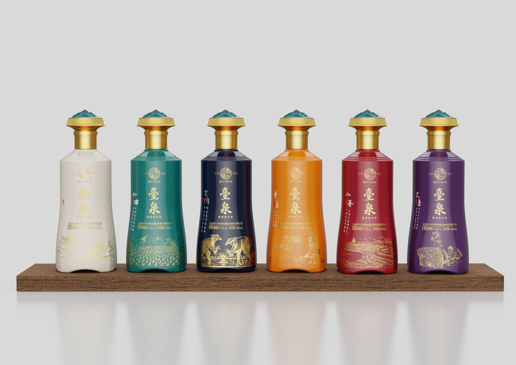
Consequently, the seasonal theme was reimagined as scenes of farming and winemaking. Golden line drawings wind their way around the bottle, while the names of the solar terms and poems are placed in relatively separate areas. Viewers can understand the story by looking at the illustrations, and the text can be read without being interrupted by the images.
This creates a hierarchy within the cultural content. First, the brand is seen; then, the solar terms are recognized; and only upon closer inspection do the scenes of labor and the verses unfold. Rather than telling all the stories at once, the goal is to make people want to keep watching.
First, choose a bottle frame that can hold twenty-four bottles.
The proposal compares bottle silhouettes with different degrees of tapering. If the silhouette is too straight, the cultural imagery can easily look like a sticker on a plain bottle; if there are too many variations, it distracts from the illustration and the brand.
The current design draws inspiration from the stability of the ding vessel and the relationship between the circle and the square, as embodied in the concept of “heaven is round and earth is square.” The rounded shoulders transition into a square base, and the body of the vase features subtle expansions and contractions. The front presents a complete visual composition, while the side also has its own distinct silhouette.
The blue-green mountain-shaped design on the top of the cap echoes the golden neck of the bottle. It serves as a unifying design element shared by all twenty-four varieties. This ensures that when the seasonal illustrations are changed, the entire collection of bottles remains consistent in its overall design.
Twenty-four variations—why does it still feel like a series?
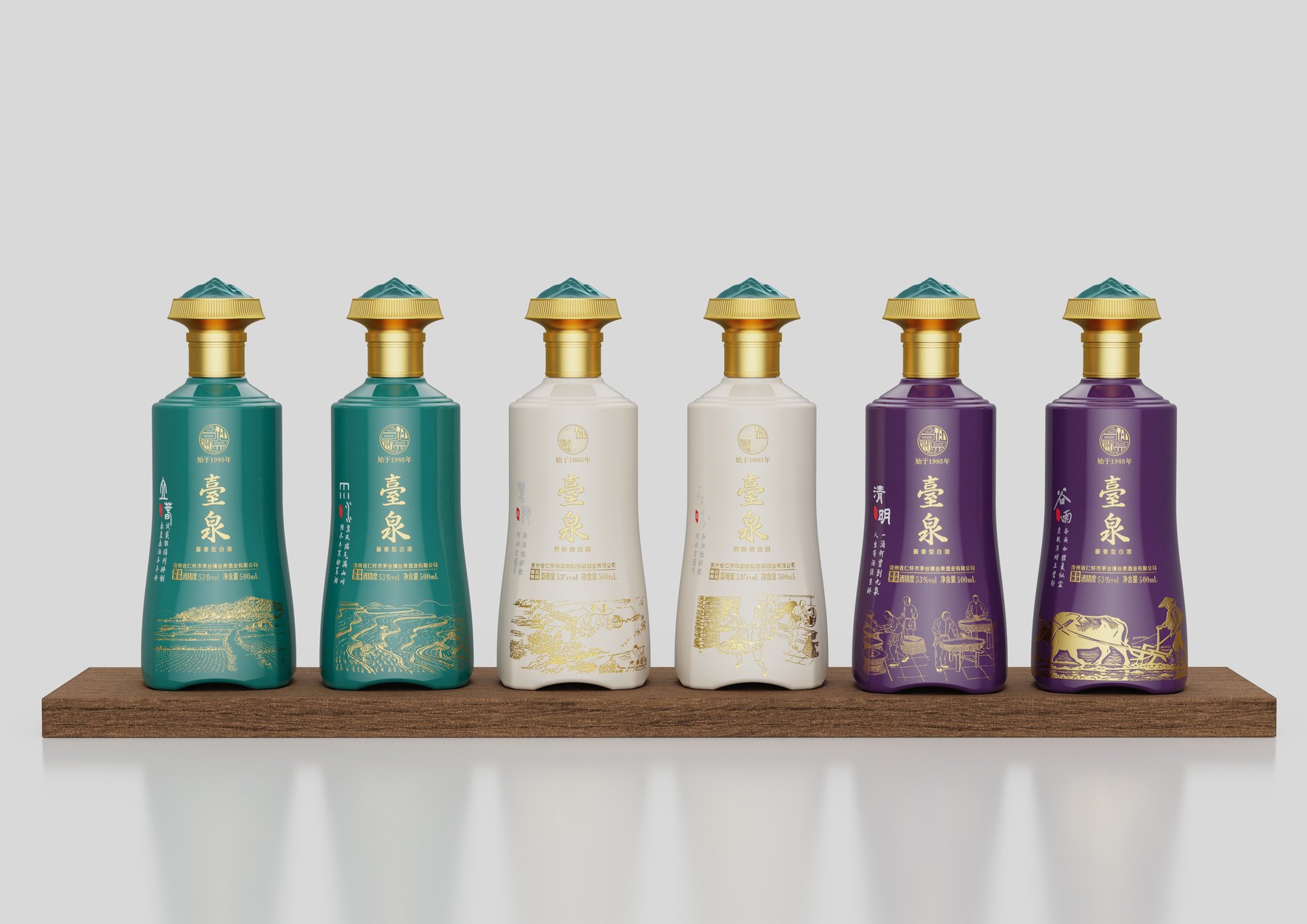
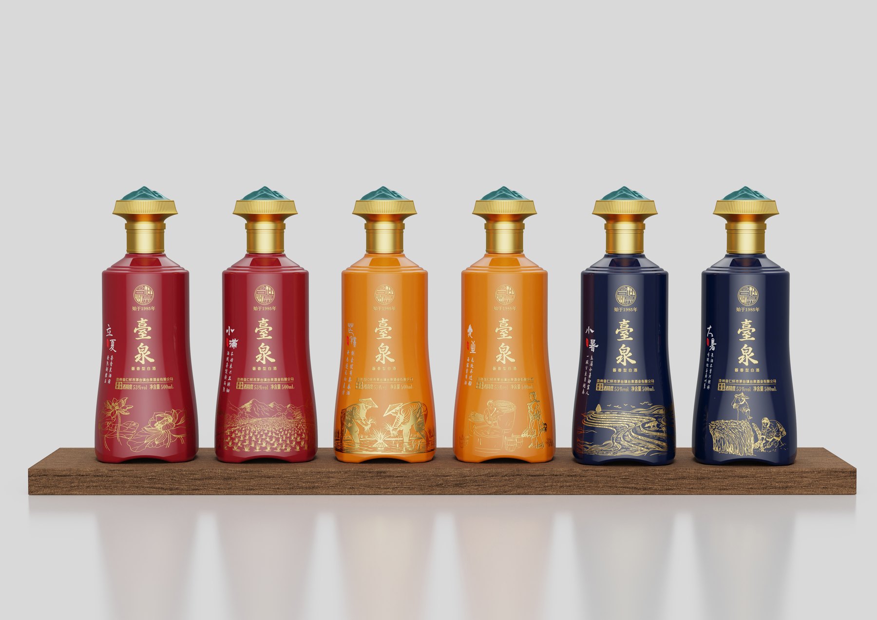
Illustrations and color schemes were previously compared using two sets, Group A and Group B. In design, it’s not just about whether a single image looks good; it’s also about whether the brand’s identity remains consistent when different colors and visuals are placed side by side.
The design specifies the bottle shape, the “Taiquan” branding, the names of the solar terms, and the primary placement of the illustrations. Colors such as turquoise, moon white, purple, vermilion, orange-yellow, and royal blue are used in conjunction with content related to the various solar terms. Variations are limited to the content and color schemes, while the reading order remains consistent.
Golden line art connects the different background colors. The large areas of background color provide visual distinction when viewed from a distance, while the names of the solar terms and specific scenes serve as focal points for close-up reading. Thus, the 24 designs are not 24 separate restarts, but rather a systematic series of variations.
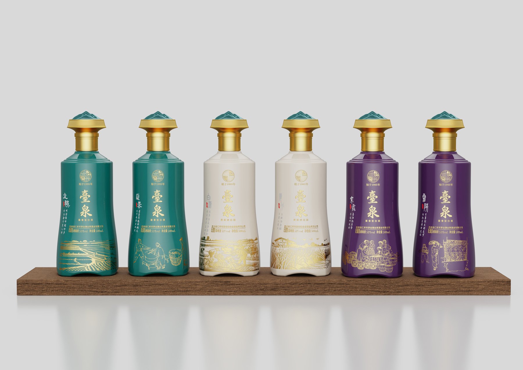
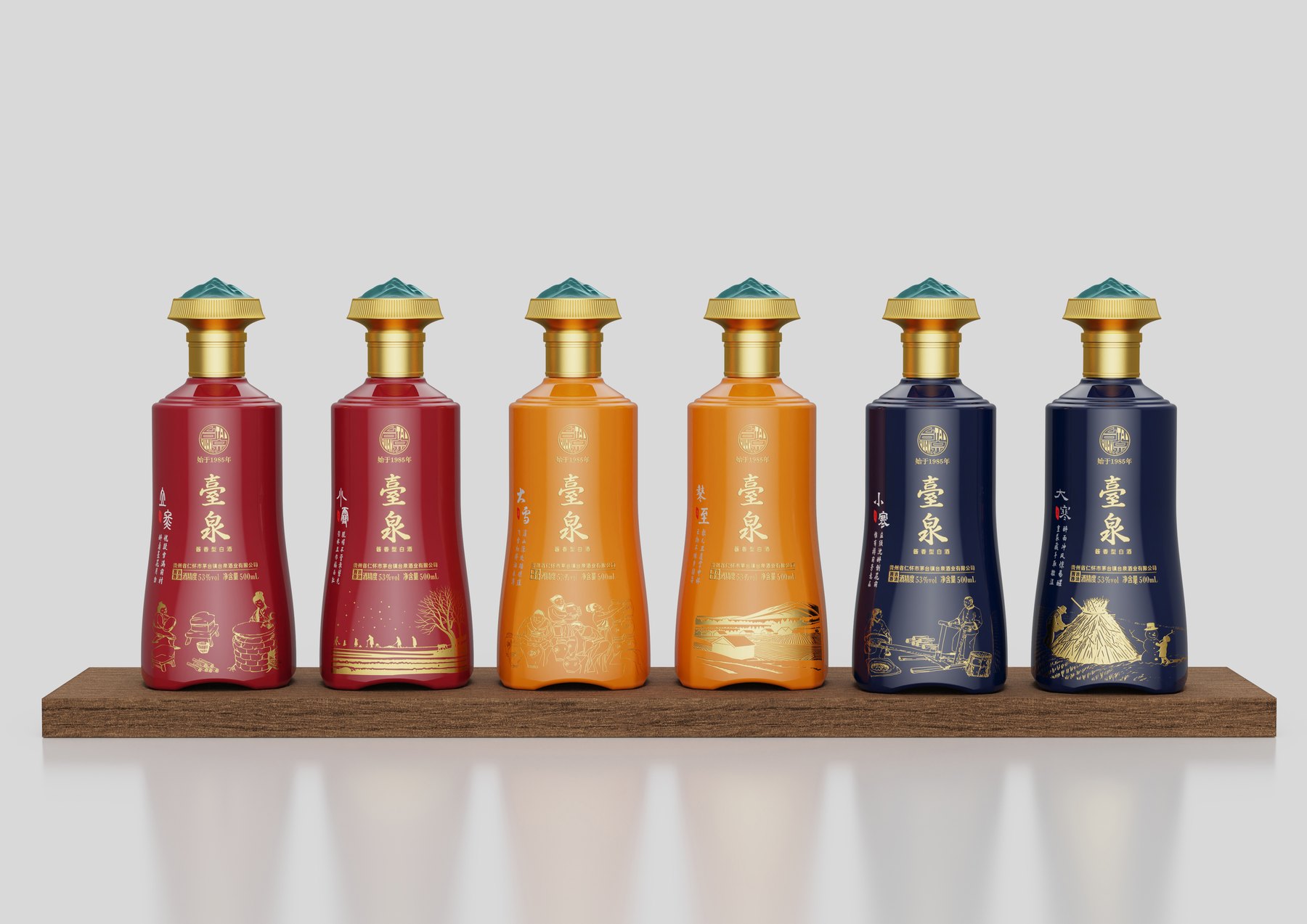
From a single bottle to a gift set, you can’t change the brand’s image.
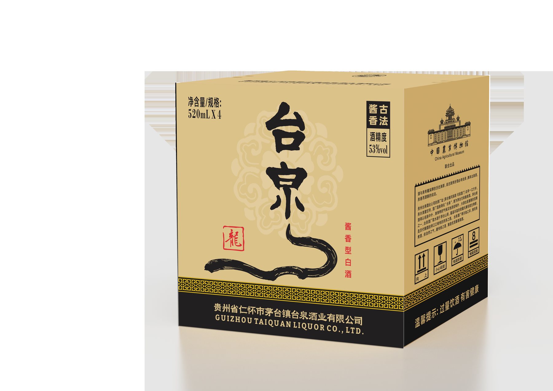
The Fengquan Gift Edition adopts a different visual approach: first, you see the box; then, you see the bottle. The red wine bottle and the gold “Taiquan” lettering maintain a visual connection with the gift box’s primary color scheme, and the visual focus remains on the wine bottle once the box is opened.
This represents a different product direction from the Solar Terms Commemorative Edition. The former uses a bottle-and-box set to create a complete display, while the latter explores cultural themes through a series of illustrations. They do not need to look the same, but they must retain a clear brand name and a consistent visual style.
The value of a gift box goes beyond simply adding an extra layer of packaging. The box’s exterior, the way it opens, and the front of the bottle must all be considered together to ensure that the product inside isn’t overshadowed by an overly ornate outer box.
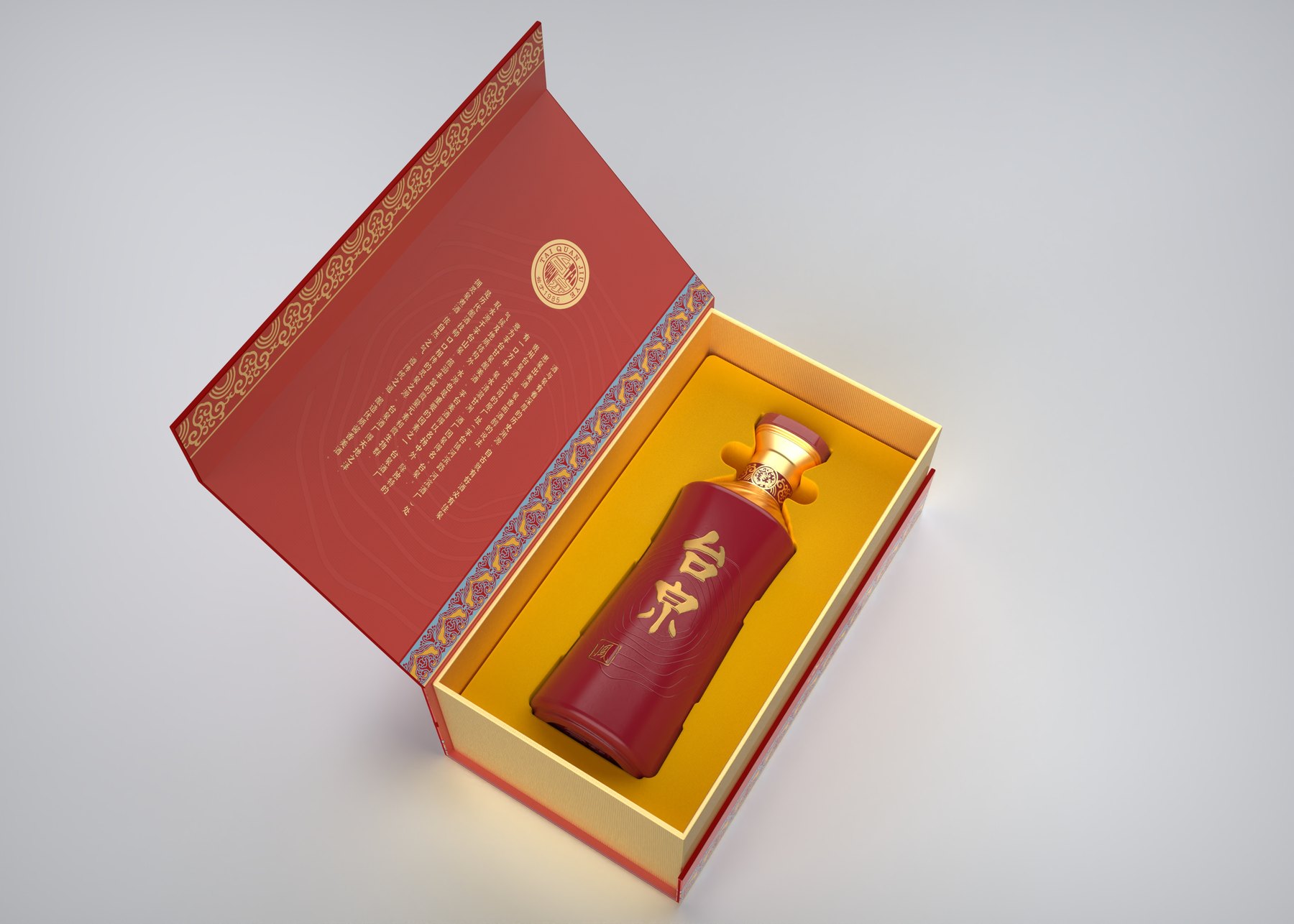
Let each piece tell a story, and let the entire collection remain true to Taiquan.
The project developed a commemorative edition of the "Twenty-Four Solar Terms" featuring bottle designs, a color palette for the series, illustrations of agricultural activities and winemaking, as well as a combination of poetry and calligraphic seals. It also showcased the relationship between the Fengquan wine bottles and their gift boxes.
The key to this design concept isn’t that it includes more elements than other baijiu labels. Rather, the bottle shape unifies the design, colors distinguish between products, illustrations tell a story, and the brand name always has its own place. As a result, culture becomes an integral part of the product rather than overshadowing it.
If your baijiu or gift products also consist of multiple lines, you can first identify the shared brand identity and then decide on the variations for each product line. Meilin can work with you to develop a specific packaging direction that integrates the bottles, labels, and gift boxes.
Related Services:Packaging Visual Design Services. You can also learn moreBeverage and Gift Packaging Design。
Continue reading:Materials Needed for Bottle Design;How to Choose a Custom Bottle Design Service。
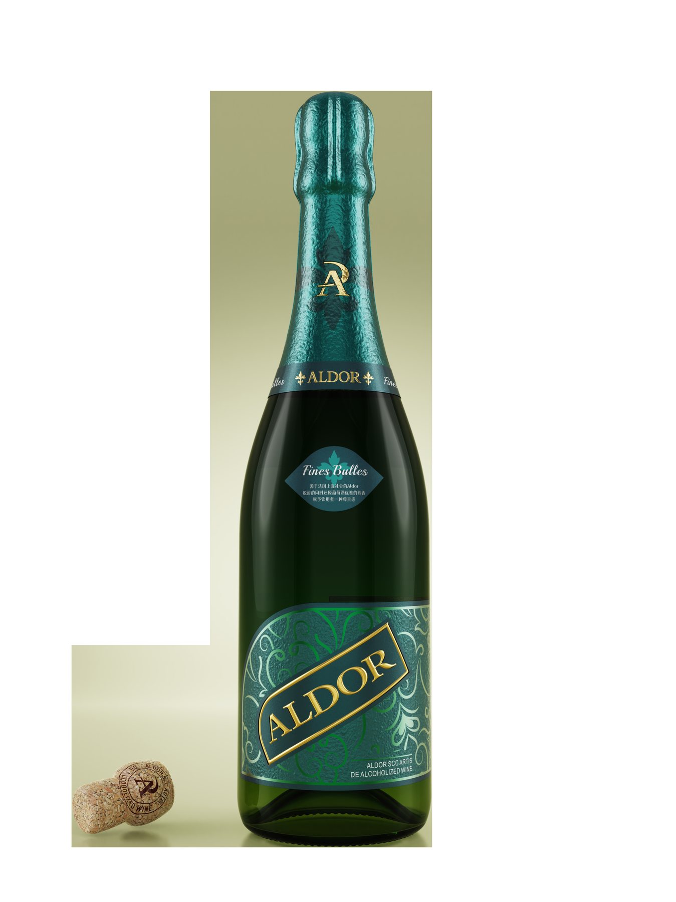
Similar Projects:Aldor Alcohol-Free Beverage Packaging Design;Dream Dimension Soda Packaging Design。
PROJECT GALLERY
More Project Photos
MORE CASES
More Related Cases
Do you have a clear plan for new products? Start with a project assessment.
Please submit information on the product category, capacity, material, filling method, launch date, and reference materials. Meilin will discuss suitable bottle designs, packaging, and implementation strategies based on the specifics of your project.

Shenzhen Meilin Industrial Design Co., Ltd.
Establish brand identity through the aesthetics of original bottle designs,
Ensure the successful implementation of designs through engineering expertise.
We specialize in innovative bottle and packaging design for mineral water, fruit juices, alcoholic beverages, cooking oil, personal care products, and household cleaning products.
Design Services
Industry Solutions
© 2026 Shenzhen Meilin Industrial Design Co., Ltd.