
PROJECT CASE
Aldor Non-Alcoholic Wine Bottle and Packaging Design
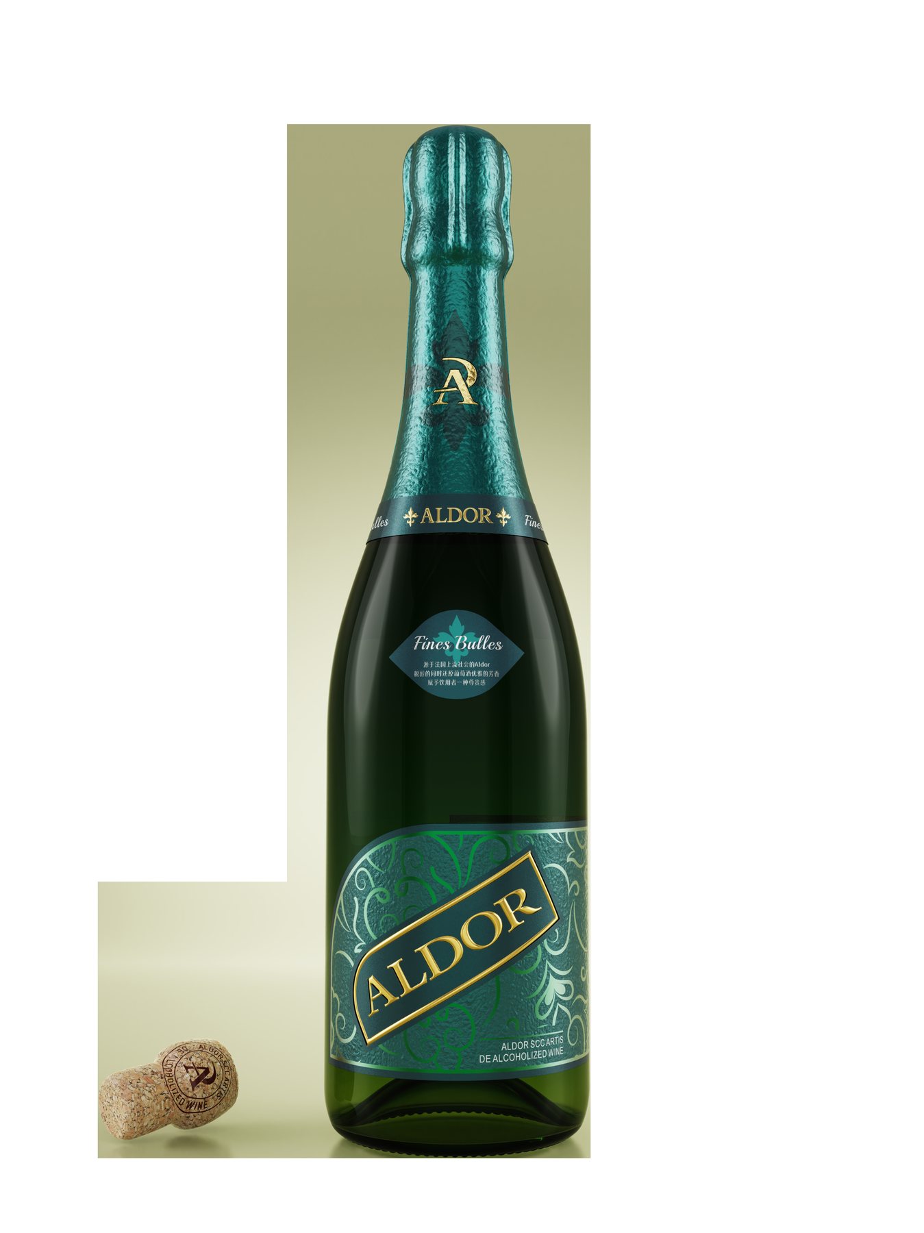
Even without alcohol, the packaging doesn’t have to be any less sophisticated.
Alcohol-free wines need to clearly communicate their product features while maintaining a sense of solemnity when raised in a toast. If the packaging resembles that of ordinary beverages too closely, the wine’s image will be diminished; if it simply replicates traditional wine labels, the new brand is likely to be overlooked.
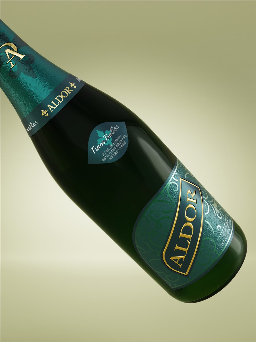
For this design project for Aldor, the challenge lay somewhere in between. Meilin designed the brand logotype, front label, neck label, and bottle cap around the deep green wine bottle. Rather than simply adding more gold to the labels, the goal was to ensure the bottle itself made a strong first impression.
The brand name must be clear, the product’s identity must be legible, and decorative elements must not overshadow them. This serves as the common starting point for the three subsequent design directions.
First, make the name stick; then find a memorable hook.
The Aldor wordmark uses a serif typeface, while the letter combination logo is suitable for smaller spaces such as the bottle neck and cap. The two versions—one large and one small—serve to showcase the brand at different viewing distances.
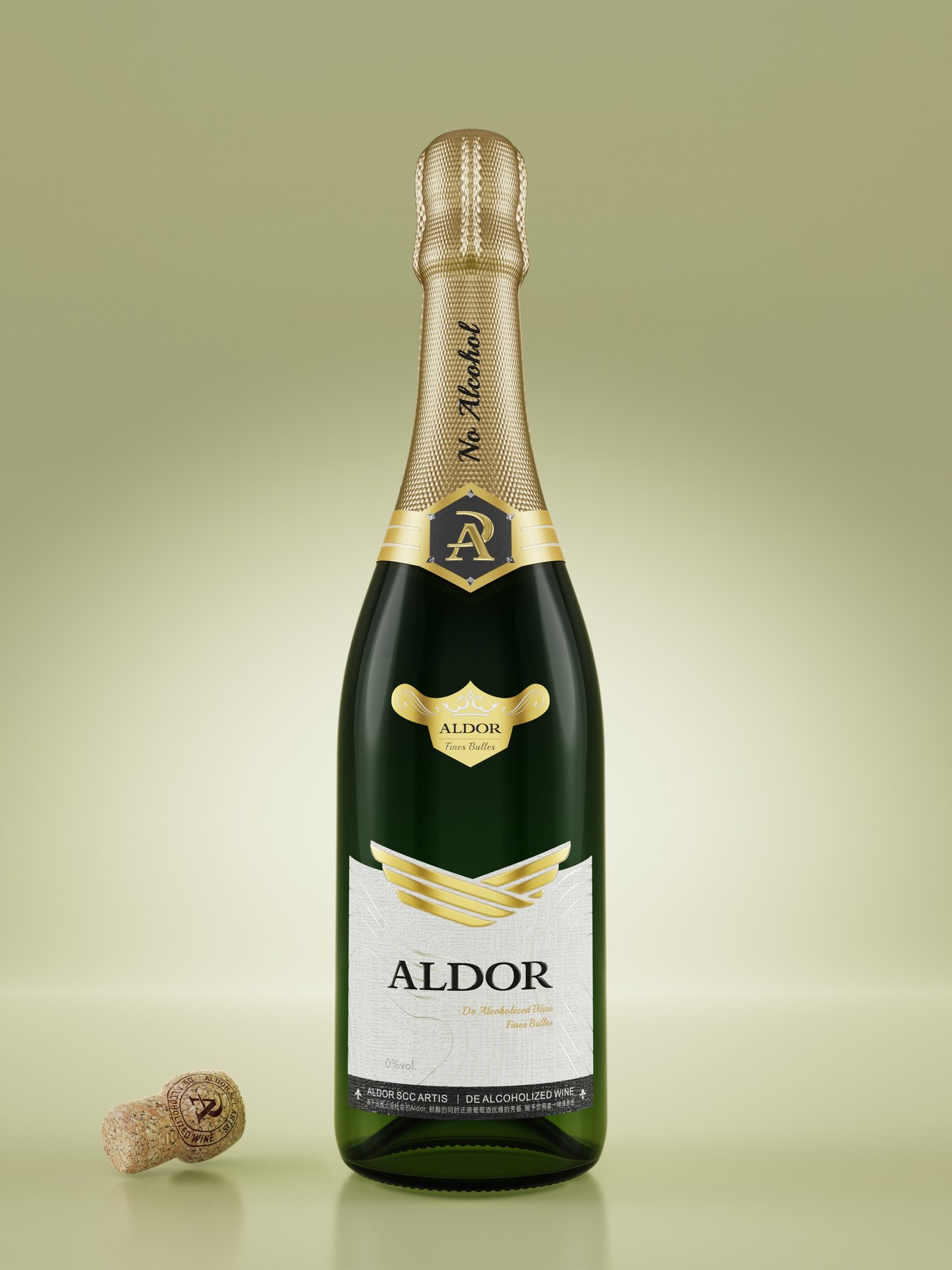
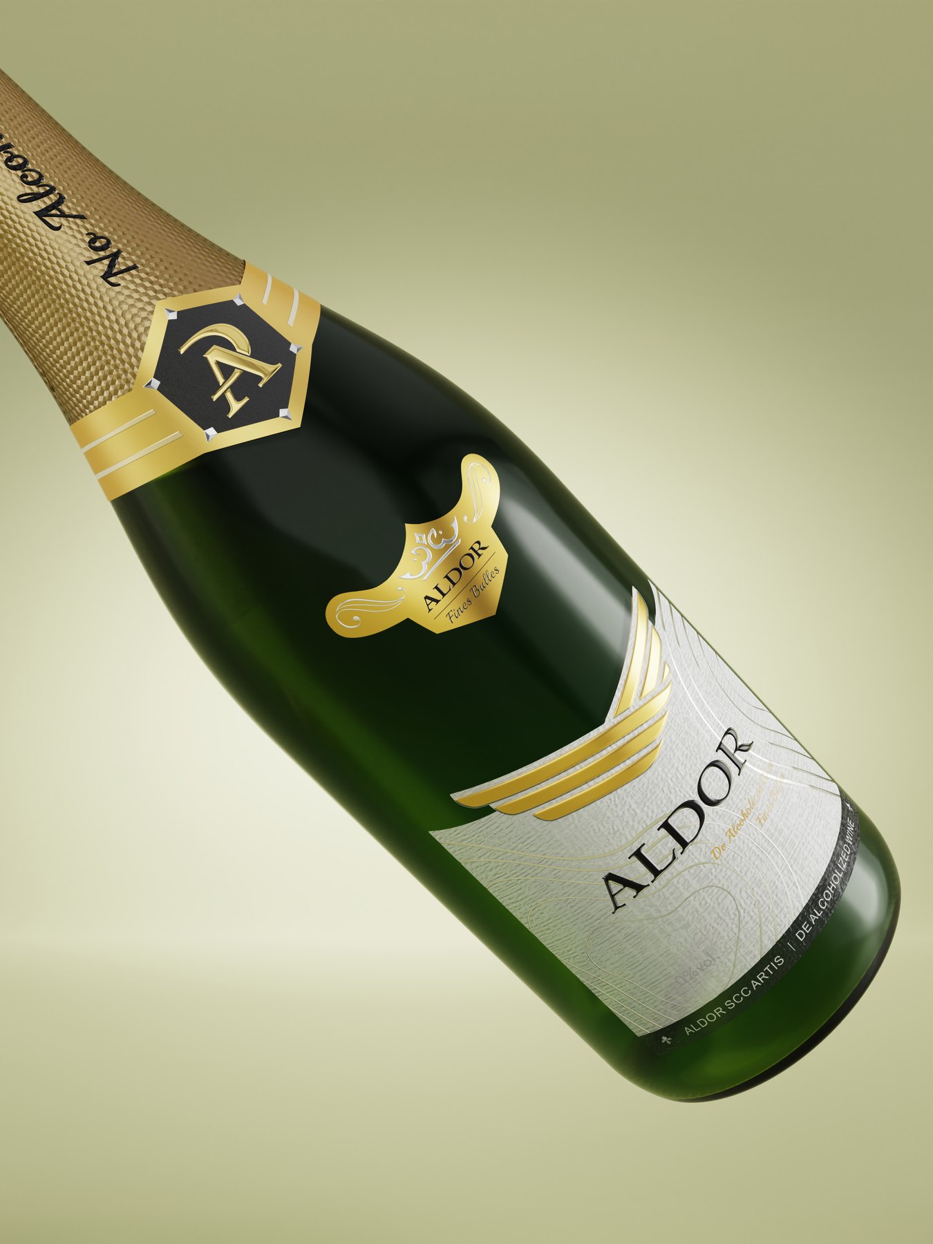
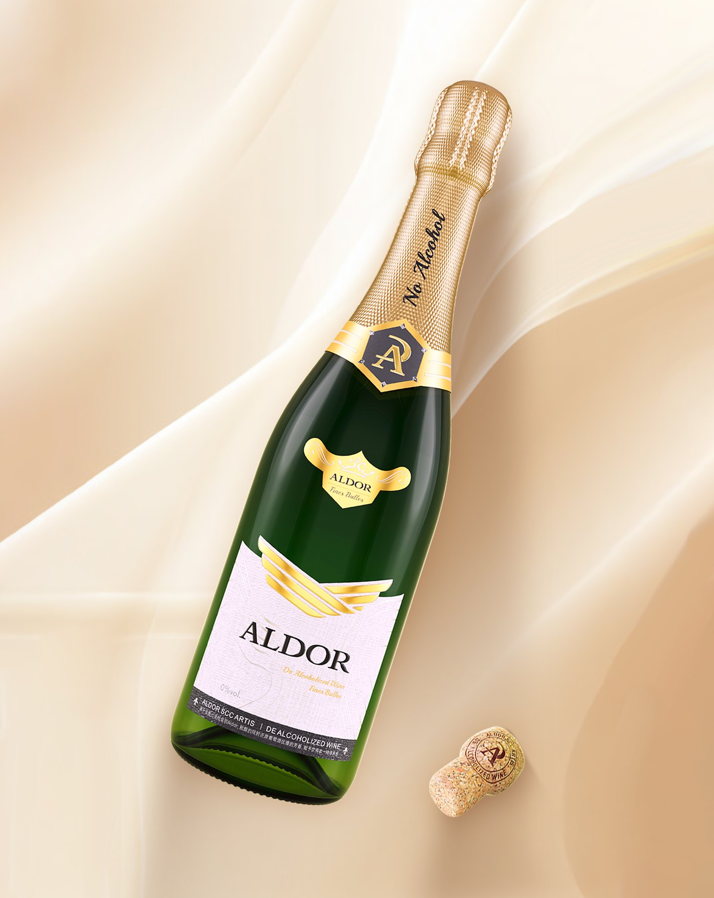
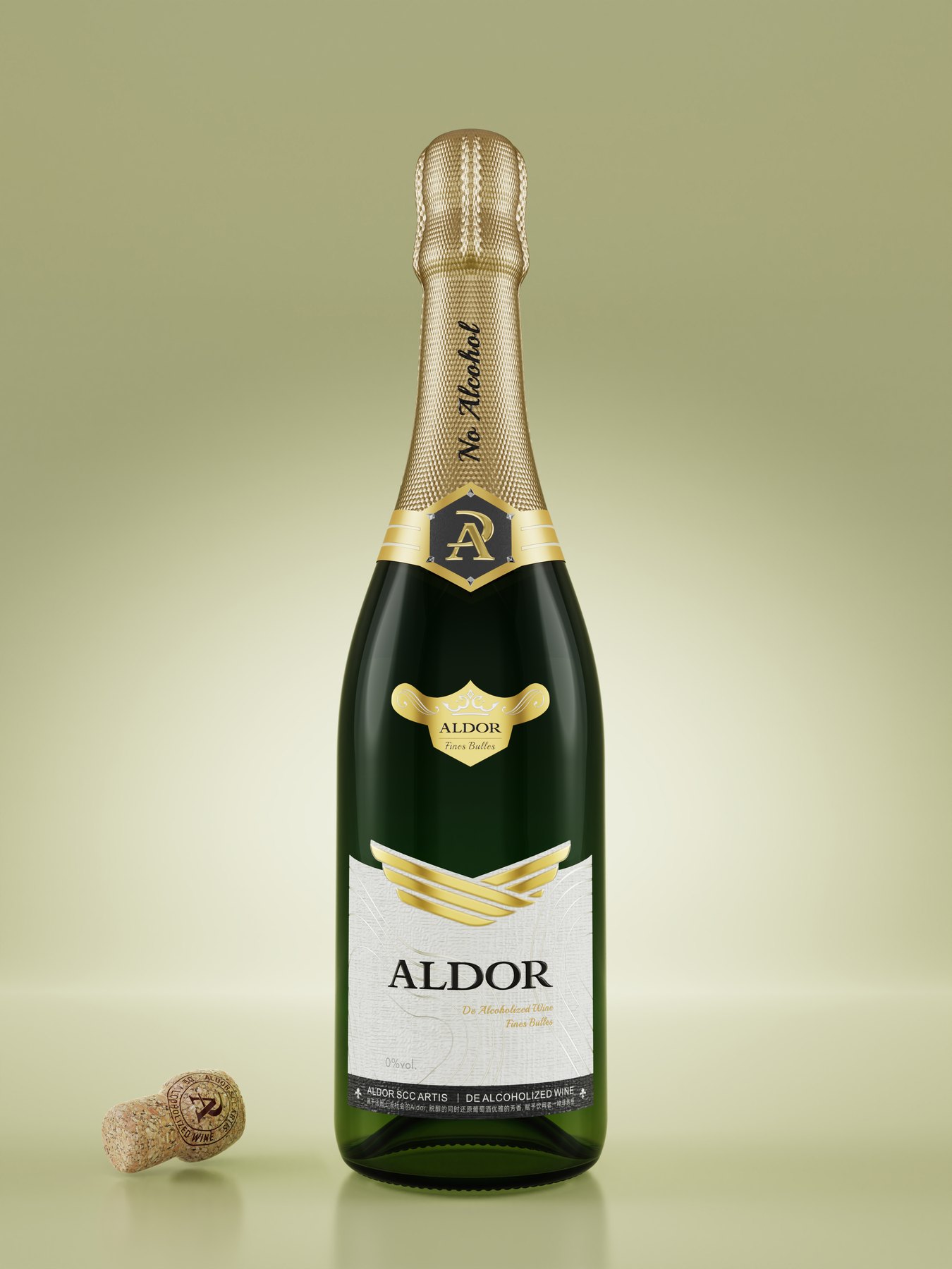
Design A contrasts the off-white label with the dark green bottle. The brand name is centered, and the wing-shaped symbol serves as a visual focal point at the top. The gold accents do not cover the entire label but are concentrated on the symbol, the bottle cap, and select details.
The off-white area provides a serene backdrop for the text. The winged symbol ensures this wine label is more than just a name, while the gold bottle seal draws the eye back to the bottle’s neck. Simplicity isn’t about doing less; it’s about focusing attention on a few key elements.
Three Approaches: A Comparison of Three Ways of Expression
Direction A emphasizes negative space and the brand name. From a distance, the viewer first notices the interplay of gold, white, and dark green across the entire bottle; upon closer inspection, they read the label. Its strength lies in its legibility and the way it effortlessly connects the bottle neck with the front label.
Direction B features the Grape Fairy as the main graphic. The image first tells a story about grapes and wine, then wraps up the message with the brand name. This direction leans more toward an illustrative style rather than relying on color blocks and text.
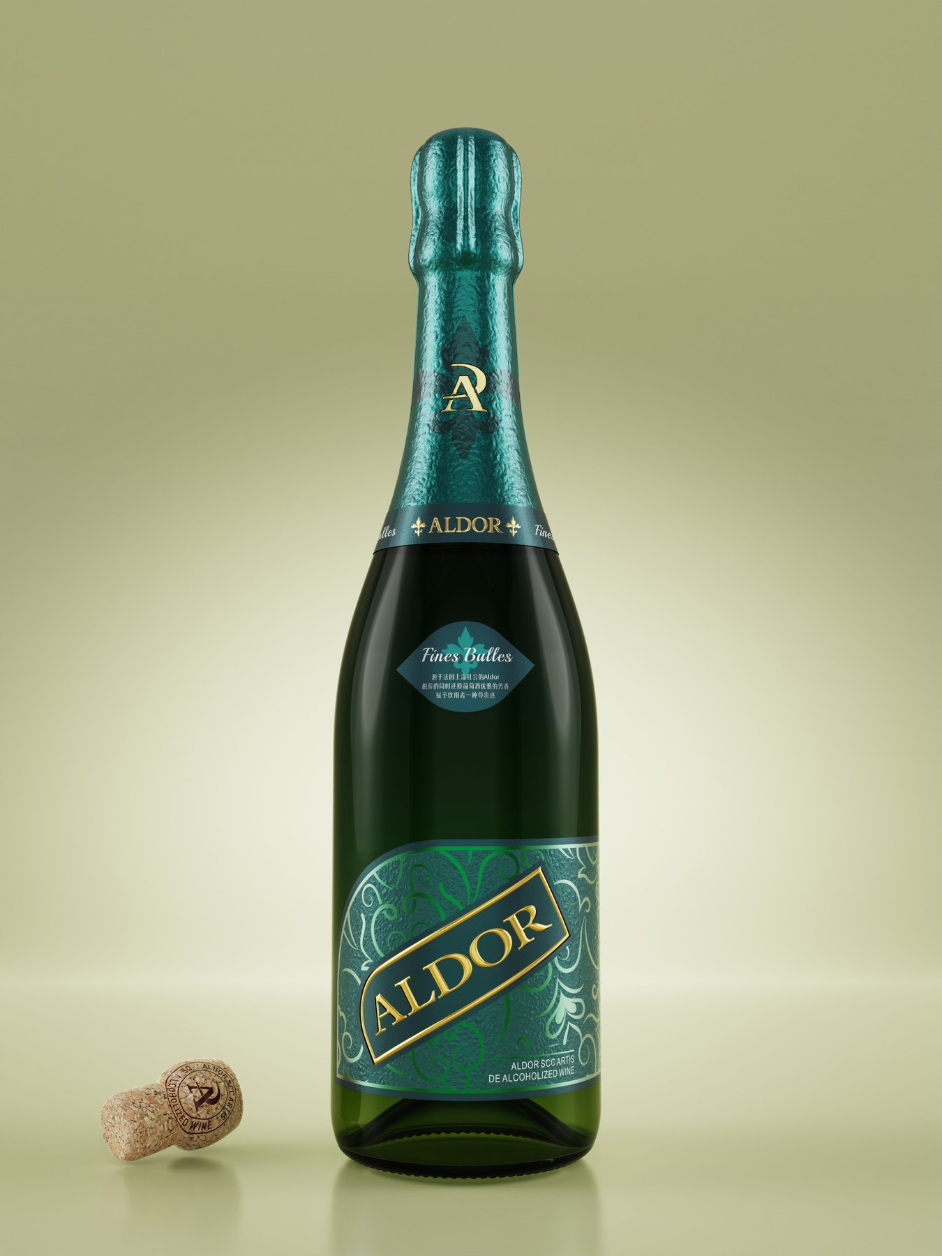
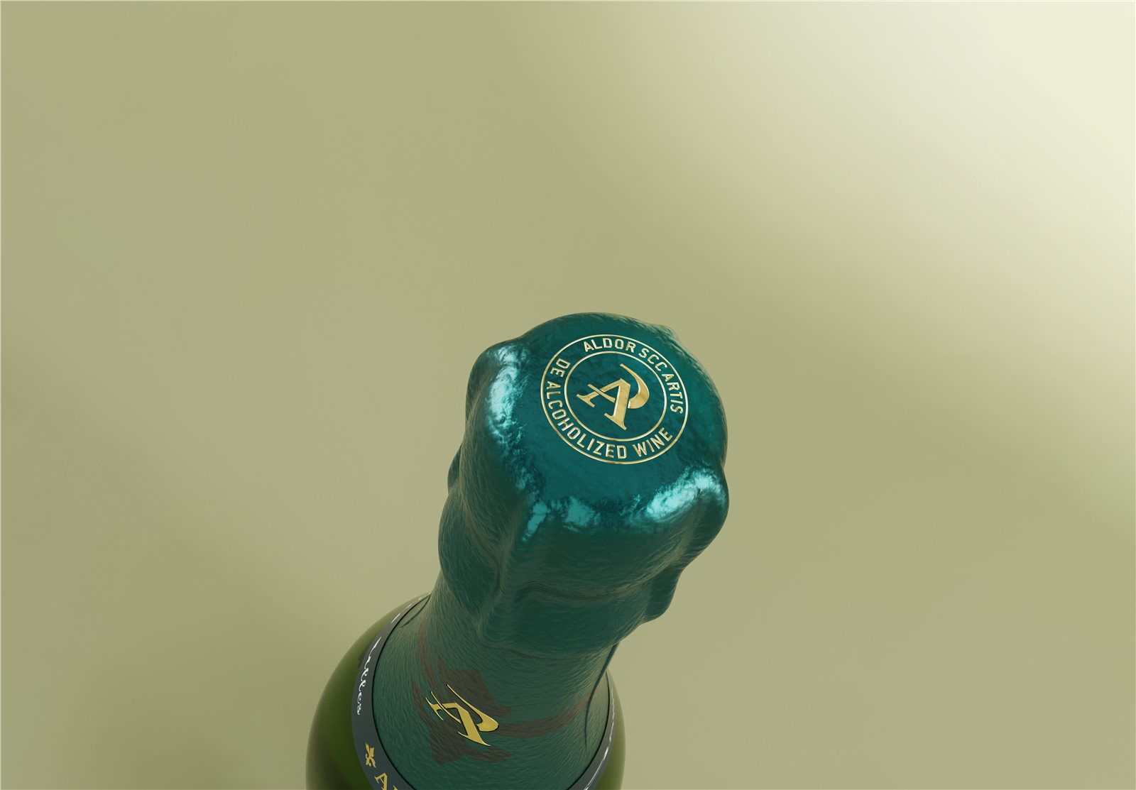
Direction C features a blue-green bottle cap and label, combining irises, cloud patterns, and the word “Aldor” arranged diagonally. It also compares double-layer labels with sleeve labels. Compared to the understated style of Direction A, this direction places greater emphasis on patterns and colors.
The three design concepts aren’t simply different color schemes. The use of white space, character illustrations, and decorative patterns determines whether consumers see the name, the story, or the design first. That is the true significance of comparing these concepts.
Why can't we just design the label for the front of the bottle?
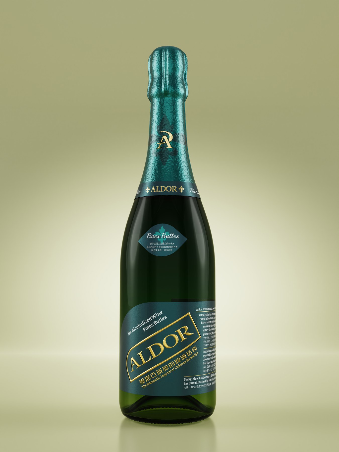
When examining a wine bottle, start at the top, then move down through the neck and shoulders, and finally to the front label. If only the front label is complete but the upper part of the bottle lacks cohesion, the entire bottle can easily look like a collection of disjointed packaging parts.
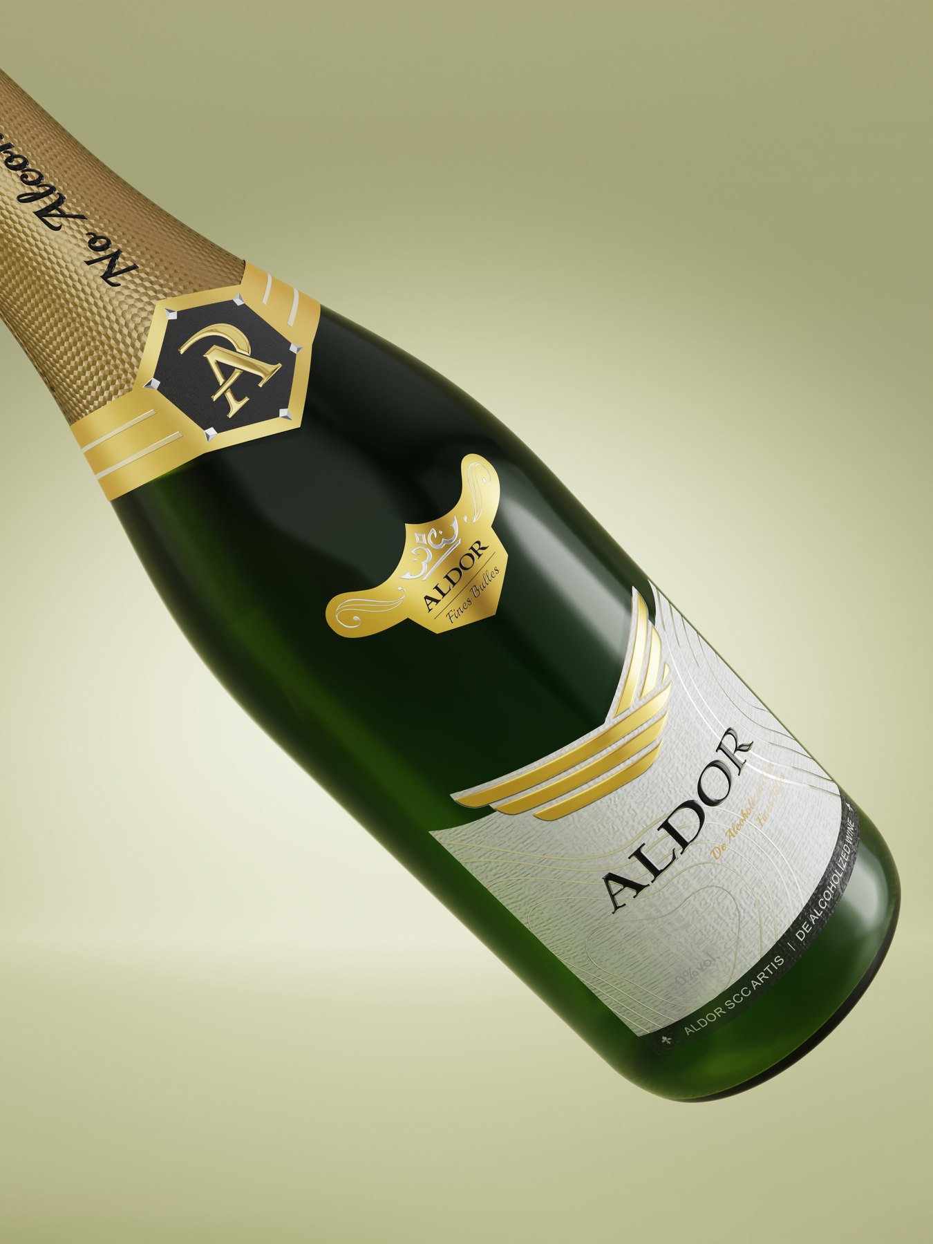
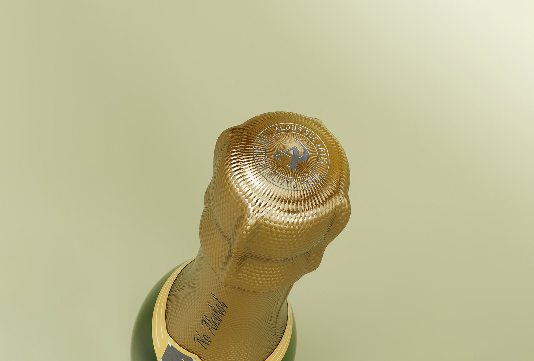
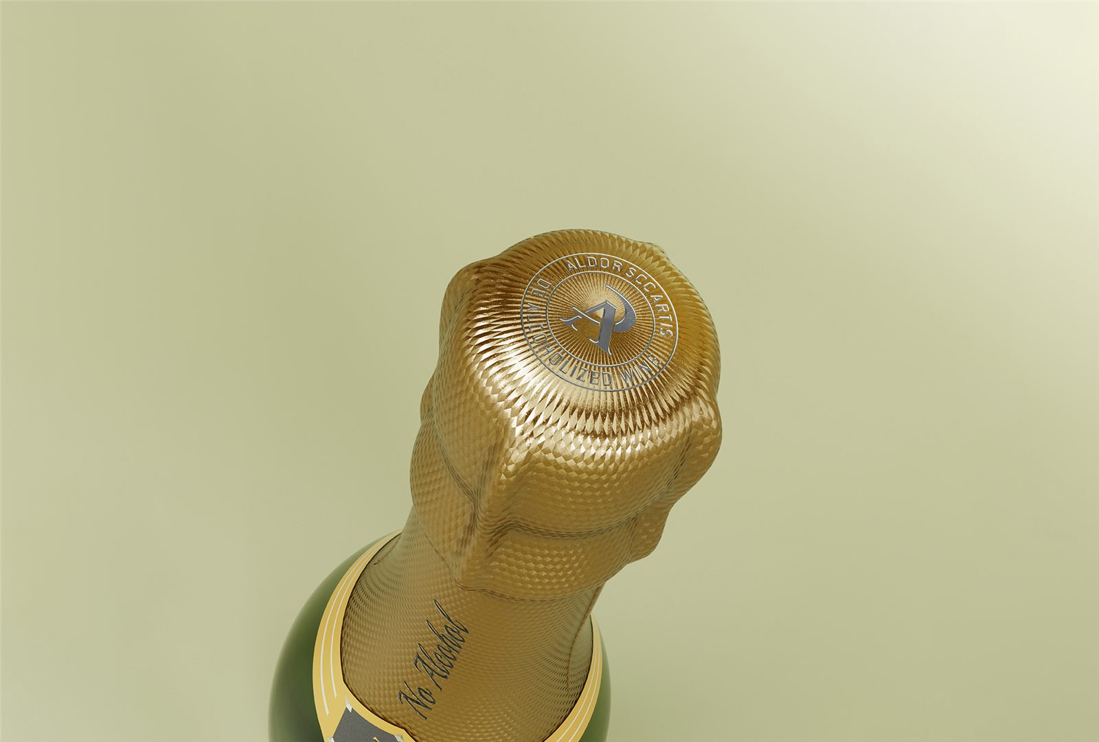
In Direction A, the golden bottle cap, lettering, winged symbol, and off-white label are arranged in sequence to complement one another. The brand logo reappears on the top of the cap, ensuring brand continuity even when viewed from above.
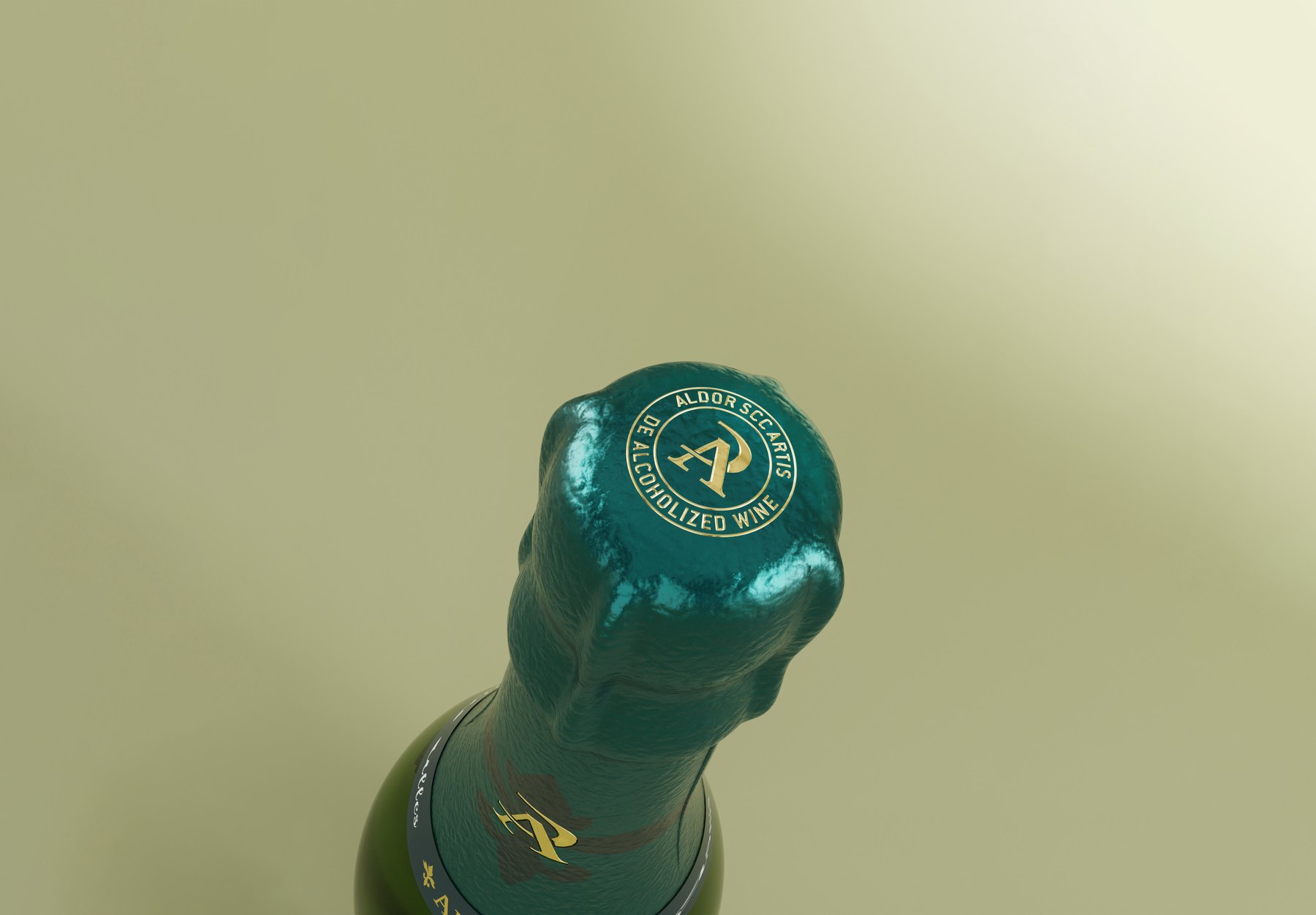
For Direction C, a blue-green color is used consistently across the bottle cap, neck label, and main label. Although the colors differ between the two directions, the design principle remains the same: first, create a cohesive look for the entire bottle, then arrange the specific details.
Why Are Gold and Beige Good Choices for the Main Display?
The primary focus is on Direction A, which places the brand name in the most readable position. The wing-shaped symbol adds character, the off-white negative space minimizes distractions, and the deep green bottle remains intact. These elements do not compete with one another; instead, they are perceived in sequence.
Compared to illustrations and full-bleed patterns, this direction condenses the visual focus even further. It offers a direct way to convey the brand message before delving into product details. Direction C, on the other hand, showcases more distinctive decorative options.
When it comes to packaging for alcohol-free beverages, the focus should not be on imitating a specific traditional liquor brand. The true value of this approach lies in preserving the aesthetic appeal of the beverage while ensuring that the brand name and product attributes are clearly highlighted.
Clarify the overall context of a bottle of wine
This project resulted in the development of the Aldor logo variations, as well as three packaging design concepts: "Minimalist," "Grape Fairy," "Iris," and "Cloud Patterns." The bottle cap, neck label, and front label were compared side by side rather than being designed separately and then combined.
This also serves as a guide for similar projects: first decide how you want the brand to be perceived, then determine how much decoration to use. The label, bottle neck, and bottle body must be considered as a whole; you cannot judge the overall effect of the bottle based on a single flat label image.
If your wine, alcohol-free wine, or other alcoholic beverages require a brand and packaging overhaul, please discuss your product, existing containers, and desired direction with Meilin to first identify the key issues in the overall bottle design.
Related Services:Packaging Visual Design Services. You can also learn moreBeverage and Gift Packaging Design。
Continue reading:Materials Needed for Bottle Design;How to Choose a Custom Bottle Design Service。
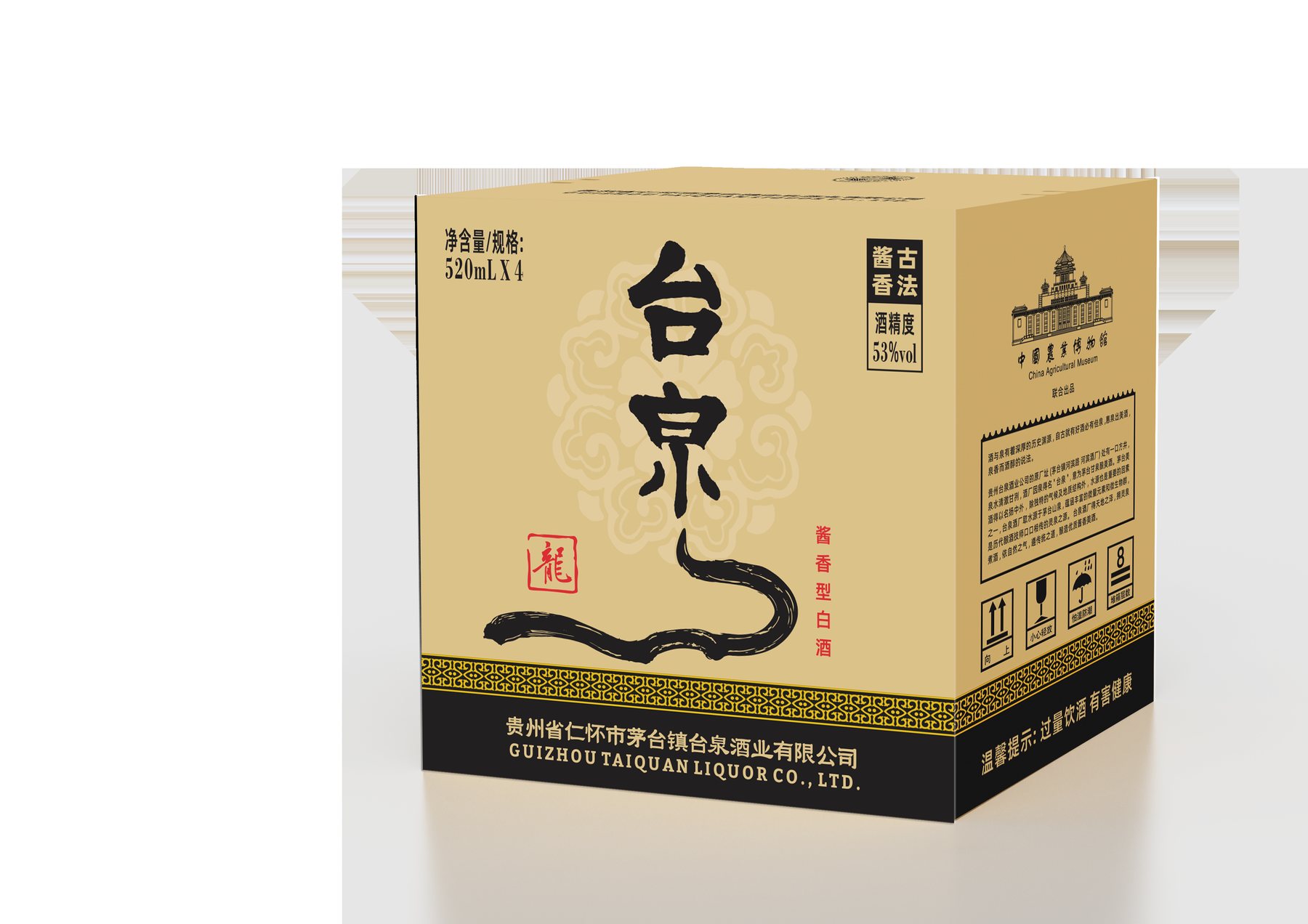
Similar Projects:Dream Dimension Soda Packaging Design;Taiquan Wines Gift Box Packaging Design。
MORE CASES
More Related Cases
Do you have a clear plan for new products? Start with a project assessment.
Please submit information on the product category, capacity, material, filling method, launch date, and reference materials. Meilin will discuss suitable bottle designs, packaging, and implementation strategies based on the specifics of your project.

Shenzhen Meilin Industrial Design Co., Ltd.
Establish brand identity through the aesthetics of original bottle designs,
Ensure the successful implementation of designs through engineering expertise.
We specialize in innovative bottle and packaging design for mineral water, fruit juices, alcoholic beverages, cooking oil, personal care products, and household cleaning products.
Design Services
Industry Solutions
© 2026 Shenzhen Meilin Industrial Design Co., Ltd.