Four flavors—I don't want to just make four ordinary bottles of brightly colored drinks.
The same slender glass bottle, four flavors—is changing just four colors enough? For Dream Dimension, while colors can distinguish flavors, they alone cannot fully define the brand. The packaging also needs a memorable personality.
Dream Dimension is a 275 mL soda-based alcoholic beverage featuring grape, blueberry, peach, and lychee flavors. The project has selected glass bottles with crown caps, and Meilin focused its design efforts on the brand logo, the four bottle labels, and the series packaging.
The key issue thus becomes clear: the four products should look like they’re from the same brand, yet each should have its own distinct characteristics; the visuals can be lively, but the brand and flavor names must remain legible.
First, let’s turn “Dream Dimension” into a reusable symbol.
“Dream Dimension” needs more than just a product name; it also needs its own visual identity. The design transforms the character “梦” into a compact symbol, which, when paired with the Chinese name and the word “Dreamen,” creates several distinct combinations.
Symbols are suitable for small areas such as the neck and cap of the bottle, while the full text is intended for reading on the main label. Each serves a specific purpose, so there is no need to repeat the entire name in every location.
With this shared identification system, the four flavors have the foundation for flexible variations. Otherwise, no matter how rich the colors and fruit illustrations might be, they would simply be four separate images.
A shift from neat, formal emblems to more dynamic ink-wash designs
A more structured approach: place the circular badge in the center and pair it with bubble graphics. The brand is clearly visible, and the composition is neat. This style is more conventional, however, and falls short of the street-style, youthful vibe that Dream Dimension aims to convey.
We decided to focus on the label’s background. The spray-painted and splattered ink effects break up the neat borders, while the handwritten “Dreamen” spans the entire composition. Rather than adding another layer of decoration, this completely transforms the rhythm of the entire label.
Brand and product names remain in their usual positions. Black ink splashes, a bright background, and a few accent colors create contrast without allowing the design to overshadow the flavor descriptions. You don’t have to choose between vibrancy and clarity.
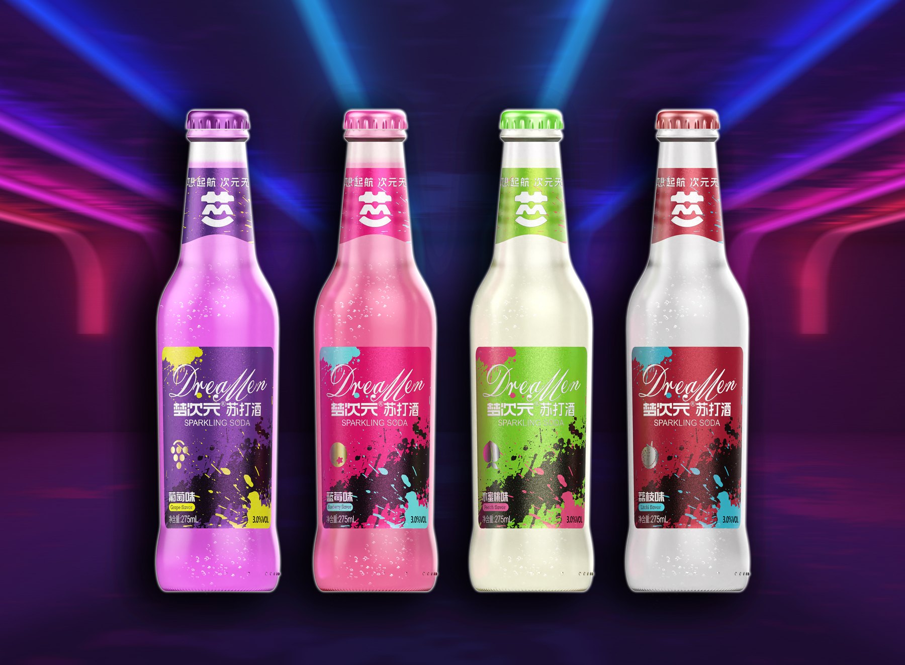
Include the neck and cap in the design, rather than focusing solely on the front label.
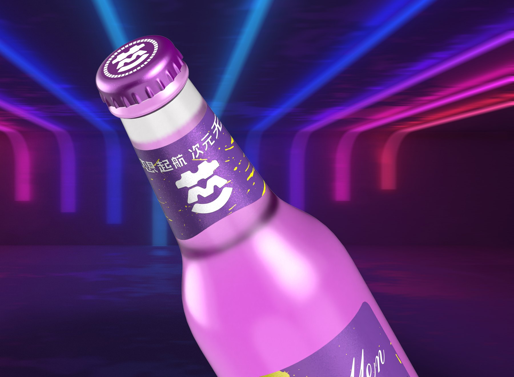
The main label on the slender bottle is positioned toward the bottom; if there is no visual connection with the upper portion, the composition can easily appear disjointed. The neck label continues to feature the “Dream” symbol and uses the same flavor-specific color, guiding the eye from the bottle opening to the front label.
The crown cap is also linked to the flavor and color scheme. When viewed from the front, it displays the full text; when viewed from above, it features a shared symbol. As a result, the bottle neck, cap, and label are each simple on their own, yet come together as a cohesive set.
When the four bottles are displayed side by side, the same brand cues appear at the top of each bottle, followed by images of their respective flavors at the bottom. The sense of cohesion in the series isn’t achieved through slogans, but by placing the same elements in the same positions.
Color is used to distinguish elements, while layout brings them together.
Purple for grapes, pink for blueberries, green for peaches, and red for lychees. Each variety features a corresponding fruit illustration and flavor label, drawing customers in with the colors first and then helping them identify which one they’re looking at.
Although the colors vary significantly, the label layout remains consistent. The positions of the brand name, product name, flavor, and volume are the same, and the ink-splatter design follows the same rhythm. As a result, the four variants are distinct from one another without appearing to be four separate brands.
This is also why the layout is more cohesive: the ink wash design creates a unified look, colors distinguish specific flavors, and a consistent information sequence guides the reader. When new flavors are added, the existing rules can be carried forward rather than starting from scratch.
Even a single, well-established bottle design can help build a brand’s identity.
The project focused on the Dream Dimension logo, basic visual guidelines, four bottle label designs, and the visual design for the color boxes, resulting in a series of mockups that confirmed the design direction. The bottle shape remains unchanged, while the brand identity extends from the label to the neck and cap of the bottle.
The value of this case study lies in effectively dividing the roles of the limited packaging space. Symbols are responsible for memorability, text for readability, color schemes for conveying flavor, and ink splatter for conveying character. It’s not about adding elements, but about ensuring each element has a clear purpose.
If you’ve already selected a bottle shape for your beverage product but still lack a distinct brand identity, Meilin can help by focusing on the bottle label, flavor lineup, and overall packaging design to collaborate on a design direction that suits your product.
Related Services:Packaging Visual Design. You can also learn moreBeverage and Gift Packaging Design。
Continue reading:Information to Prepare Before Designing Bottle Shapes and Packaging;The Difference Between Custom Bottle Designs and Existing Bottle Designs。
Similar Projects:Aldor Alcohol-Free Wine Packaging Design;Taiquan "Twenty-Four Solar Terms" Baijiu Packaging Design。