The packaging design for the Happy Password beverage series—which includes beer, fruit beer, sparkling wine, and bubbly under the same brand—showcases how the smiley face logo, blue aluminum cans, and various bottled products come together to form a clear product line.
Various Presentation Options for Bottled Beverages
Shared Identification
Circular Smile Icon
Series Classification
Each product line uses different graphics and colors.
With multiple lines of alcoholic beverages, how can you ensure consumers recognize them as part of the same brand?
The "Happy Password" design series features beer, fruit beer, sparkling wine, and bubbly, including both the classic 270 mL aluminum beer can and bottles in various orientations. Each product must clearly communicate what it is; when placed together, they must be recognizable as part of the same brand.
If each product line uses a different logo, the brand portfolio can appear disjointed; if the same label is applied across the board, it becomes difficult to distinguish between beer, fruit beer, and sparkling wine. The design challenge, therefore, is this: How can we establish a consistent brand identity while allowing each product line to clearly communicate its own unique characteristics?
A smiley face connects the different packages
The name “Happy Password” itself conveys a sense of “happiness.” The circular smiley face logo transforms this emotion into an intuitive graphic, making the packaging memorable even without reading the English text first. It appears consistently on both aluminum cans and bottled products; even as the containers change, the brand retains the same face.
However, the smiley face is only responsible for connecting the brands; it doesn’t specify the category for each product. Beer uses blue and large text to make it clear that it’s beer; fruit beer uses fruit-colored graphics to distinguish flavors; and sparkling wine places the “HIGH” emoji in the center. Retaining a common symbol while allowing each product line to have its own focus is clearer than simply copying a single label onto every product.
Canned Beer Uses Large Text and Blue to Make a Lasting First Impression
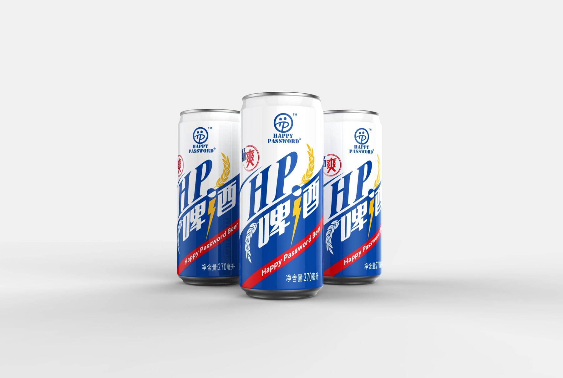
The 270-milliliter classic beer aluminum can features a predominantly blue design. Large letters and the Chinese category name dominate the front, with only a few red and yellow accents. Given the limited space on the can, this approach—allowing consumers to clearly see the brand and beer name first, followed by other details—is more direct than cramming the design with too many elements.
Fruit beer and sparkling wine: using different graphics to clearly distinguish the products
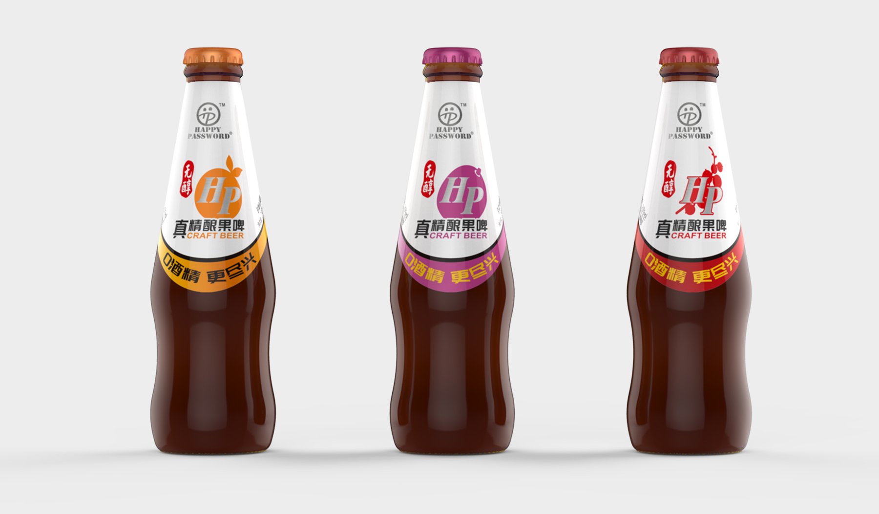
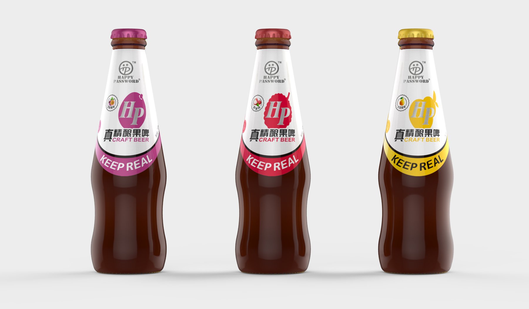
The fruit beer comes in a brown, tapered bottle. On the front, fruit-colored graphics surround the letters "HP," and the color of the band around the neck changes to match the body of the bottle. Even without reading the label word for word, the different versions—orange, purple, and red—are easily distinguishable.
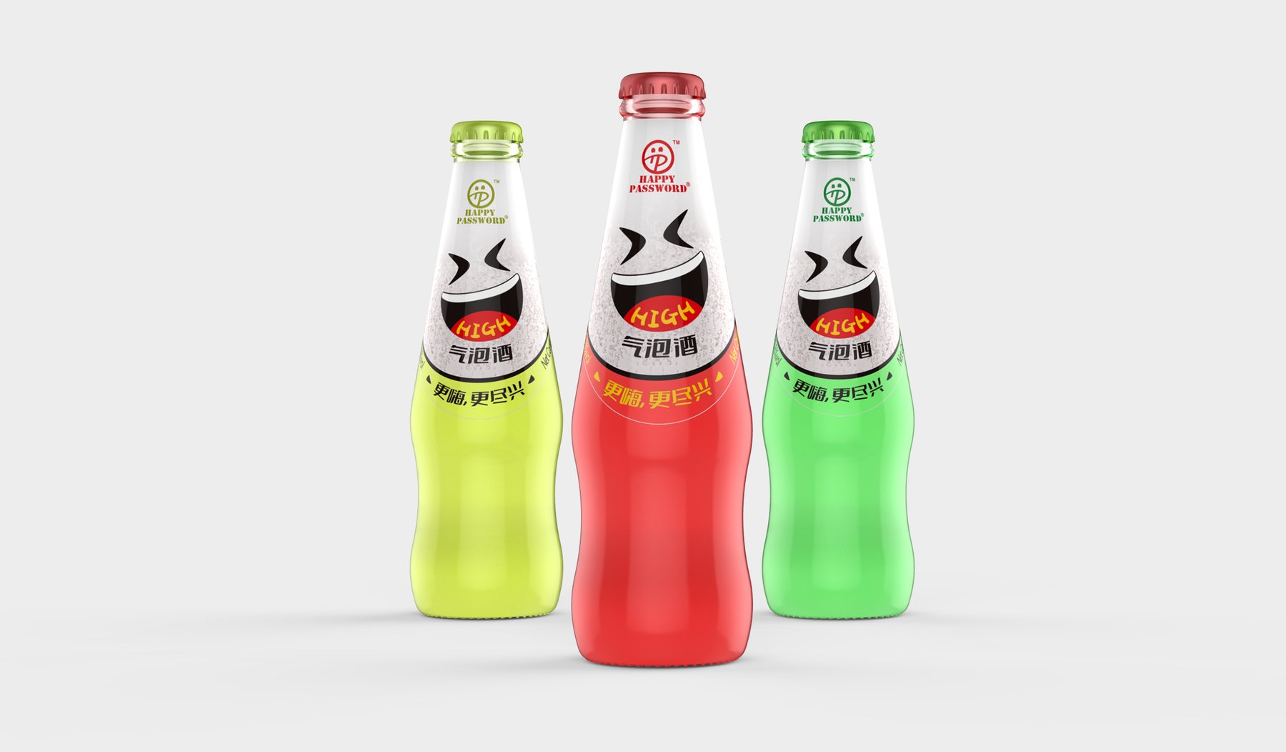
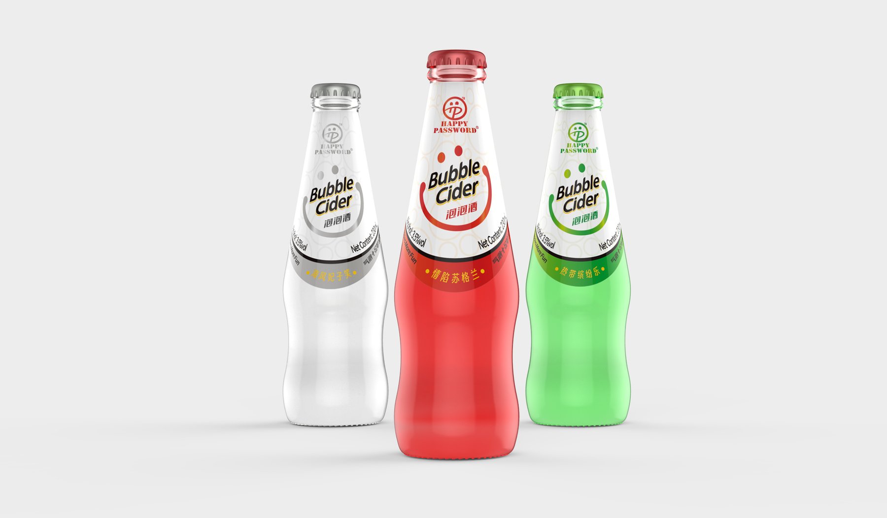
The sparkling wine features a big smile in the center of the bottle, with the word “HIGH” appearing inside the smile. The bubbly, on the other hand, uses a more straightforward English name and a three-color bottle design. While both share the smiling face brand logo, they do not replicate the fruit graphics found on the fruit beer. If your project is still weighing different container and design options, you may want to readHow to Choose Between Custom Bottle Designs and Existing Solutions。
When Different Containers Are Arranged Side by Side, Where Does the Sense of Cohesion Come From?
Because aluminum cans and glass bottles differ in front surface area and shape, a shared logo cannot be achieved simply by mechanically replicating the same label. By placing the smiley face in an easily recognizable spot and arranging the large text, fruit illustrations, or emoticons according to the container and product type, the series will appear cohesive without seeming repetitive.
This approach gives each product its own display space and prevents cross-category packaging from appearing disjointed. Even within beverage packaging,Taiquan Winery Case Studies与Aldor Alcohol-Free Wine Case StudyDifferent expressions have been chosen to serve as a comparison.
The combination of a blue main background and large letters ensures that the canned beer maintains a clean, easily recognizable front design.
Different fruit graphics and neck bands are used on the same bottle style to distinguish between fruit beer flavors.
A smiley face serves as the main graphic on the front of the sparkling wine bottle, and the colors help distinguish between the different bottle versions.
Sparkling wine retains the shared logo while establishing its own visual identity using the English product name and the bottle’s color.
The bottle neck label and the color band below it remain in the same position across all flavor variations.
What Does This Beverage Packaging Design Leave Behind?
This design solution doesn’t simply provide a label that can be replicated across all alcoholic beverages; rather, it establishes a clear set of rules: the shared smiley face serves to identify “Happy Password,” while the graphics and colors of each product line clarify the specific product. It demonstrates Meilin’s ability to establish brand recognition across different containers and product categories while preserving the distinct characteristics of each product.
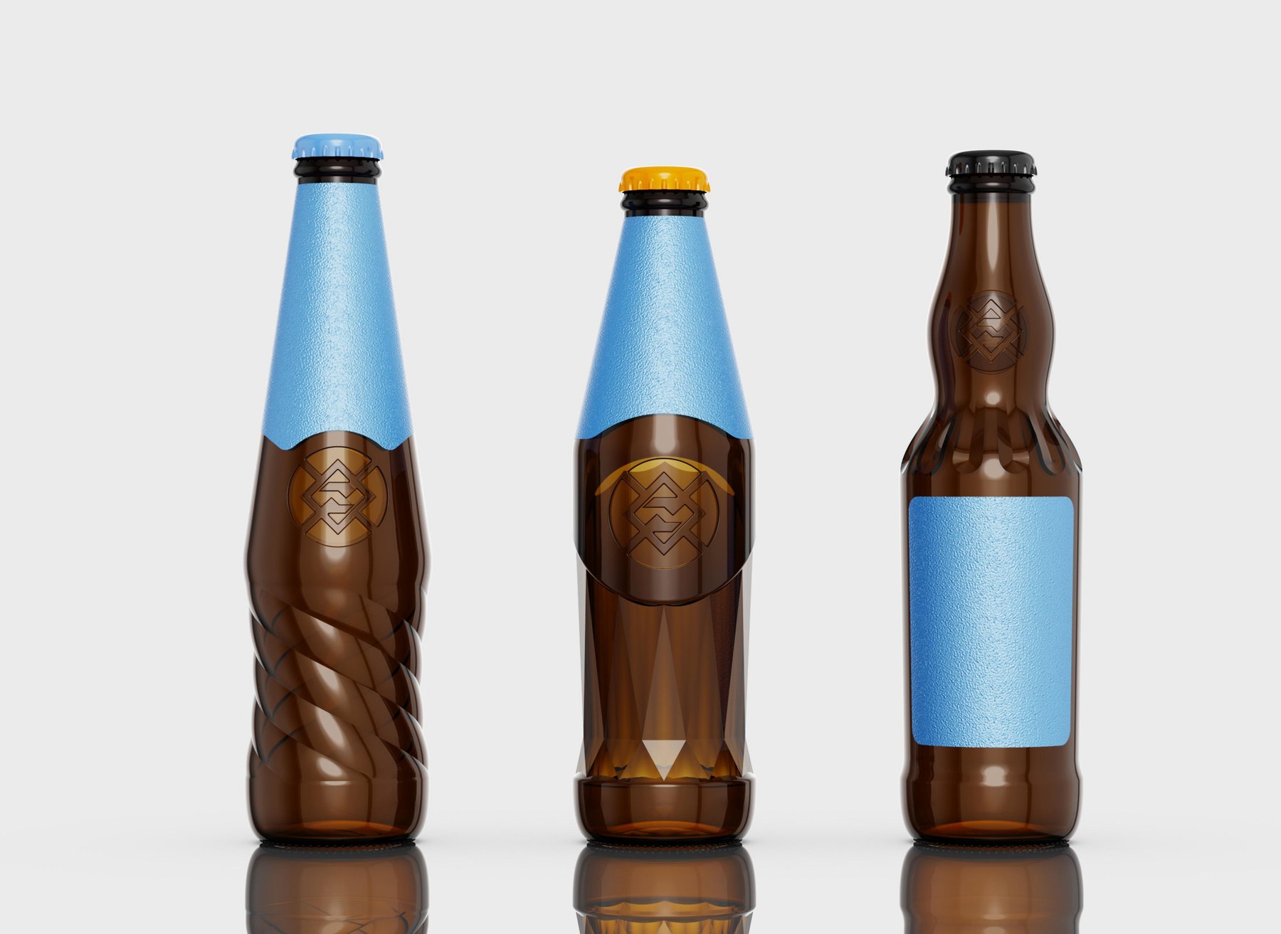
Blueprint Craft Beer 258 mL Bottle Design Proposal: Compares three design directions—the bottle’s spiral fluting, the crystalline surface at the base, and the undulating shoulder—and illustrates the placement of the brand logo on the small bottle.
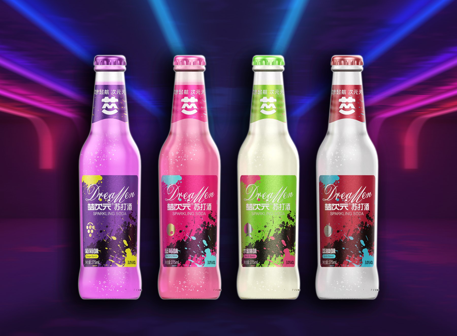
Dream Dimension 275mL soda-based alcoholic drinks transition from neat, badge-like designs to a street-inspired, splatter-paint aesthetic. By utilizing shared brand symbols, a consistent layout, and four distinct flavors, the classic glass bottles develop their own distinctive series identity.
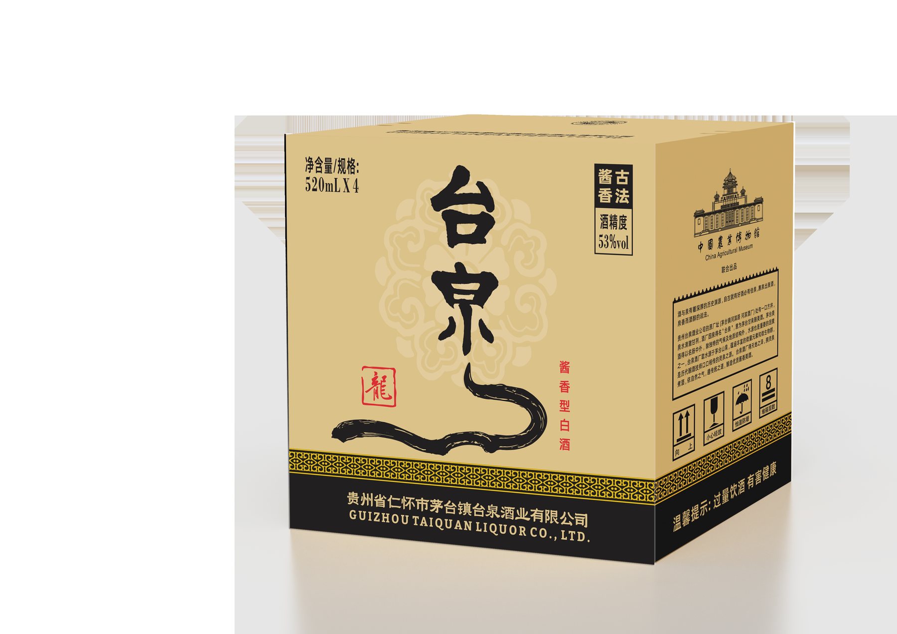
Taiquan Baijiu’s packaging connects the 24 solar terms through a unified bottle design, telling different stories through illustrations of farming and winemaking, and expands upon the Fengquan bottle-and-box set to create rich cultural content while maintaining a clear brand identity.