
PROJECT CASE
"Like Water, Without Strife" 480 mL Natural Soda Water Bottle and Packaging Design
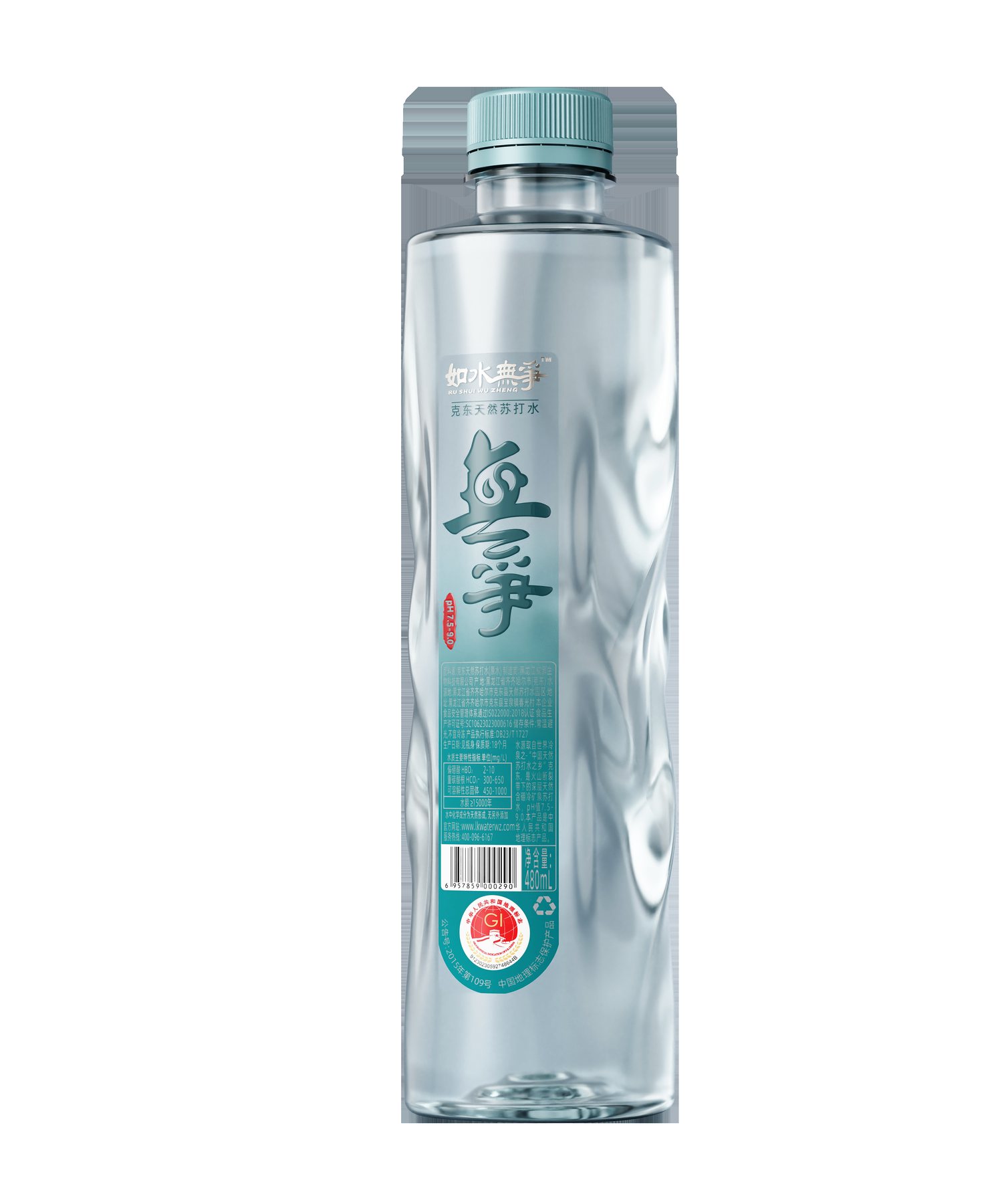
A meaningful name shouldn't be paired with an ordinary bottle.
The brand name “Like Water, Without Strife” inherently evokes the tranquility and restraint associated with water. This project centers on a 480-milliliter bottle of natural sparkling water. If the packaging consisted solely of a cylindrical bottle and an information label, the distinctive qualities of this name would be difficult to discern.
The real challenge in design isn’t adding a few more decorative elements, but ensuring that the bottle shape and the brand name convey the same message. The design must leave a lasting impression among a row of water bottles, yet avoid making the “non-competitive” concept come across as overly flashy.
Meilin focused on three elements: the continuous undulations of the bottle’s body, the concentrated calligraphic characters on the label, and the restrained use of color. She first established the relationship among these three elements, then addressed the bottle cap and the cardboard box.
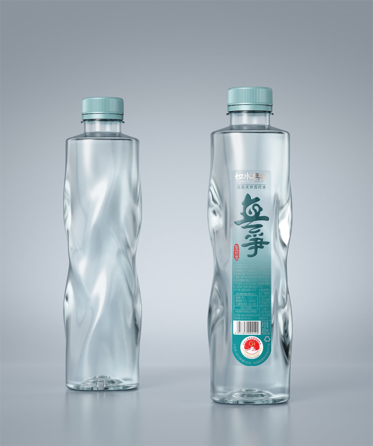
Incorporate the essence of water into the shape, rather than just printing a picture of water
The bottle maintains a tall, upright overall silhouette, with sloping undulations on both sides breaking up the otherwise smooth surface. The lines resemble the paths left by flowing water on the surface, with a continuous direction rather than a uniform distribution of texture across the bottle.
There are two visual reasons for this design. The front needs to maintain a clear label placement, while the side needs to retain a recognizable shape even when the bottle is rotated. By assigning different functions to the texture and the label, the bottle as a whole avoids looking cluttered.
The bottle’s shoulders taper toward the narrower neck, and the continuous lines of the body flow downward. The top is simple, while the middle section features variations, creating a cohesive visual flow. The design is distinctive without overshadowing the brand name.
Why Do Tags Focus on Only One Main Topic?
“The calligraphic characters for ”Wuzheng” are placed in the most prominent spot on the label. The brand description and product information are arranged around them, so that consumers first notice the name and then read about the natural sparkling water and the 480 mL size. A small red stamp provides a subtle contrast without adding another complex illustration.
White space here is not simply empty space. It gives the large text room to breathe and maintains a distance between the text and the transparent bottle. Since the brand name already evokes the essence of water, the label doesn’t need to be cluttered with water droplets, mountains, and excessive ornamentation.
The bottle’s contours are responsible for shape recognition, while the calligraphy is responsible for name recognition. By each performing its own specific function, the brand’s characteristics are transformed from a single phrase into a recognizable bottle.
Turquoise and black are two expressions of the same concept.
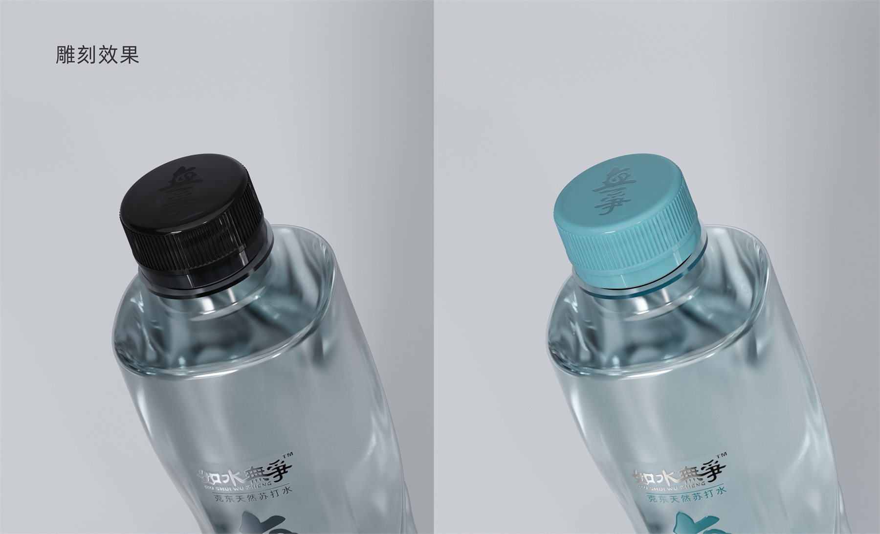
The project features two visual versions: light green and black. The light green version integrates the cap and label, creating a fresher overall look; the black version accentuates the contrast between the calligraphy and the transparent bottle, resulting in a more serene visual effect.
Both versions retain the same bottle shape and key text elements; the comparison focuses on the product’s character, not on redesigning two unrelated bottles. The colors may vary, but the placement and order of the brand elements remain the same.
The cap’s branding is also integrated into the overall bottle design. The brand’s typography is repeated on the top of the cap, ensuring the top view isn’t left blank. The cap and label share the same color, minimizing scattered color blocks and allowing each of the two packaging directions to remain cohesive.
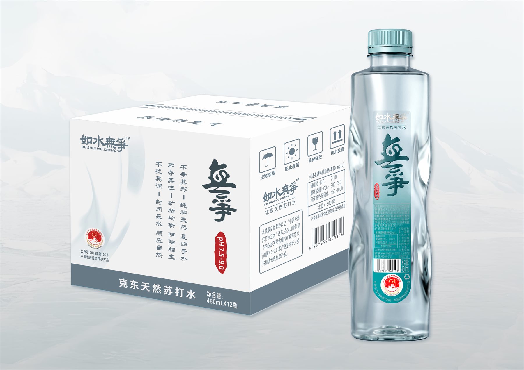
From a single bottle to a whole case, everything revolves around the same name
The 480 mL × 12-bottle carton continues the calligraphic typography and two color schemes. While each individual bottle emphasizes vertical proportions, the carton reorganizes the brand name, bottle image, and product information across a larger surface area. Rather than simply enlarging the label, it retains the most essential identifying elements.
The final design integrates the bottle shape, label, cap graphics, and cardboard box into a cohesive whole. The focus of the design is not on showcasing the number of elements, but on ensuring that each component helps reinforce the message “As serene as water” without competing for attention.
For a natural sparkling water project that already has a brand name but lacks distinctive visual elements, it’s worth asking first: What is the most valuable aspect of the name? Then decide whether it should be incorporated into the outline, the typeface, or the color. Identifying this key element is more meaningful than simply adding more decorative elements.
Related Services:Industrial Design Services for Bottle Shapes、Packaging Visual Design Services. You can also learn moreDesign of Drinking Water and Mineral Water Systems。
Continue reading:Why is it necessary to determine the label format for mineral water bottles first?;Design Methods for Creating Distinctive Aquarius Shelving;The Approval Process for PET Bottle Designs: From Renderings to Mold Production。
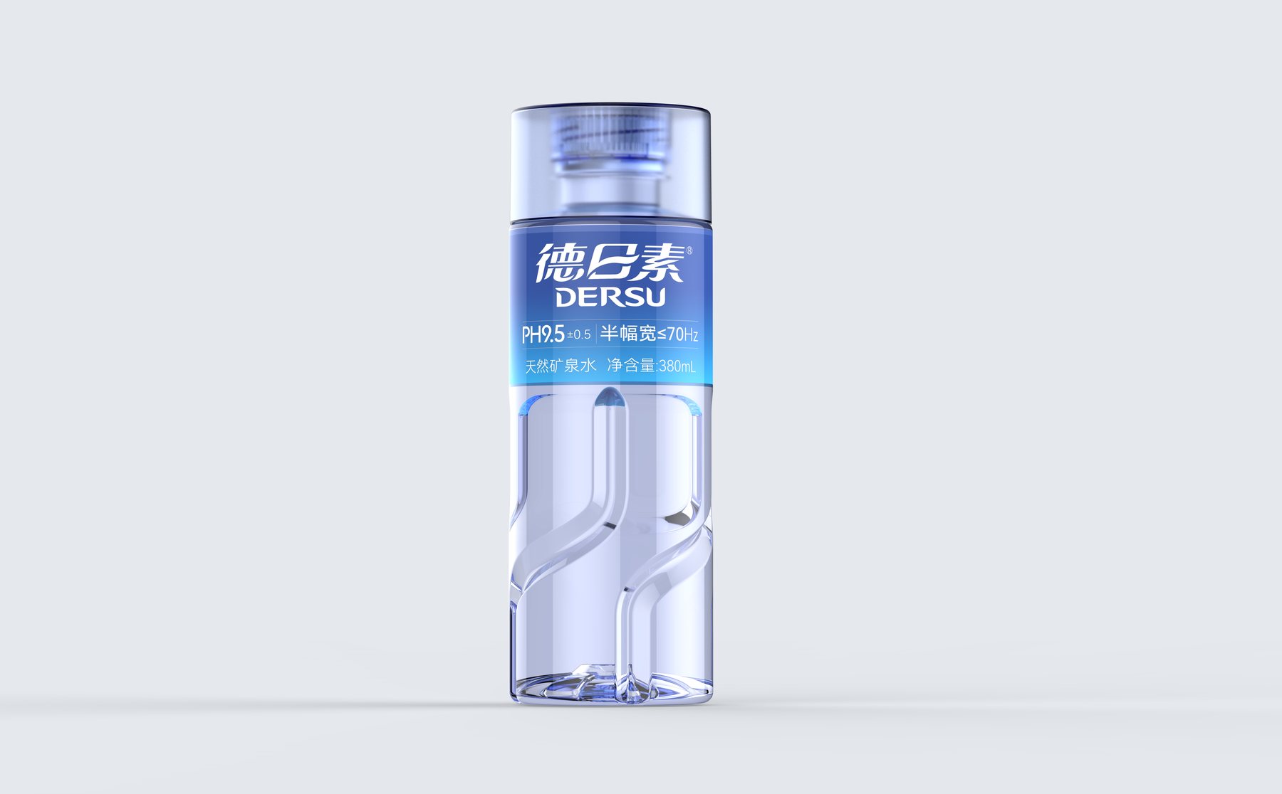
Similar Projects:Design of the De Risu 380 mL Mineral Water Bottle;Design of the Hunan Fenshui Mineral Water Series。
PROJECT GALLERY
More Project Photos
MORE CASES
More Related Cases
Do you have a clear plan for new products? Start with a project assessment.
Please submit information on the product category, capacity, material, filling method, launch date, and reference materials. Meilin will discuss suitable bottle designs, packaging, and implementation strategies based on the specifics of your project.

Shenzhen Meilin Industrial Design Co., Ltd.
Establish brand identity through the aesthetics of original bottle designs,
Ensure the successful implementation of designs through engineering expertise.
We specialize in innovative bottle and packaging design for mineral water, fruit juices, alcoholic beverages, cooking oil, personal care products, and household cleaning products.
Design Services
Industry Solutions
© 2026 Shenzhen Meilin Industrial Design Co., Ltd.