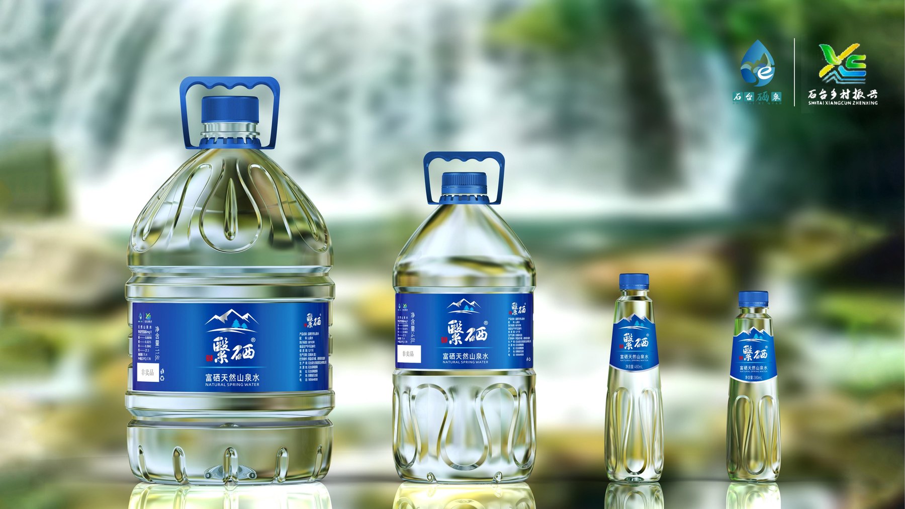
Case study on the bottle and packaging design for the Yise Natural Mountain Spring Water series, covering 380 mL, 480 mL, 4.8 L, and 11.8 L PET bottles, labels, and outer cartons, illustrating how small and large-capacity bottles maintain a consistent brand identity.
Series of bottle shapes, labels, and shipping cartons
Four Different Sizes—How Can They Still Look Like the Same Bottle of Water?
For a line of mountain spring water ranging from 380 mL and 480 mL to 4.8 L and 11.8 L, the challenge isn’t designing four different bottles, but ensuring that the four sizes still feel like they belong to the same brand. For the smaller bottles, the product name must be clearly legible, while the larger bottles require space for a handle and a larger front information area. The design proposal compared which bottle features could be carried across all sizes and addressed the bottle shoulder, body, and label placement separately.
It looks like a small bottle—why can't we just enlarge it?
If the 380-mL bottle shape were scaled up proportionally to 11.8 L, the slender, narrow silhouette would become unbalanced; the label, which was originally the right size, would also appear too small on the front of the larger bottle. The design retains the line relationships that identify the series, while the bottle shoulder, handle, and label area are rearranged to accommodate the increased capacity.
When you need to organize products with multiple specifications, you can start by familiarizing yourself withBottle Design ServicesScope of Work.
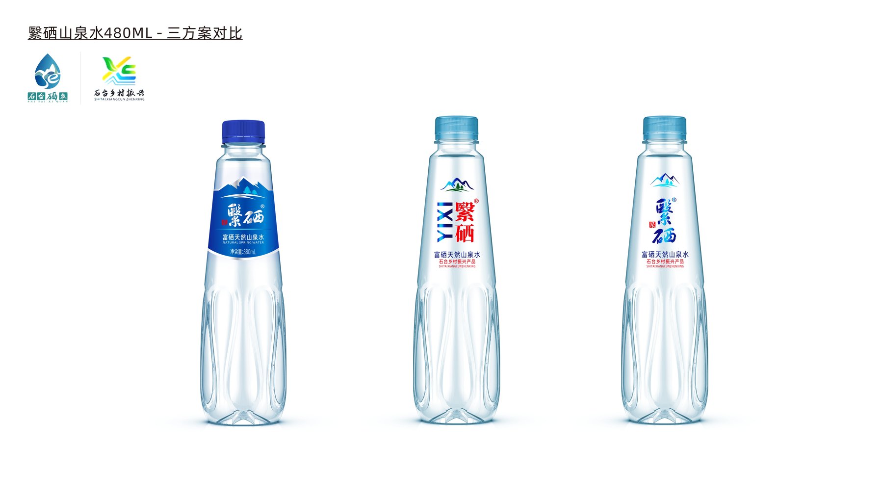
Three Approaches: Where Should the Focus Lie in Each Case?
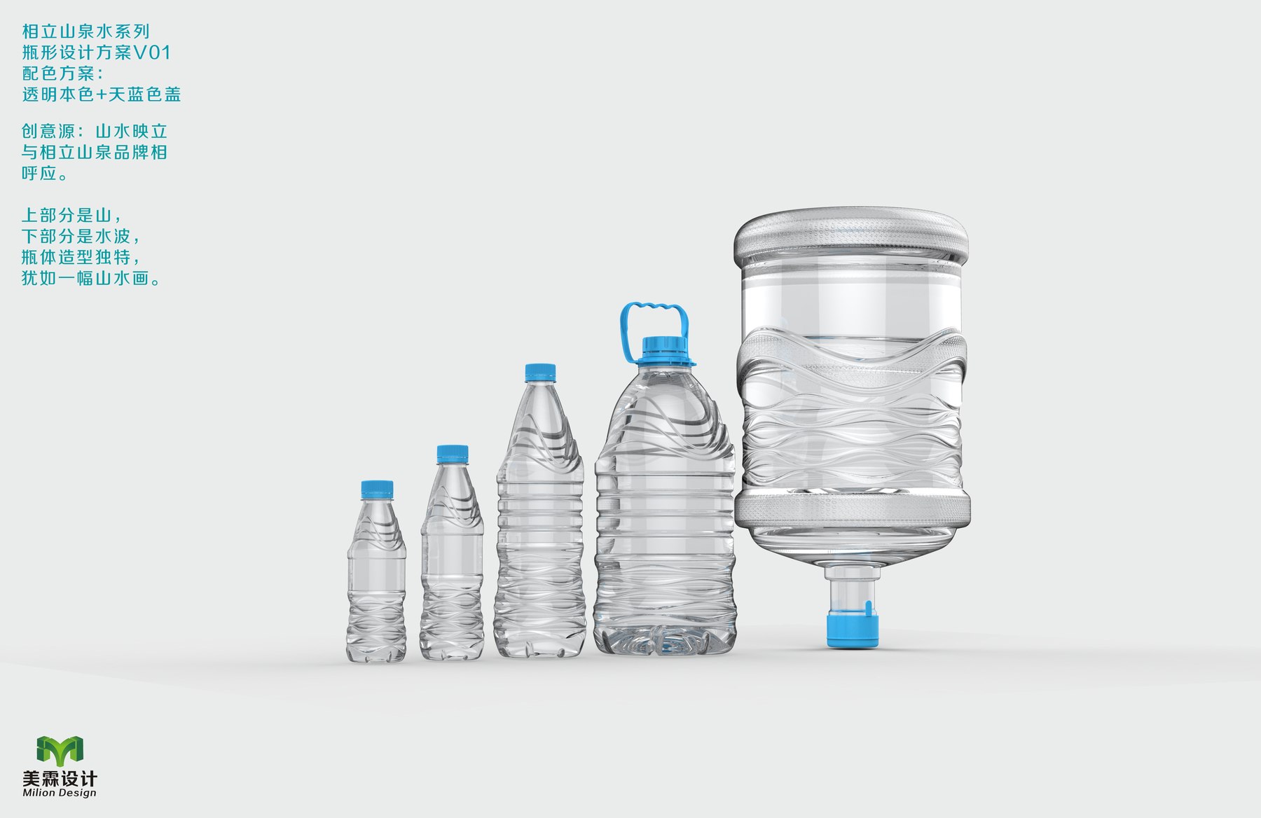
The proposal compares three bottle design orientations. The mountain-shaped zigzag incorporates natural imagery into the bottle’s shoulders and body, creating a distinct silhouette, though sufficient space must still be reserved for the label on the front. The diagonal water ripple pattern adds variety to the transparent bottle; however, if applied too densely on smaller bottles, the text may appear crowded. The shoulder area features a more concentrated pattern, while the middle section is more cohesive, making it ideal for ensuring the brand name is the first thing seen.
Why Do Waterdrop Lines Reserve Changes for the Two Ends?
The proposal identifies V4.2 as the primary direction. Instead of covering the entire bottle with the pattern, this design keeps the rounded, teardrop-shaped lines on the lower half of the small bottle and the shoulder of the large bottle. This preserves the series’ signature elements while allowing the brand and product names to be fully displayed on the middle section.
The 380 mL and 480 mL sizes retain the slender, transparent bottle design; the proportions for the larger sizes are adjusted accordingly. To learn about the steps leading up to production preparation, please refer toThe Process for PET Bottle Design, from Concept Art to Mold Making。
The specifications have changed—which features remain the same?
The 4.8L bottle has a fuller shoulder and more space on the front for the label; the 11.8L version features further adjustments to the shoulder and handle areas. Both large bottles incorporate teardrop-shaped lines, but do not replicate the width-to-height ratio of the small bottles.
The four sizes are based on the same set of water droplet patterns and mountain-shaped labels.
The three label orientations compare single-language labels, front-and-back labels, and a combination of Chinese and English.
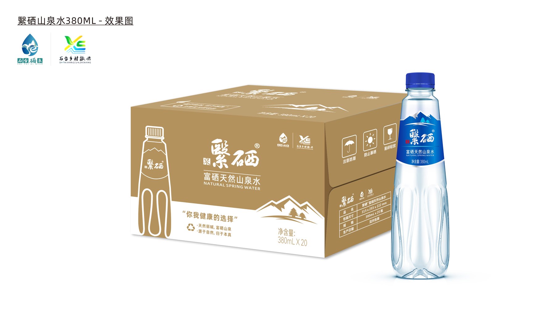
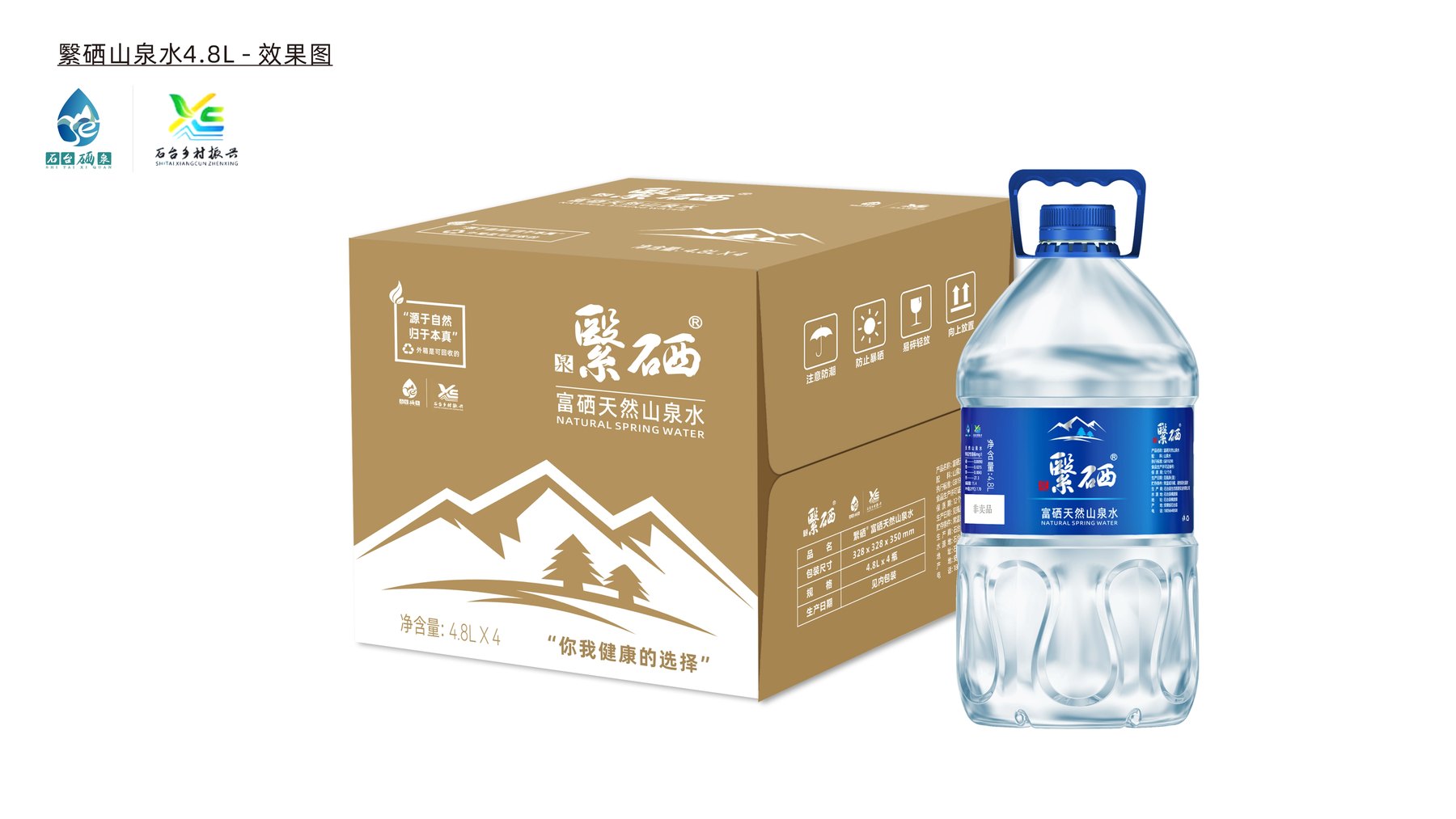
The 380 mL single bottle and the 20-bottle outer carton feature a consistent brand visual identity.
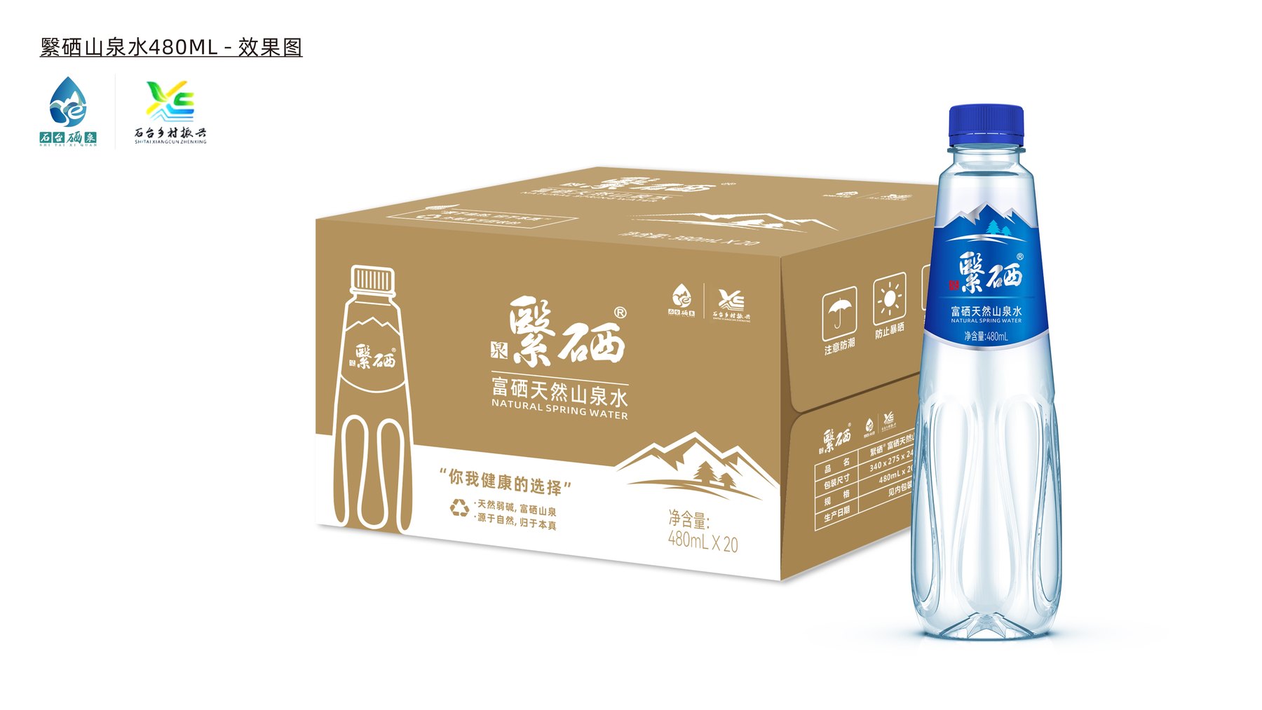
The 480-mL size retains the same shape, label design, and shipping packaging.
For the 4.8L size, redesign the bottle shoulder, handle, and large-area label.
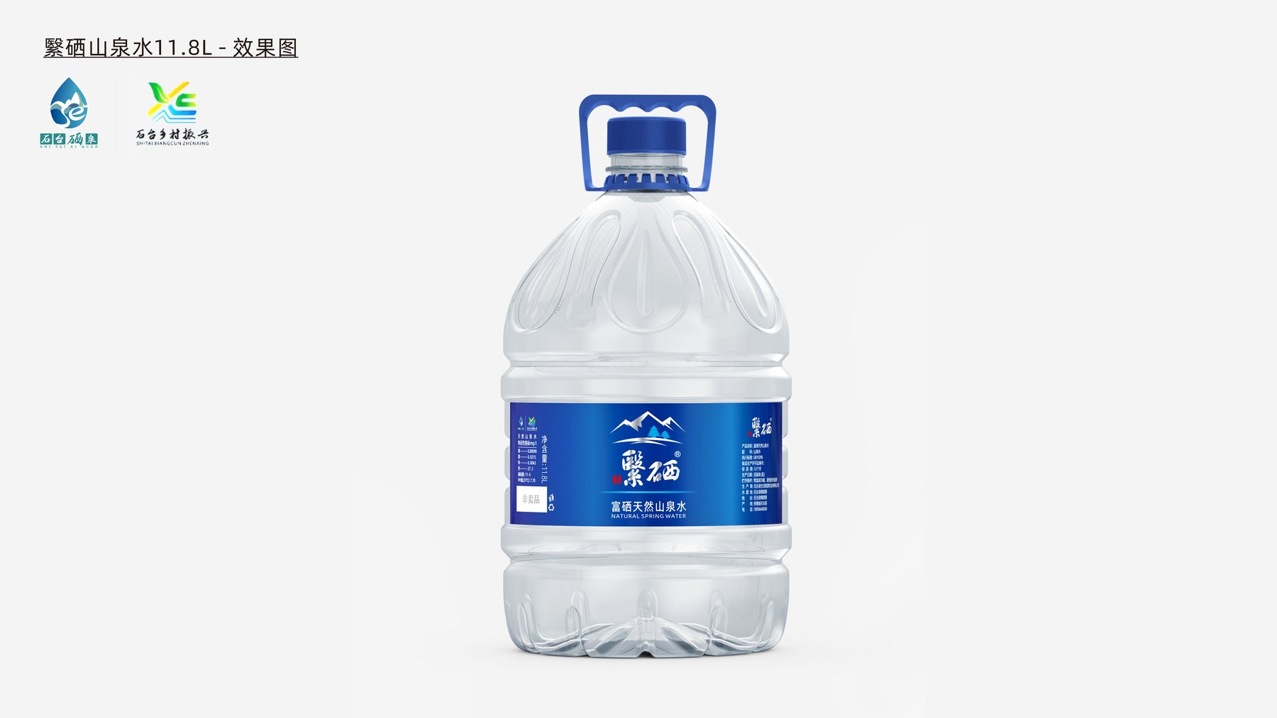
The 11.8L model features a wider body and a separate handle area to accommodate high-capacity applications.
Ultimately, this results in a set of brand relationships that transcend capacity.
The label design options compared transparent front-and-back labels with single-label designs. The renderings of the complete packaging set feature blue mountain-shaped labels, allowing the brand name and spring water information to appear clearly on the transparent bottle; the outer box continues the mountain-shaped design and natural color scheme.
The project presents bottle designs, labels, and outer packaging options for four different capacities. It demonstrates Meilin’s ability to incorporate a consistent visual identity across different sizes, rather than creating a separate design for each size.
Design proposal for multiple bottle sizes for Xiangli Mountain Spring Water, ranging from portable bottles to large barrels, comparing three design concepts: mountain-and-water ripples, the curves of a stream on the side, and the outline of the character “立” (li).
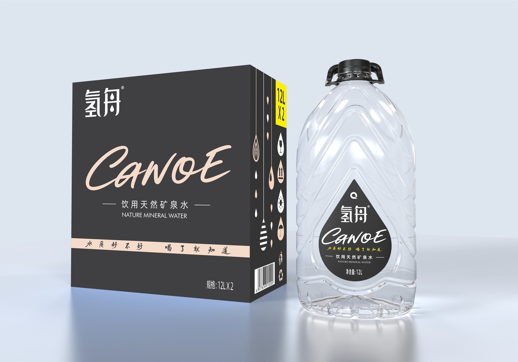
Case study of Hydrogen Boat Natural Mineral Water’s various bottle sizes and carton packaging, demonstrating how the 520 mL, 5 L, and 12 L designs maintain consistent brand identity across different capacities.
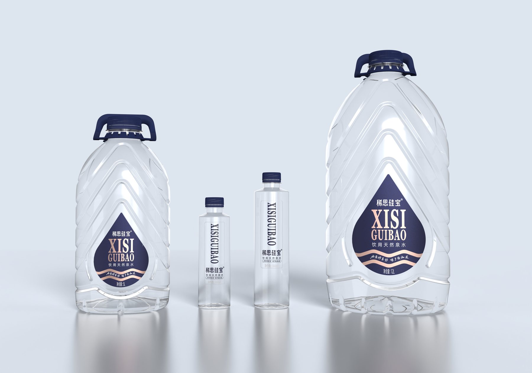
How can the two drinking water series—Hydrogen Boat and Xisi Silibao—maintain their distinct identities while ensuring a cohesive brand relationship between the small bottles and the 5L and 12L large bottles? Meilin approached this by focusing on the bottle silhouettes, teardrop-shaped labels, color schemes, and cardboard boxes to organize the packaging for bottles of various sizes.