Project Overview
Brand
Xiangli Mountain Spring
Products
Mountain Spring Water Series Containers
Specifications
Travel-sized bottles, containers with handles, and large buckets
Design Content
Design Proposal for Bottles in Multiple Sizes
Proposal Directions
Landscapes, Streams, and the “Li” Character Sculpture
Project Status
Design Proposal
From travel-size bottles to large containers, how can you make sure people recognize it as the same brand?
This set of bottle design proposals for Xianglishan Spring features travel-sized bottles, containers with handles, and large barrels. The sizes vary greatly, so the bottles cannot simply be scaled up or down; yet when displayed together, they need to clearly convey that they belong to the same brand.
This was the design challenge of the proposal: What shape could transcend different sizes and become a distinctive visual feature of Shili Shanquan? Mei Lin didn’t limit her search for answers to the label alone; instead, she compared the brand name, imagery of mountains and water, and the bottle’s silhouette. When she began the multi-size project,First, review the application and technical specifications....and can also help determine which features should be standardized and which dimensions need to be revised.
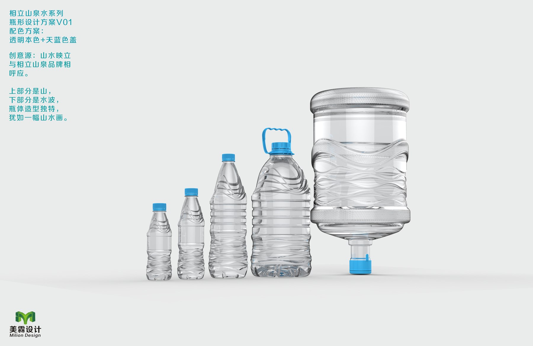
V01: Place the mountain shape at the top and the water ripples at the bottom
V01 draws its inspiration from the concept of “Mountains and Waters Reflected.” The bottle’s shoulders and upper section evoke the contours of mountains, while the lower section features continuous ripples that symbolize water. Even with the label covered, the division between the upper and lower parts of the bottle still brings to mind mountain spring water.
This collection features small bottles, containers with handles, and large barrels. The ripples are not mechanically replicated with the same density across all sizes: the lines on the small bottles are tighter, while those on the large barrels have more room to spread out. By maintaining the common landscape-inspired relationship and adjusting the lines according to the size of each piece, it is easier to create a natural sense of cohesion within the series than by simply scaling up a small bottle.
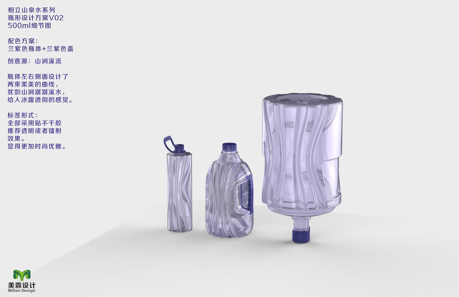
V02: Making the Side of the Bottle Memorable, Too
The V02 proposal details panel places the “mountain stream” motif on the side of the bottle. The downward-extending curves are visible on the small bottles, the containers with handles, and the large barrels, though the length of the lines and the angles of the curves vary across each size.
When people pick up a bottle, they don’t always hold it so that the label is facing them. The design features distinct changes along the sides, so the distinctive characteristics of this design concept remain visible even when the bottle is rotated. At the same time, the front maintains a relatively unobstructed display area, ensuring that brand and product information aren’t crowded out by the texture.
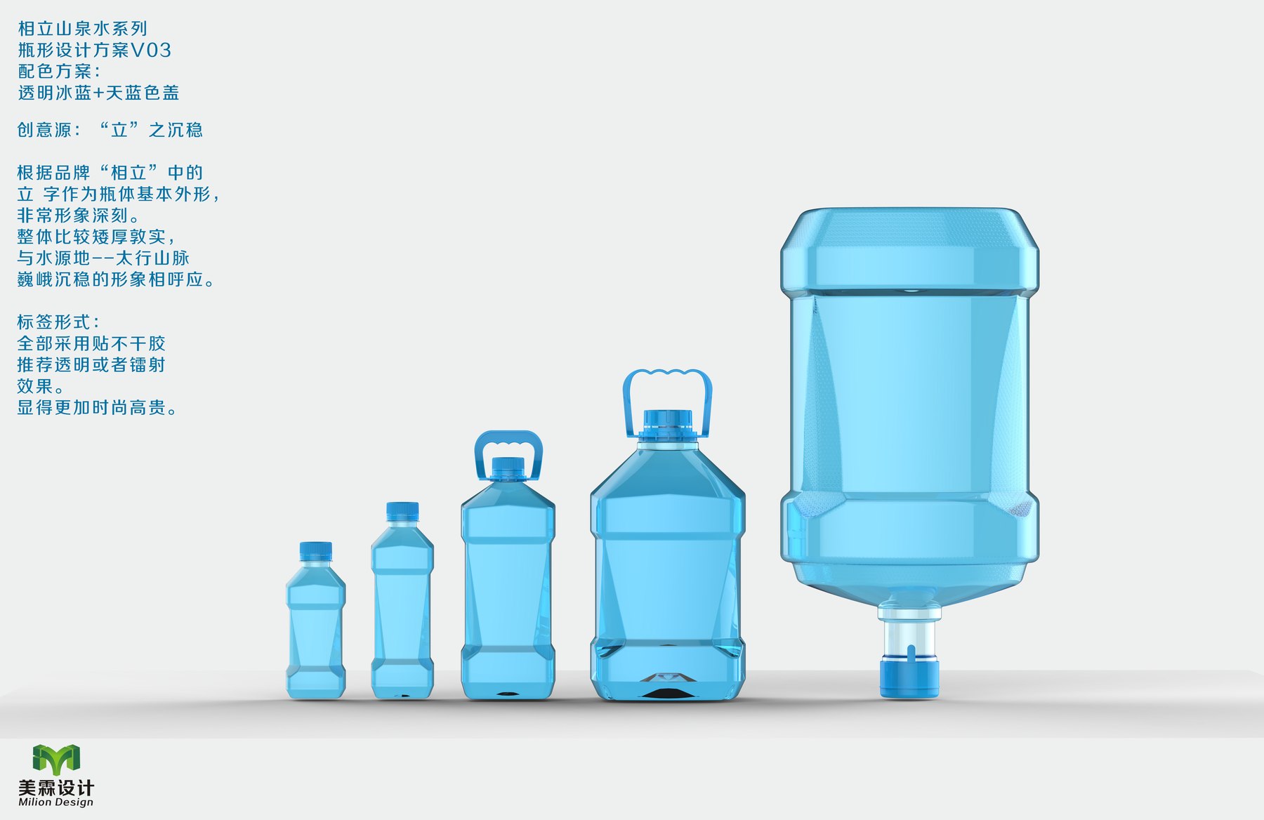
V03: Use the character “立” to create a more stable outline
V03 took a different approach: rather than featuring continuous water waves as the focal point, the design draws inspiration from the character “立” in the brand name. The bottle’s shoulder and body form a sharp transition, and the ice-blue bottle and sky-blue cap accentuate this silhouette.
Small bottles have their own ergonomic design, while large containers feature a wider front surface; they don’t need to look exactly the same. As long as the key design elements and overall aesthetic remain consistent, different sizes can still belong to the same series. This approach emphasizes the recognizability of the brand’s typography, while V01 places greater emphasis on the fluidity of mountain and water landscapes.
Different perspectives, each addressing a different question
This set of proposals presents three comparable directions. V01 evokes associations with mountain springs through the imagery of mountains and water; V02 incorporates the side profile into the brand’s visual identity; V03 transforms the brand name into a more powerful bottle silhouette. Which one is most suitable depends on whether the brand wants consumers to first perceive the imagery of mountains and water, the fluidity of the curves, or the brand’s typography.
For drinking water brands available in multiple sizes, Meilin presents a systematic approach here: retaining common characteristics while respecting the respective proportions of small bottles, large bottles, and large containers. Continue readingCase Studies of Bottle Designs in the Hunan Fenshui Series与Case Studies of the Yise Mountain Spring Series. If you're planning a new product, you can learn more aboutThe Difference Between Original Bottle Designs and Off-the-Shelf Solutions、Meilin Bottle Design Services, orContact Meilin to discuss the project。