Design proposal for a 150 mL desktop soy sauce glass bottle by Shisheng Brewing, comparing different bottle silhouettes, label information, and two aesthetic options: decals and heat-shrink film. The images on this page show design concepts and do not indicate that the product has entered production.
A small bottle—you need to clearly see both its shape and the brand at the same time
This design proposal for Shisheng Brewing centers on a 150-milliliter desktop soy sauce glass bottle. With limited space on the front of the small bottle, the bottle shape, brand logo, and product name must all fit within the same visual composition. The focus of the design is to give the bottle a distinct silhouette while ensuring that consumers can clearly identify the product.
This is also a common trade-off in the packaging of small-sized condiments: if you focus solely on the design, product information gets pushed aside; if you enlarge the text, the bottle tends to lose its distinctive appeal. When launching a new product, you can start by referring toDocuments Required for the Bottle Design Project, clearly specify the product category, specifications, and label information.
Several bottle shapes, each with its own unique features
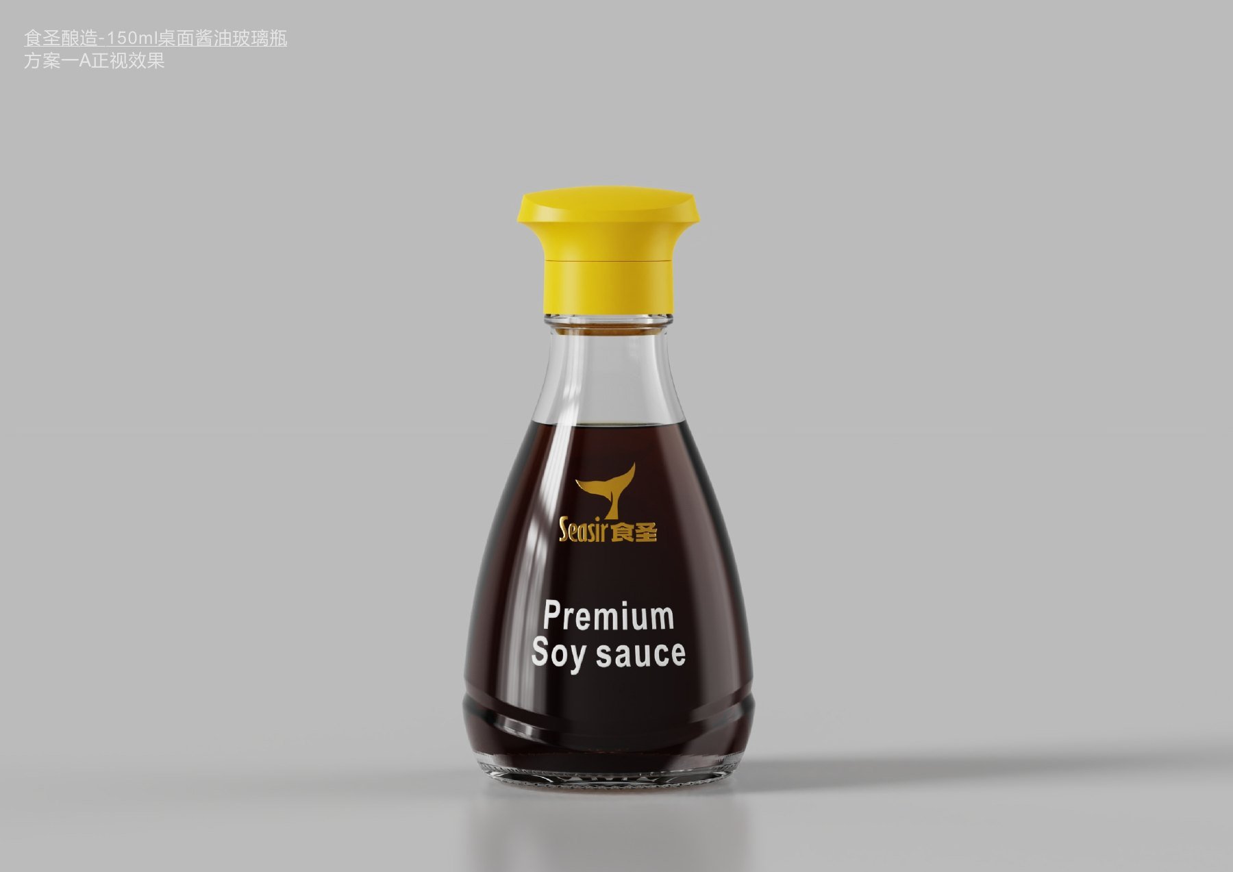
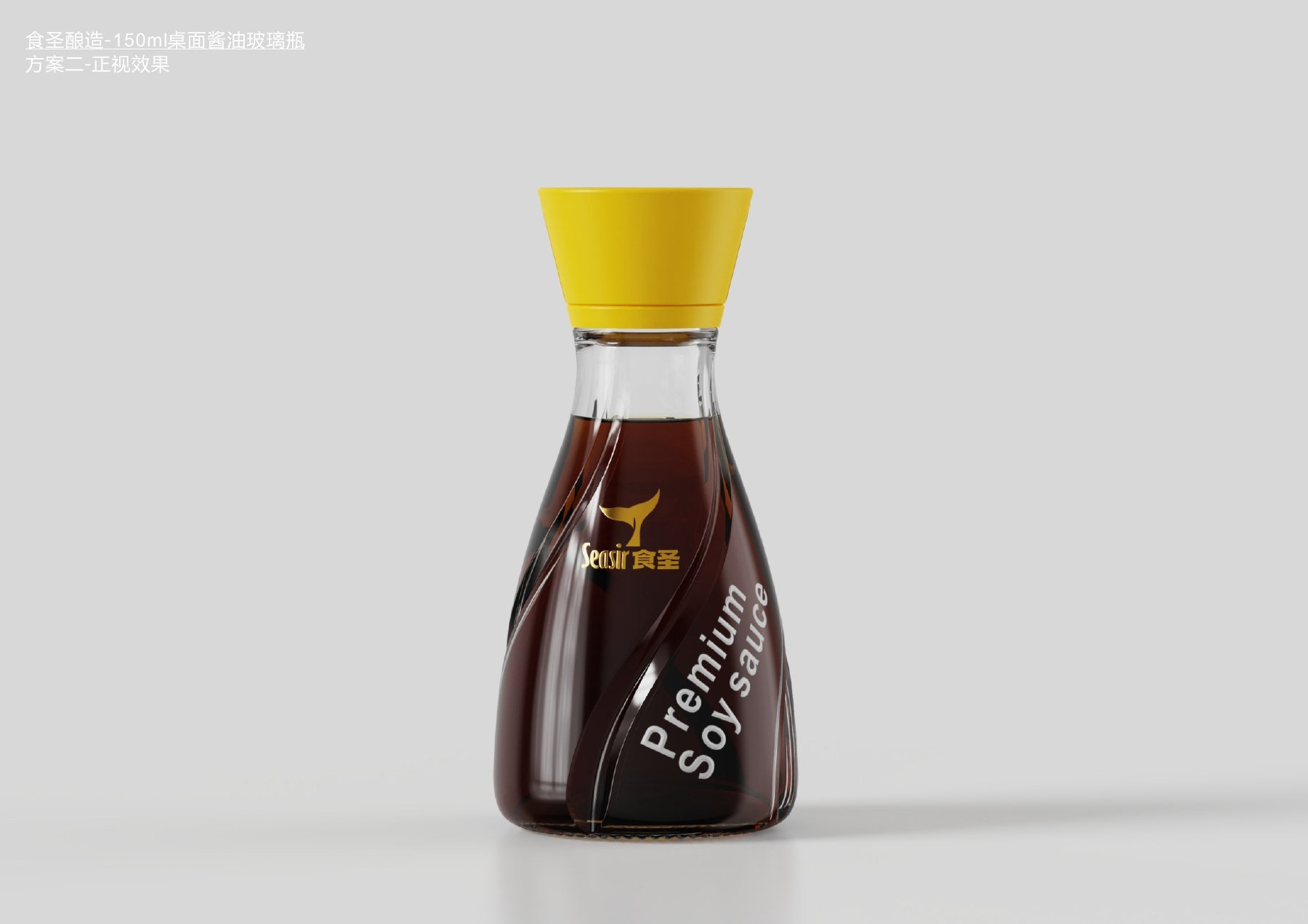
The original proposal featured more than one bottle orientation. In Option A, the bottle’s shoulders and body are rounder, and the brand logo is placed on the more complete front side. In Option B, the silhouette is straighter, and the text on the bottle is arranged along the more regular contours of the body. The addition of diagonal lines in another orientation gives the bottle a more dynamic appearance.
The trade-offs between these design approaches are quite straightforward: a rounded bottle shape creates a softer look, a straight silhouette makes the front-facing information more focused, and diagonal lines make the design more eye-catching. For small soy sauce bottles, the design can be distinctive, but the brand and product names must not be pushed to a position where they are illegible.Original Customization and Solution SelectionWe should also first consider what problem the product itself is meant to solve, rather than simply comparing the number of design elements.
Design A features a more rounded bottle shoulder and body.
In another design, diagonal lines are placed on the bottle to create a more pronounced visual variation.
Place the cap, bottle shape, and text in their respective positions
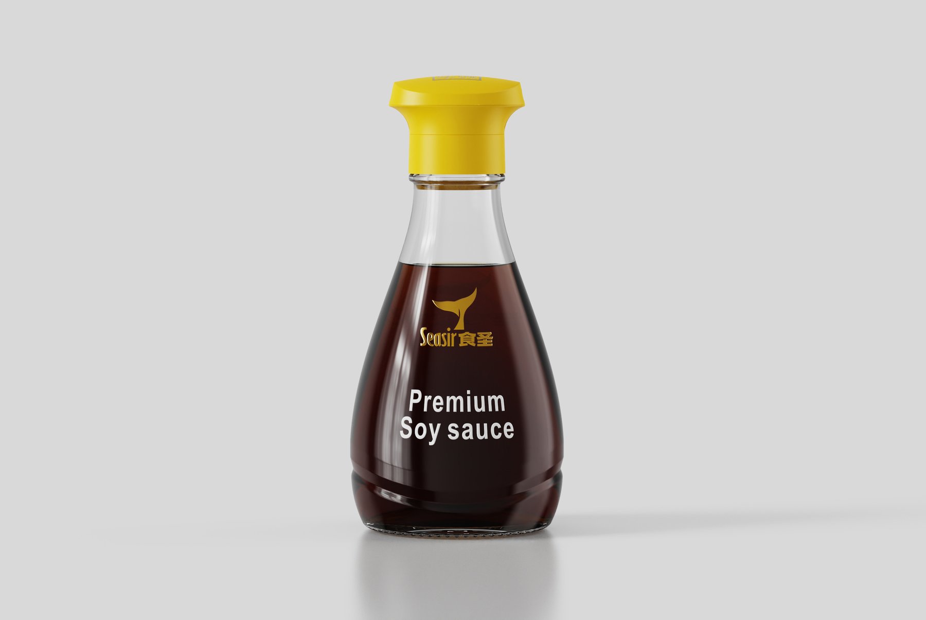
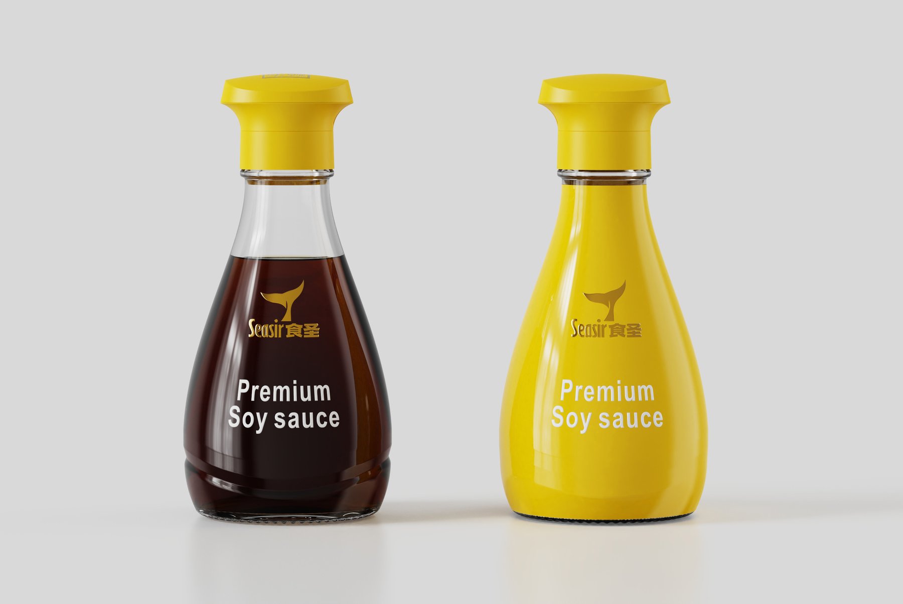
The subsequent renderings showcase a combination of a yellow cap, a transparent neck, and a dark-colored body. The bottle widens from the narrow neck downward, creating a space on the front to display the brand logo and product name. The yellow cap first draws the eye to the top of the bottle, while the gold logo and white text then rest against the dark-colored body.
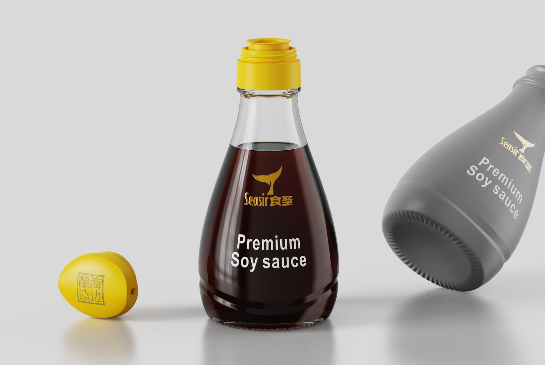
Each color and element serves a specific purpose, giving the bottle a sense of depth and making the information easy to distinguish. By showcasing both the cap and the base in detail, the brand can evaluate the entire bottle as a single design concept, rather than just a single rendering of the front.
Front view design for a 150 mL tabletop soy sauce bottle, with the brand logo and category text centered on the front of the bottle.
Close-up views of the bottle cap, neck, and bottom, for comparing appearance and the placement of information.
Same Bottle Shape, Two Different Label Designs
The proposal also compares the baked-on design and heat-shrink film on the same bottle shape. The baked-on design preserves more of the transparent glass, allowing the dark-colored contents to become part of the visual appeal. The heat-shrink film, on the other hand, covers the bottle with a large area of yellow, making the brand color stand out more.
These two approaches aren’t simply about changing colors; they involve a trade-off: should this desktop bottle showcase its contents more prominently, or should the brand’s signature color be the first thing people notice? What is presented here is a comparison of visual effects; it does not mean that either of these designs has been used in production.
For the same bottle shape, the design achieves two distinct effects: one that preserves the transparency of the glass and another that features a large area of yellow coating.
What does the proposal entail, and who should use it as a reference?
This page presents design proposals and renderings of bottle designs. It demonstrates how Meilin takes into account the proportions of the bottle, the cap, the brand logo, and the placement of product text all at once. For brands developing packaging for small-sized condiments, carefully considering the interplay between form and information is more valuable than simply designing an aesthetically pleasing bottle.
Design proposal for the Luhua 60 mL fragrance sample bottle: For in-store sampling at supermarkets (non-sale items), this proposal compares three opening mechanisms—flip-top, screw-top, and dip-top—as well as the presentation of the bottle shoulder and brand information.
Design proposal for Youshanfang’s 375 mL glass bottle of flaxseed oil, comparing three variations in terms of grip position, front label information, and bottle silhouette.
Food Seasonings and Oils | Bottle Design + Label Design PET Containers | Case Studies Optimize the bottle's proportions and information hierarchy to balance ease of handling and shelf display.