Project Overview
Brand
Luhua
Products
Scent Sample Bottle
Capacity
60 mL
Uses
Non-sale items for supermarket demonstrations
Design Content
Proposals for Bottle Shapes and Opening Methods
Project Status
Design Proposal
It’s just a small bottle—so why start with “how it smells”?
It’s difficult to convey the aroma of peanut oil through the text on a label alone. Lu Hua’s proposal for this 60-mL container is intended as a non-sale item for in-store scent experiences at supermarkets. The focus here isn’t on how to downsize a large bottle for sale, but rather on how a person picks it up, opens it, smells the aroma, and sees the color of the oil inside.
With a bottle capacity of only 60 mL, the cap, brand name, and label must all share a limited amount of space. If the label is too crowded, the oil’s color won’t show through easily; if only the transparent bottle is left, the brand might not stand out enough. Therefore, the design approach integrates the opening mechanism with the front-of-package information. For experiential packaging like this, clarifying the actual usage scenario is usually more important than simply choosing an aesthetically pleasing bottle shape.
Flip-open direction: Place the opening and closing mechanism at the front
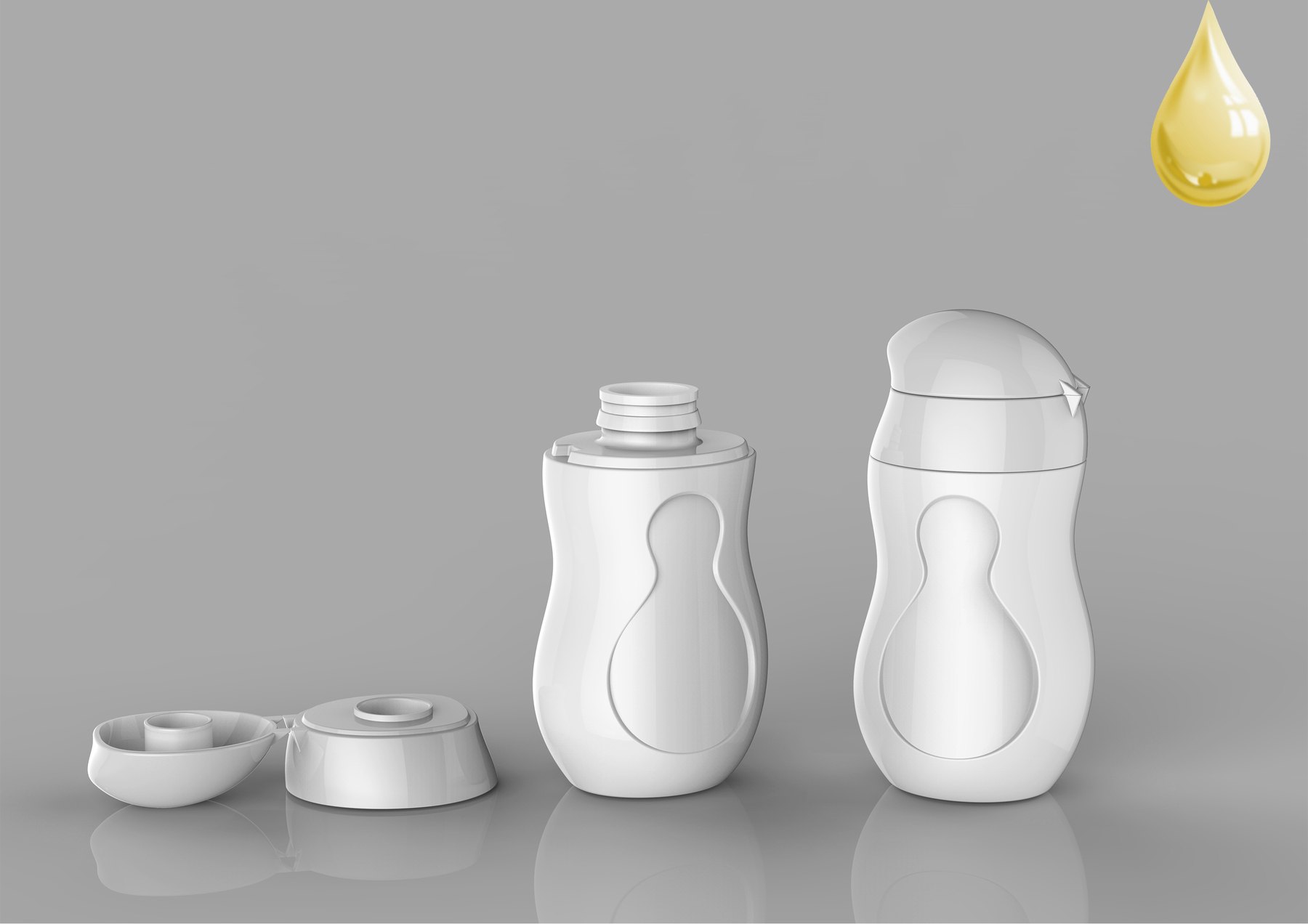
One design features a flip-top cap, creating a seamless appearance between the cap and the bottle. Peanut-inspired design elements are incorporated into both the cap and the bottle, allowing the product to be instantly recognized upon seeing the bottle. The white prototype illustrates both the open and closed states of the cap, making the relationship between the bottle opening, the grip area, and the front label zone more intuitive.
The key here isn’t to fill the bottles with decorative elements, but to ensure that both the opening mechanism and product identification are immediately clear at a glance. Leaving a clear, unobstructed area in the middle of the bottle also makes it easier to determine where the brand name should be placed later on. If you’re planning a similar project,First, organize the project documentation for the bottle designs., particularly the intended use, how to open the cap, and the information on the bottle label.
Three ways to open it—what problems does each one solve?
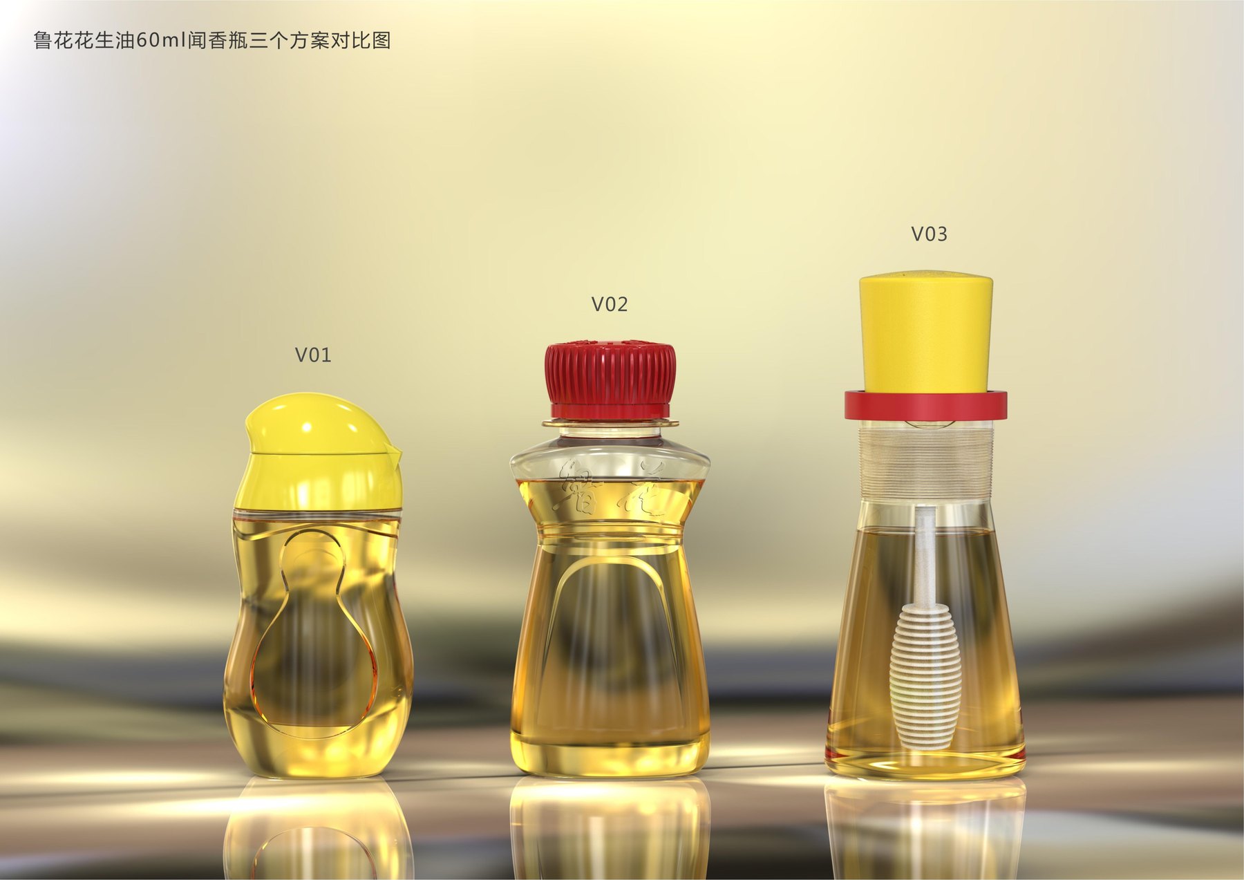
The original proposal presented a side-by-side comparison of three design directions. The flip-top cap emphasizes the direct action of opening and closing; the red screw cap draws attention to the bottle’s shoulder and the “Luhua” brand name; and the cap with a dip stick integrates the act of sampling into the bottle’s appearance. These are not simply color variations of the same bottle, but rather responses to three distinct design challenges.
If the goal is a simpler opening motion, the direction of the flip-top cap is worth considering; if the goal is to make the brand visible first, the direction of the twist-top cap better highlights front-facing brand recognition; if the goal is a more unique sampling experience, the direction of the dip-top cap offers another possibility. By comparing these key factors first, brands can determine whether they are prioritizing the opening experience, brand visibility, or the interactive experience.Choosing Between Custom Bottle Shapes and Off-the-Shelf Solutions...and we must also return to the problem the product is meant to solve.
Next, compare the bottle shoulder and the visible oil color
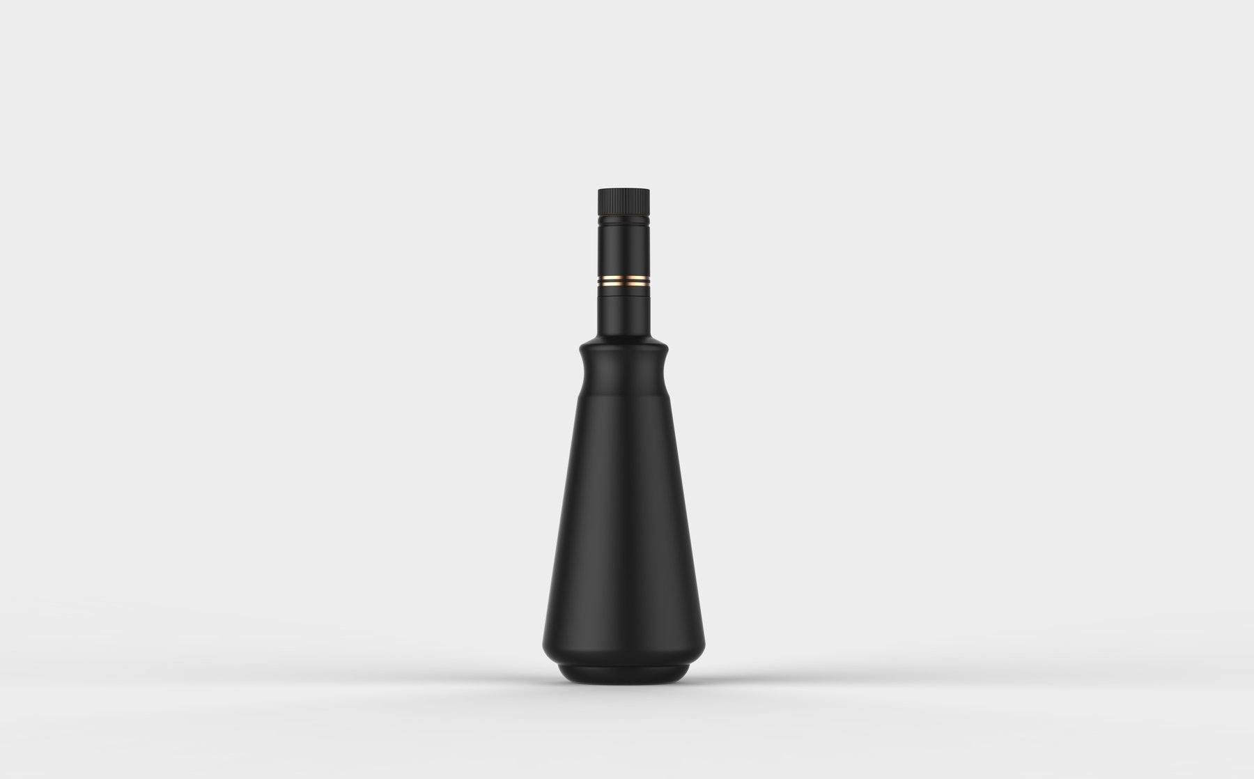
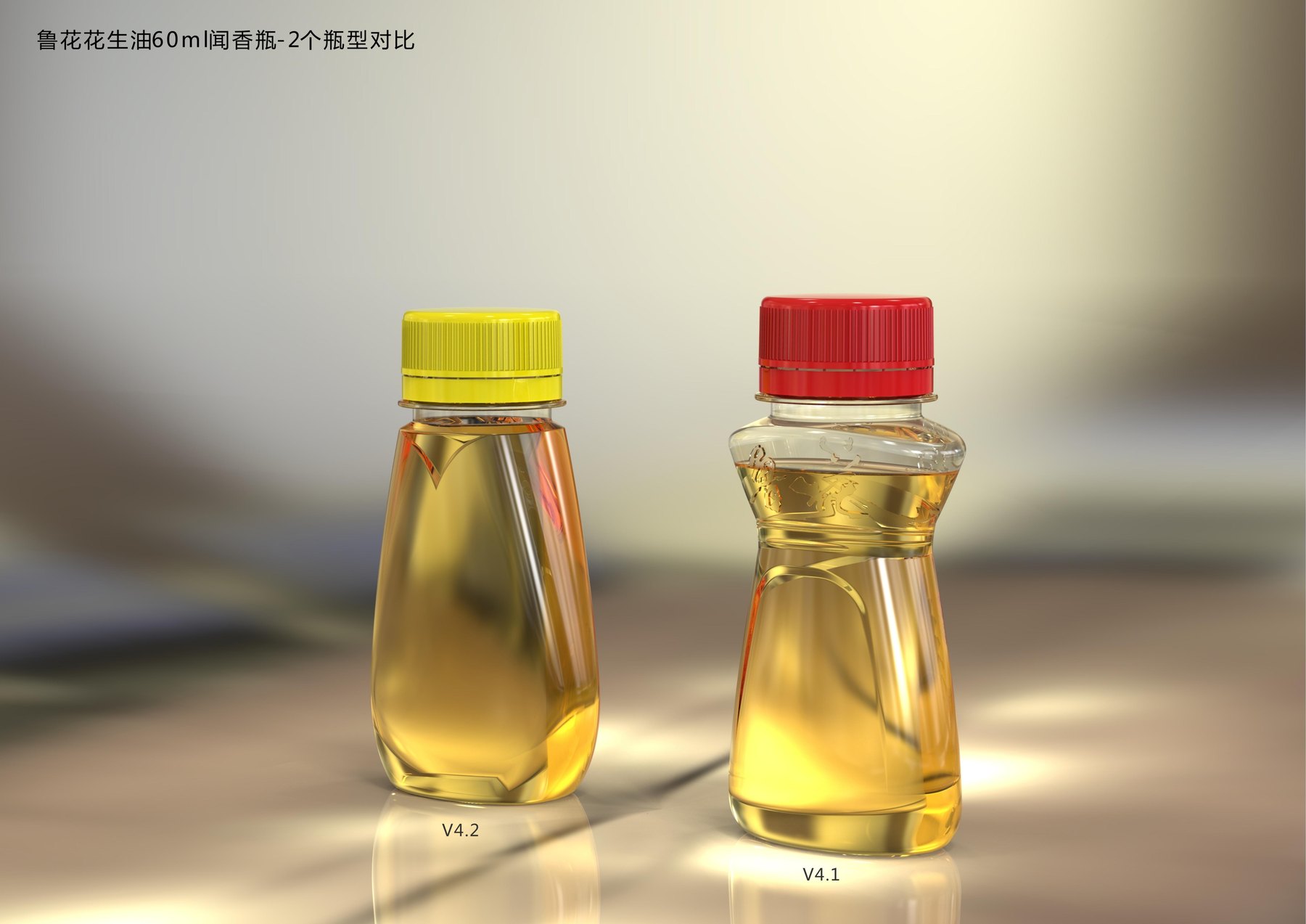
Additional renderings compare the two shoulder designs side by side. In one version, the shoulder and front areas are organized in a teardrop shape, while in the other, the brand name is placed on the shoulder. The cap color differs from that of the shoulder line, causing the visual center of gravity of the entire bottle to shift accordingly.
Small containers don’t need to have all the information printed on the label. By combining the bottle shoulder, the transparent body, and the brand name, the oil’s color remains visible, and consumers can still recognize the brand at a glance.
What issues does this set of proposals clarify?
This design proposal for a fragrance sampling bottle breaks down the processes of opening the cap, sampling the scent, brand recognition, and product display for comparison, then integrates them back into a single 60-mL bottle for evaluation. Meilin provides more than just a single rendering of the bottle’s appearance; it offers several bottle design concepts, each with its own focus. Brands can clearly see what each concept prioritizes and then discuss which experience best aligns with their specific use cases.
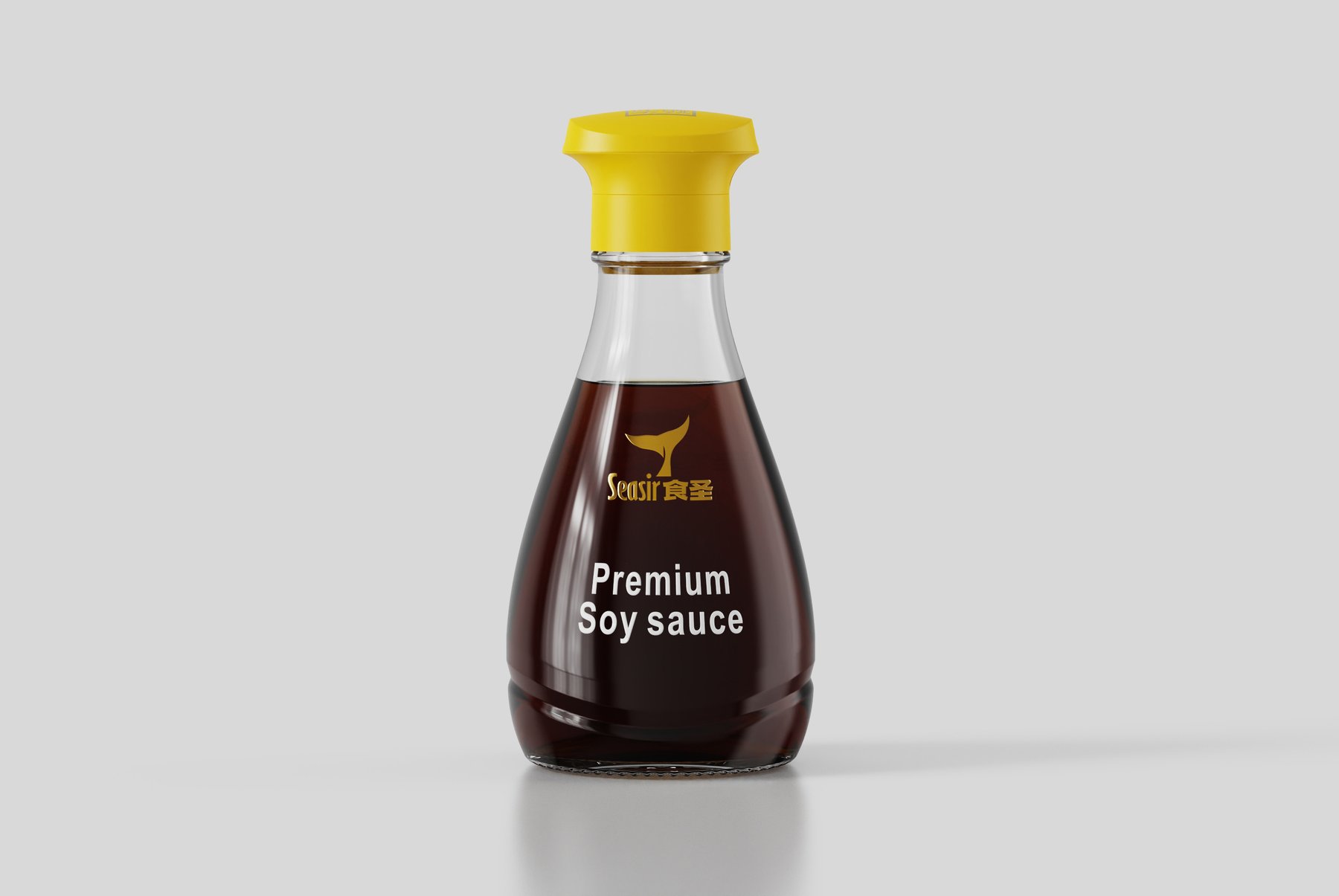
If you're planning to design sample-size or small-capacity food containers, you may want to refer toYoushanfang Flaxseed Oil Bottle Design Proposal与"Food Sage" Soy Sauce Bottle Proposal. You can also learn moreMeilin Bottle Design Services, orContact Meilin to discuss the project。