
PROJECT CASE
CATEGORY
SERVICE
MATERIAL / SUPPORT
STATUS
Project Type
Design of Aesthetic Optimization Solutions
Products
Ocean-Scented Laundry Detergent
Specifications
3 kg
Design Theme
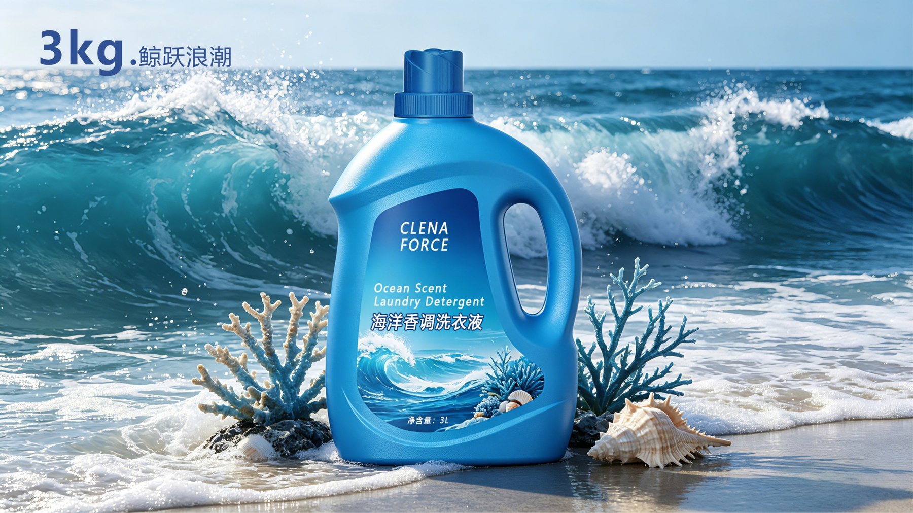
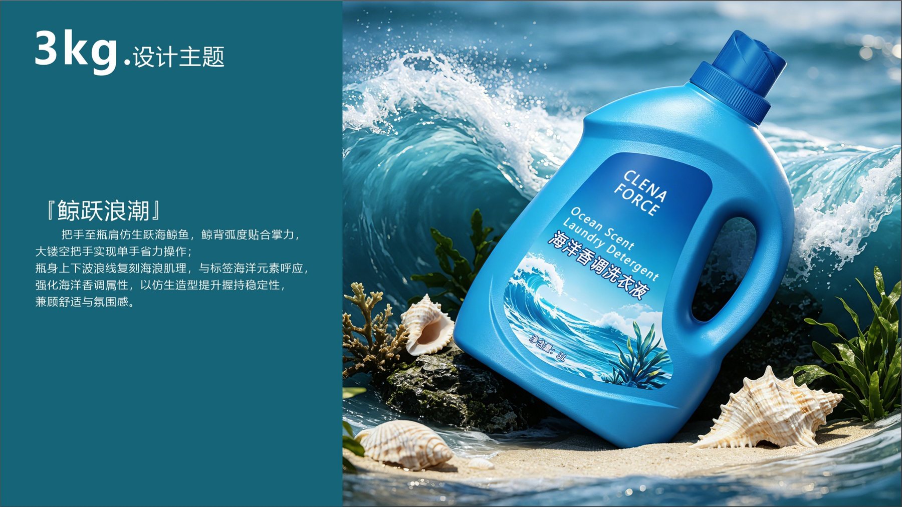
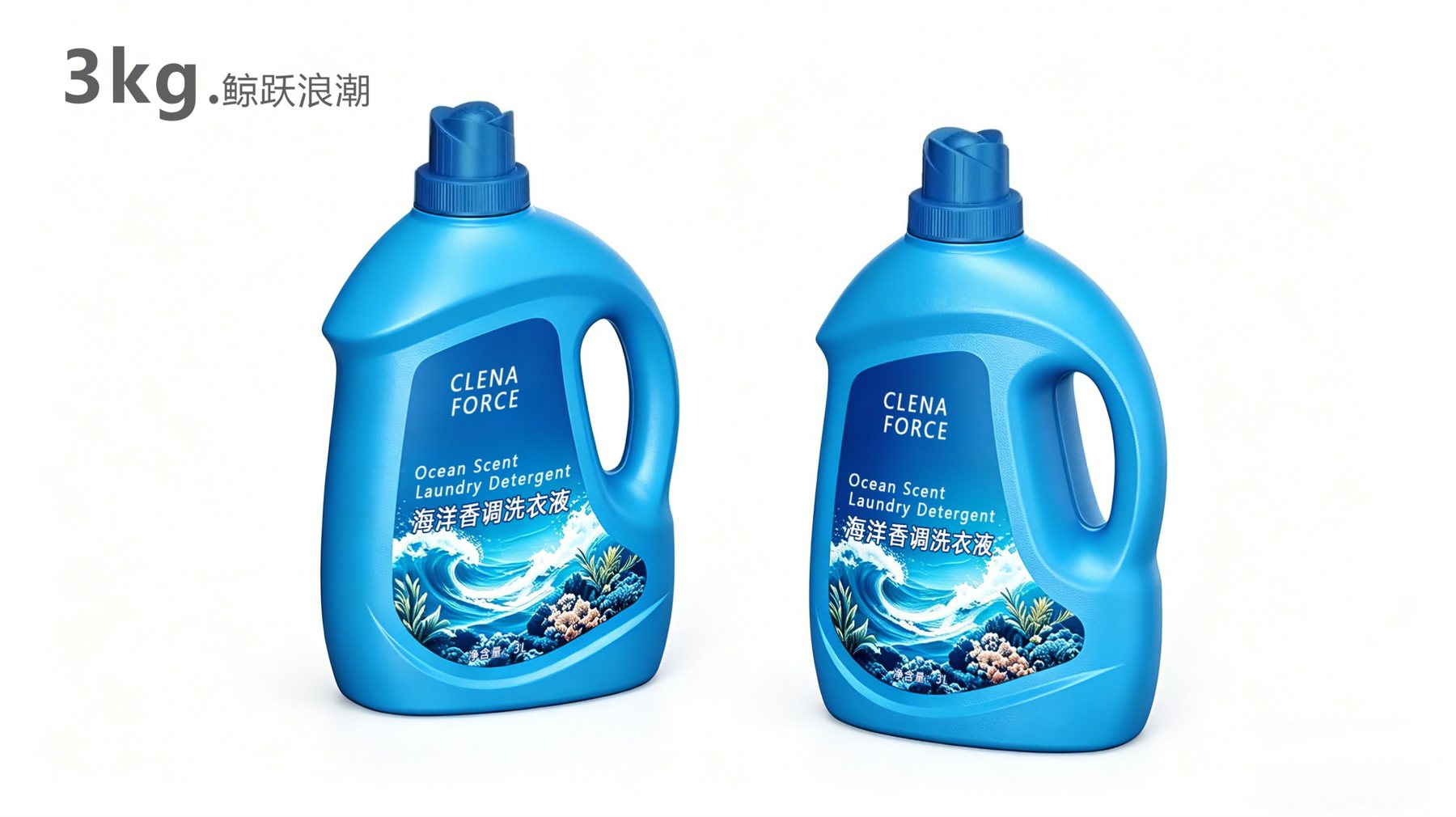
Whale Leaping Through the Waves
Key Areas for Optimization
Handle hole placement, bottle shoulder, and bottle body curves
Design Features
Integrated openwork handle with upper and lower wavy lines
Color Scheme Showcase
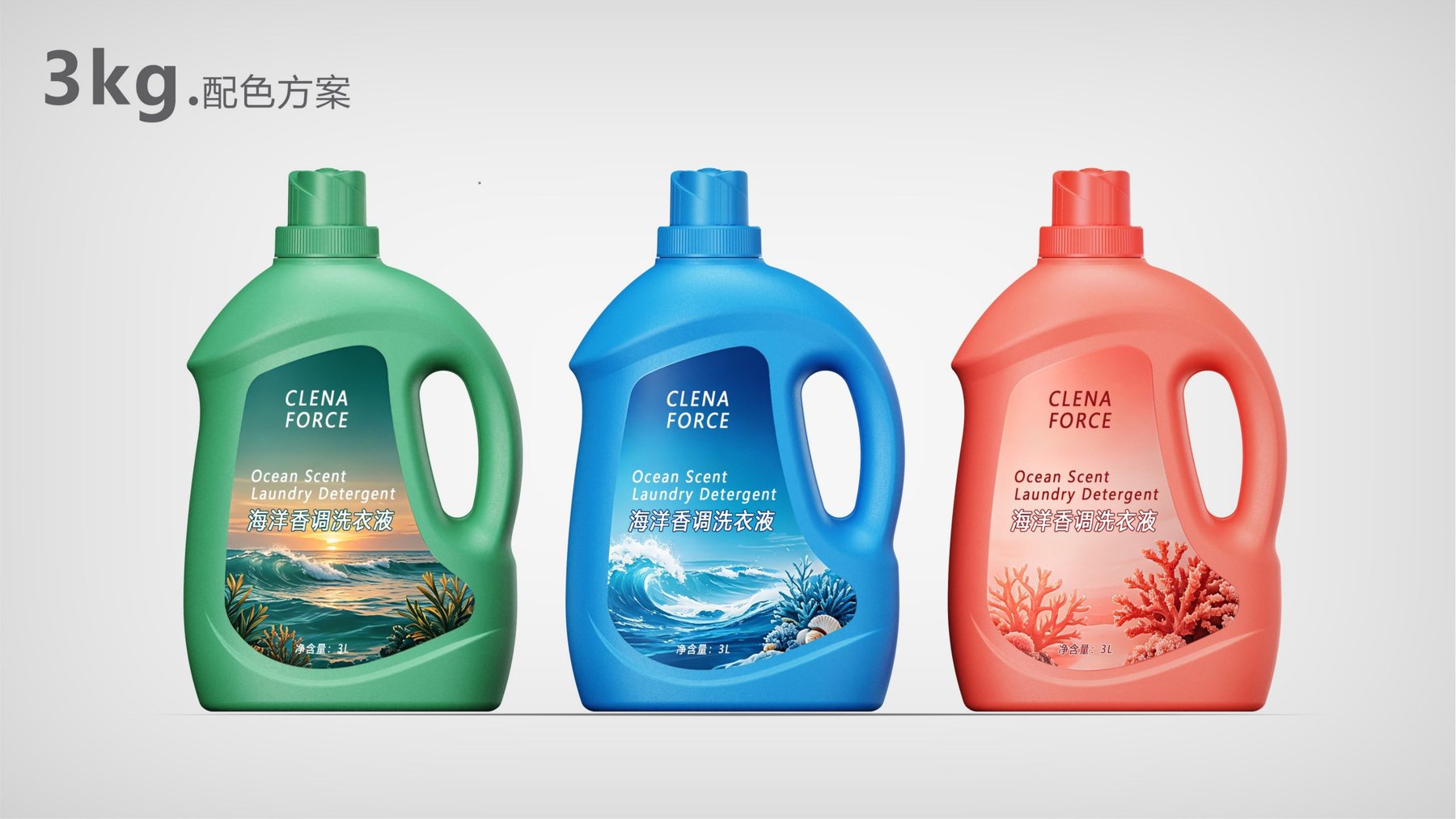
Sea Blue, Sea Green, Coral Red
Proposal Details
Wireframe Comparisons, Before-and-After Comparisons, and Multi-Angle Renderings
This is a visual optimization project centered on a 3-kilogram bottle of laundry detergent. Since the original container already featured the handle and front label area typical of large-capacity laundry detergent bottles, the design did not overhaul the basic functionality. Instead, it redefined the relationship between the bottle’s shoulder, handle, and body lines, ensuring that the ocean-themed design extends beyond the label graphics.
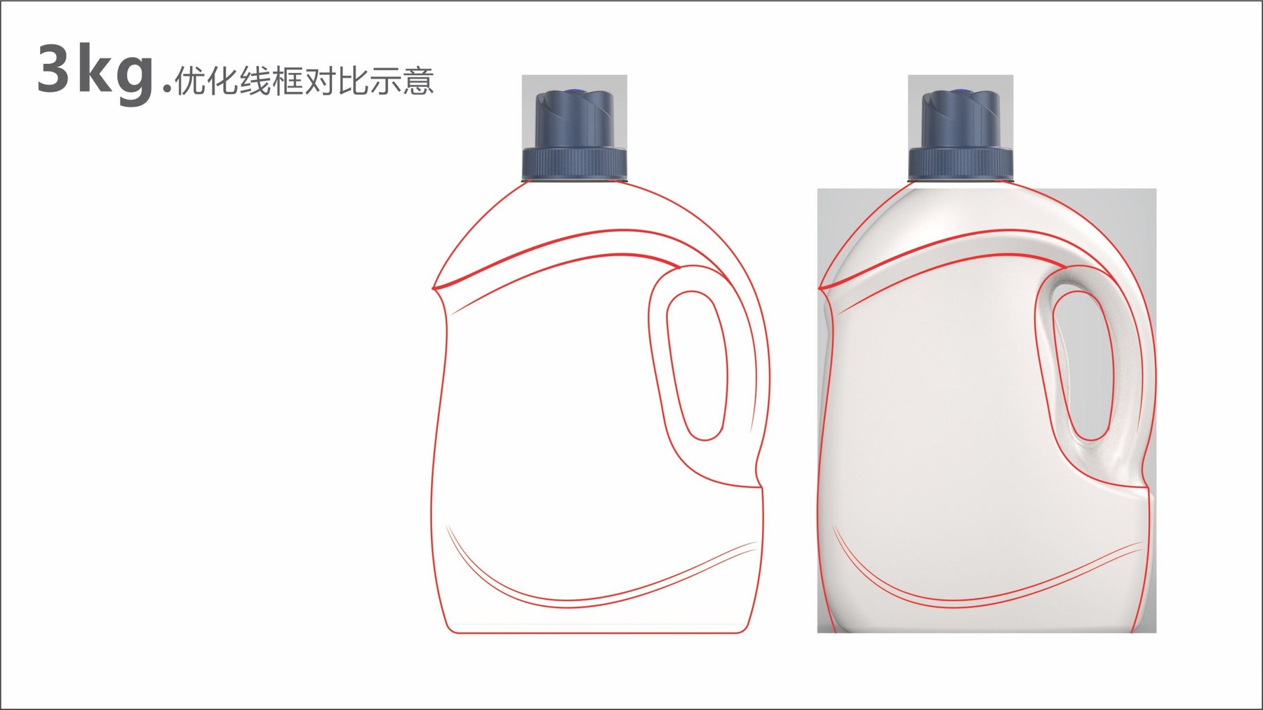
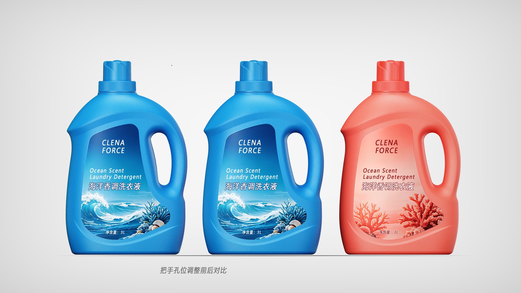
The design presentation includes wireframe overlays, before-and-after comparisons of handle hole positions, and renderings from multiple angles, allowing for a clear comparison of the design variations in the bottle shoulder, handle, and body—rather than relying solely on a single rendering.
The wireframe comparison places the original container image and the new outline side by side on the same screen. The new curve extends from the bottle’s shoulder toward the handle area on the right, forming a downward-tapered arc along the top edge of the front; the lower part of the bottle features another gentle curve that flows into the label area, allowing the two sets of lines to enclose a relatively complete front display surface.
A dedicated comparison chart of handle hole positions further illustrates the relationship between hole placement and the proportions of the bottle shoulder and body. On large-capacity containers, the handle is not merely an additional hole; it also affects the width of the front label, the side profile, and the way the bottle is held. Before launching similar projects, you may wish to refer toWhat materials are needed for bottle design and packaging design?。
The proposal named the theme “Whale Leaping Through the Waves.” The continuous curve from the bottle shoulder to the handle draws inspiration from the silhouette of a whale’s back, with the larger, openwork handle integrated into the overall silhouette rather than appearing disconnected from the body of the bottle. The bottle shoulder is no longer merely a transitional surface connecting the neck to the body; it has also become the first recognizable element of the ocean theme.
The harmonious integration of the bottle shoulder, handle, and front display area within a single design is a key distinction between custom bottle shapes and existing generic bottle designs. As the design is refined, further details can be developed around the grip area, label surface, and brand identity to ensure the design language remains cohesive. While the container orientation is still under evaluation, it can be compared againstThe Difference Between Custom Bottle Designs and Existing Bottle Designs。
There is a wavy curve on both the upper and lower parts of the bottle. The upper curve connects the bottle’s shoulder to the handle, while the lower curve extends outward from the base toward both sides; together, they define the visual boundaries of the front label. As a result, the imagery of waves, coral, and seaweed in the proposal renderings can flow naturally along the bottle’s curves rather than being forced into a rigid rectangular frame.
This approach evaluates the container’s appearance and label presentation within the same visual frame: the bottle shape establishes a visual memory, while the label conveys the product name and information about the ocean-inspired fragrance. When designing similar personal care product containers, it’s helpful to first understandIndustrial Design Services for Bottle ShapesHow to coordinate the design, label layout, and subsequent detailing.
The proposal showcases three color schemes: Ocean Blue, Ocean Green, and Coral Red. Ocean Blue emphasizes the cool color palette of the waves and the deep sea; Sea green incorporates coastal vegetation and sunset hues into the label; coral red, meanwhile, creates a unified color scheme between the bottle, the coral imagery, and the warm-toned sea. These three design variations separate color considerations from stylistic ones, making it easier to compare the different atmospheres evoked by the same ocean theme when rendered in cool, natural, and warm tones.
Aside from the color comparisons, the three design sets feature the same bottle shoulder, handle, and label outlines, allowing viewers to focus on the variations in color mood. To compare designs from the personal care product line, seeTianbo Daily Chemicals: Design of Personal Care Containers; Consider the proportions of the large-capacity handle in relation to the series; you may also refer toBottle Shapes and Packaging Design for the Hunan Fenshui Mineral Water Series。
Once the design of large-capacity liquid laundry detergent bottles enters the refinement phase, the handle cutout, finger grip area, shoulder transition, front label application area, and the relationship with the bottle bottom can be reviewed together to ensure that the design, user interaction, and packaging presentation remain consistent.
Once the direction has been determined, key surfaces can be further refined during 3D detailing and prototype reviews, and the brand can coordinate with packaging and manufacturing suppliers to confirm compatibility requirements for the bottle mouth, cap, filling, and boxing processes. If you are also evaluating the relationship between the appearance and handles of large-capacity laundry detergent or household cleaning product containers, you canContact Meilin Design to discuss project details。
DESIGN RESULT
PROJECT DELIVERY
DESIGN SERVICE
MATERIAL / SUPPORT
STATUS
MORE CASES
Please submit information on the product category, capacity, material, filling method, launch date, and reference materials. Meilin will discuss suitable bottle designs, packaging, and implementation strategies based on the specifics of your project.

Establish brand identity through the aesthetics of original bottle designs,
Ensure the successful implementation of designs through engineering expertise.
We specialize in innovative bottle and packaging design for mineral water, fruit juices, alcoholic beverages, cooking oil, personal care products, and household cleaning products.
© 2026 Shenzhen Meilin Industrial Design Co., Ltd.