
PROJECT CASE
CATEGORY
SERVICE
MATERIAL / SUPPORT
STATUS
A 2.5-kilogram bottle of laundry detergent requires a larger container, as well as a handle and a measuring-cup-style cap. When these elements are combined, the result can easily look like a utilitarian container. Hengjieli hopes to use fragranced products as a starting point to give the new bottle a softer, more cohesive appearance.
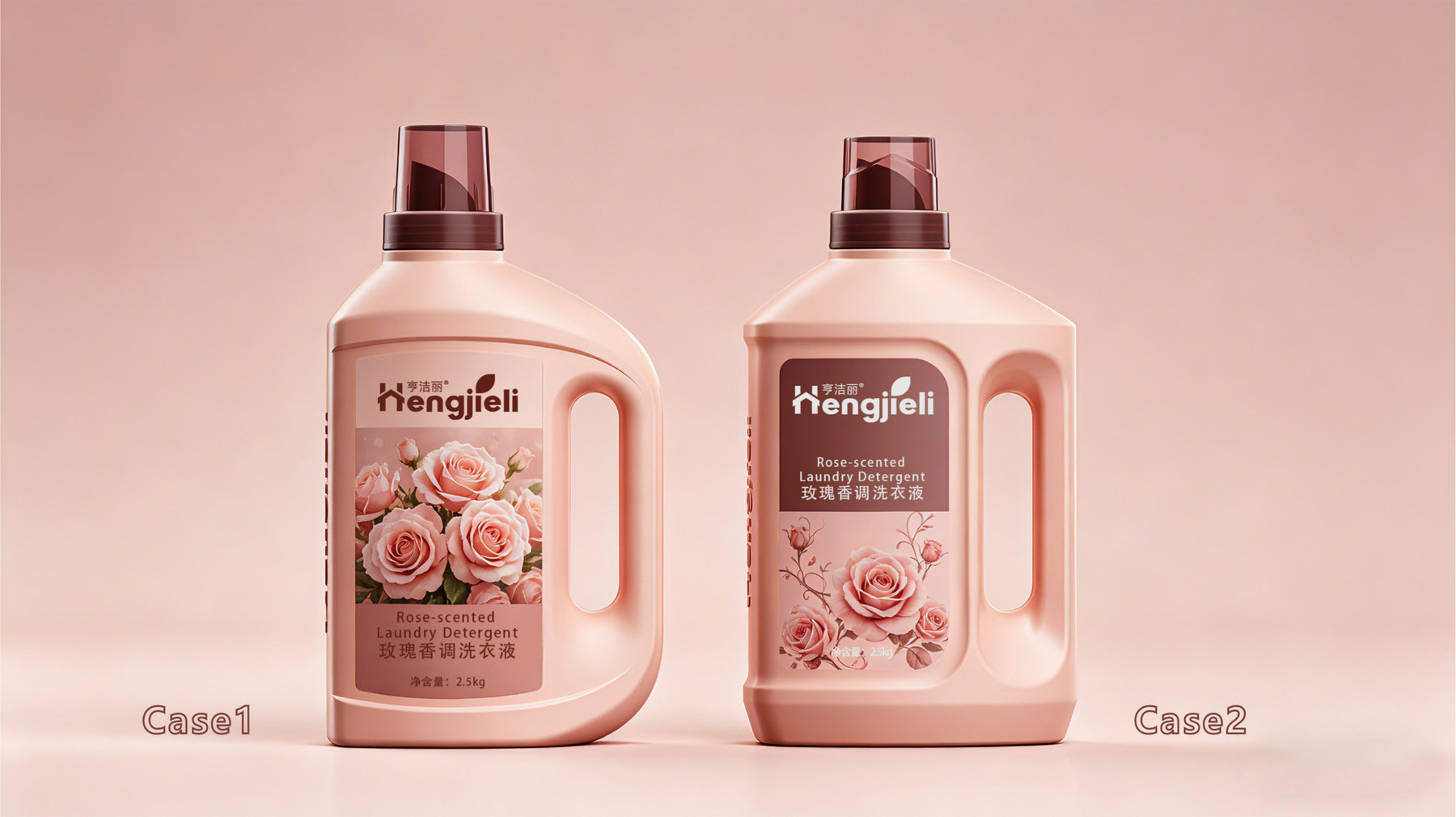
Instead of adding patterns to the bottle right away, Meilin first examined the relationship between the bottle’s shoulder, the label area, and the handle. The project proposed two design directions—“Naturally Formed Double Curves” and “Roman Colonnade”—allowing curves and rectangular forms to each emerge as distinct options.
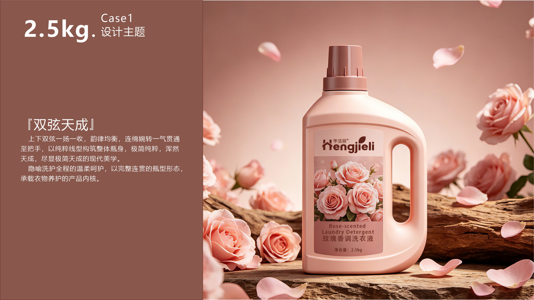
The breakthrough in the first design direction lies in the two curved lines on the bottle—one curving upward and the other curving inward—that extend from the shoulder of the bottle to the handle and then back to the body. The handle no longer appears as a component attached to the side but rather as an integral part of the silhouette.
Why should the lines be continuous? The volume of the volumetric flask is already quite evident. If the shoulder, label border, and handle each had their own set of lines, the appearance would easily look fragmented. By having them follow the same direction as they turn, the overall design will be more cohesive.
The label area on the front remains relatively intact. The curves define the outline, while the label provides brand and fragrance information—each serves its own purpose. This is also why “Double Strings, Natural Harmony” did not continue to layer textures.
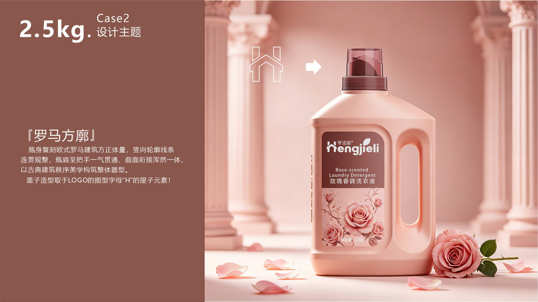
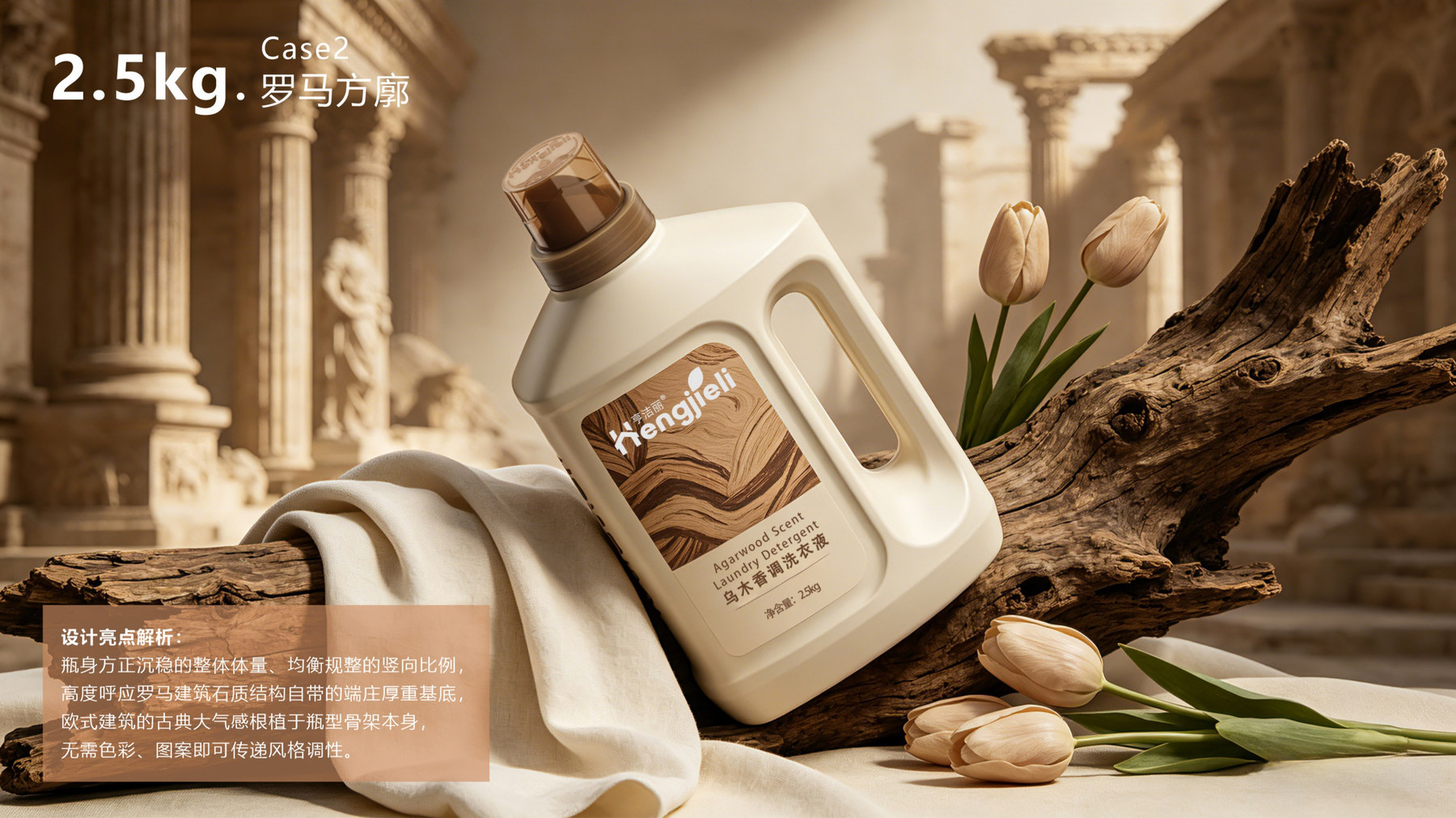
The second design concept draws inspiration from the square volumes and vertical order of Roman architecture. The bottle’s structure is more symmetrical, and the label area appears to be neatly framed. The handle and the shoulder of the bottle maintain a sense of continuity, but lack the fluidity found in the first design concept.
This difference isn’t simply a matter of adding an extra line. Curved designs tend to be softer, while angular designs tend to be more stable; the former allows the outline to flow smoothly, while the latter makes the brand’s front face appear more focused. Only by comparing them side by side can a brand clearly determine which aesthetic it needs.
The cap also incorporates the roof-like element from the brand’s letter “H.” Placing the branding at the top allows the brand to extend from the label to the container’s details, rather than simply adding a sticker.
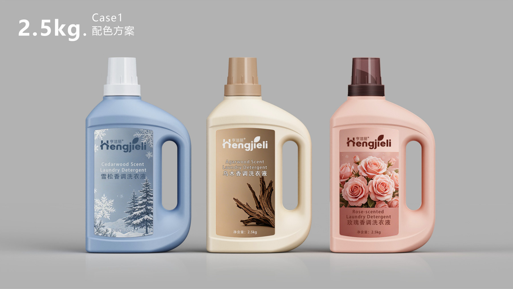
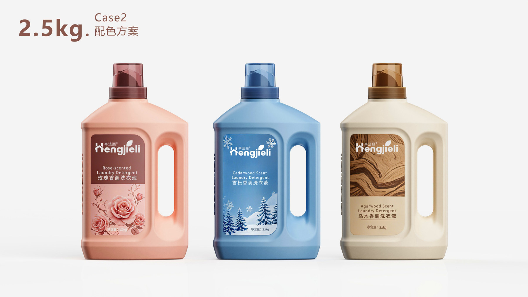
The rose fragrance features a softer pink, while the oud fragrance uses off-white paired with wood-inspired imagery. The distinction between floral and woody scents is reflected in the colors and labels, and the bottle design remains consistent. Consumers first see the collection as a whole, and then notice the different fragrance notes.
The proposal also compared color schemes such as blue. The goal was not simply to choose a single attractive color, but to determine whether the design would remain clear when the same bottle shape was paired with labels in different color temperatures and shades.
The translucent brown cap creates a sense of depth against the bottle’s color. The “Hengjieli” lettering on the side allows the brand to be recognized from another angle, providing a point of identification beyond the front label.
“The strength of the ”Double Strings, Naturally Formed“ design lies in its fluidity and softness; the handle and the body of the bottle appear as a single, unified whole. The strength of the ”Roman Colonnade” design lies in its symmetry and stability; the information area on the front is more concentrated. These two approaches each lend a distinct character to the large-capacity bottle.
Therefore, the evaluation should not be limited to the color of the label. It is also important to consider how the side profile, the proportions of the cap, the position of the handle, and the information on the front work together. Only by comparing these elements as a whole can one make a well-reasoned decision.
The project developed two design concepts for the appearance of 2.5-kilogram laundry detergent bottles and presented labels and multiple color schemes. These designs are not merely variations of the same bottle. The design process began by using different silhouettes to convey the product’s character, followed by coordinating colors and fragrance themes with the visuals.
As with household cleaning products, you can first decide whether you want the design to look soft or clean-cut, and then treat the bottle, handle, cap, and label as a unified whole. Once the brand’s distinctive features are incorporated into the overall design, the container will retain its distinctive appearance even if the label changes.
If you're planning to launch a new laundry detergent or household cleaning product, feel free to reach out to Meilin. First, clarify the capacity, fragrance series, and existing packaging material specifications, and then begin the design process by considering the overall container configuration.
Related Services:Industrial Design Services for Bottle Shapes. You can also learn moreJiaqing Container Design。
Continue reading:Information to Prepare Before Designing a Bottle;How to Choose Between Custom Bottle Designs and Original Concepts。
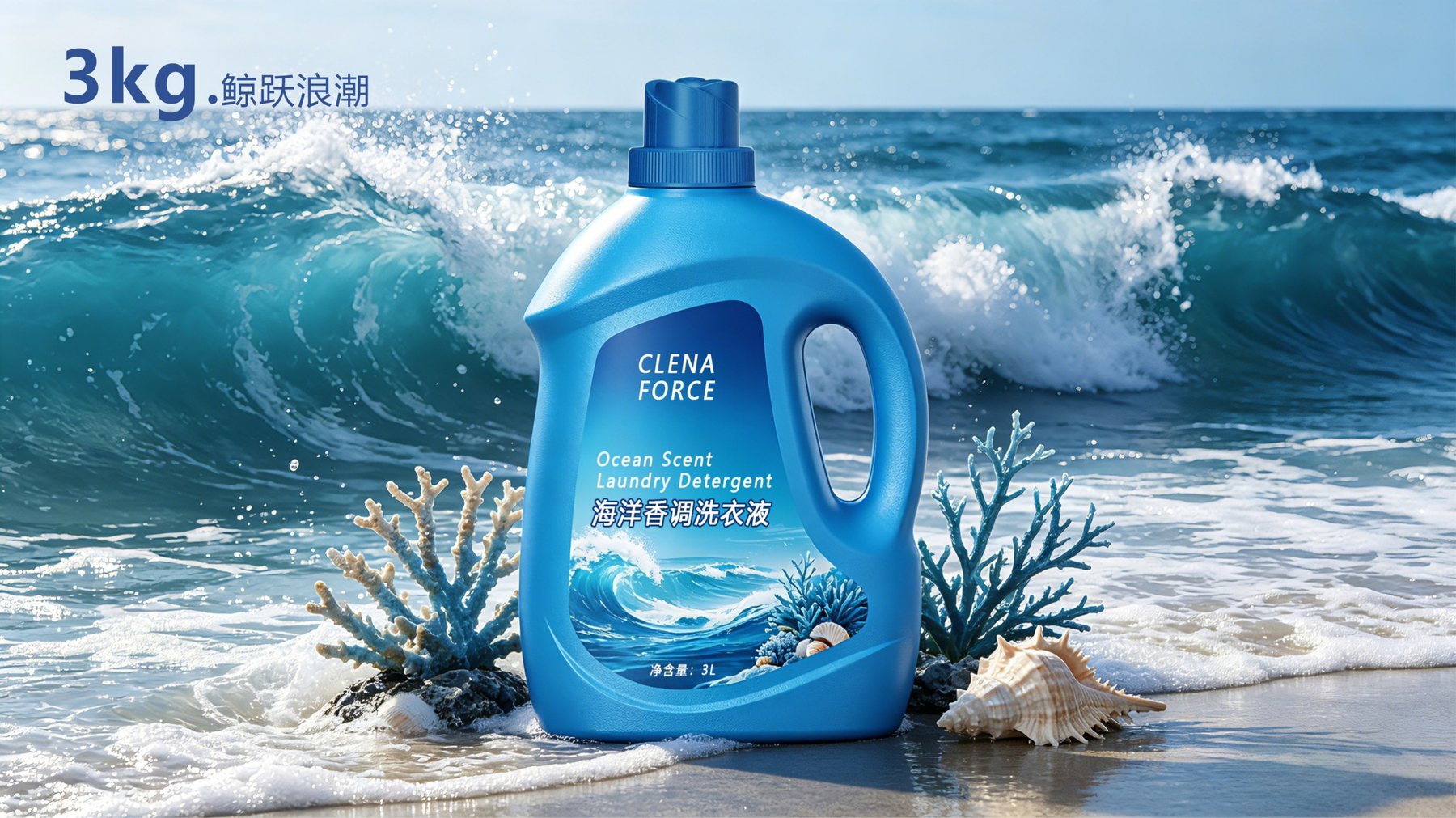
Similar Projects:Tianbo LADY SHOW Hair Care Container Design;Ocean-Themed Laundry Detergent Bottle Design。
DESIGN RESULT
PROJECT DELIVERY
DESIGN SERVICE
MATERIAL / SUPPORT
STATUS
MORE CASES
Please submit information on the product category, capacity, material, filling method, launch date, and reference materials. Meilin will discuss suitable bottle designs, packaging, and implementation strategies based on the specifics of your project.

Establish brand identity through the aesthetics of original bottle designs,
Ensure the successful implementation of designs through engineering expertise.
We specialize in innovative bottle and packaging design for mineral water, fruit juices, alcoholic beverages, cooking oil, personal care products, and household cleaning products.
© 2026 Shenzhen Meilin Industrial Design Co., Ltd.