
PROJECT CASE
Design of the Aikofu Syrup Packaging System
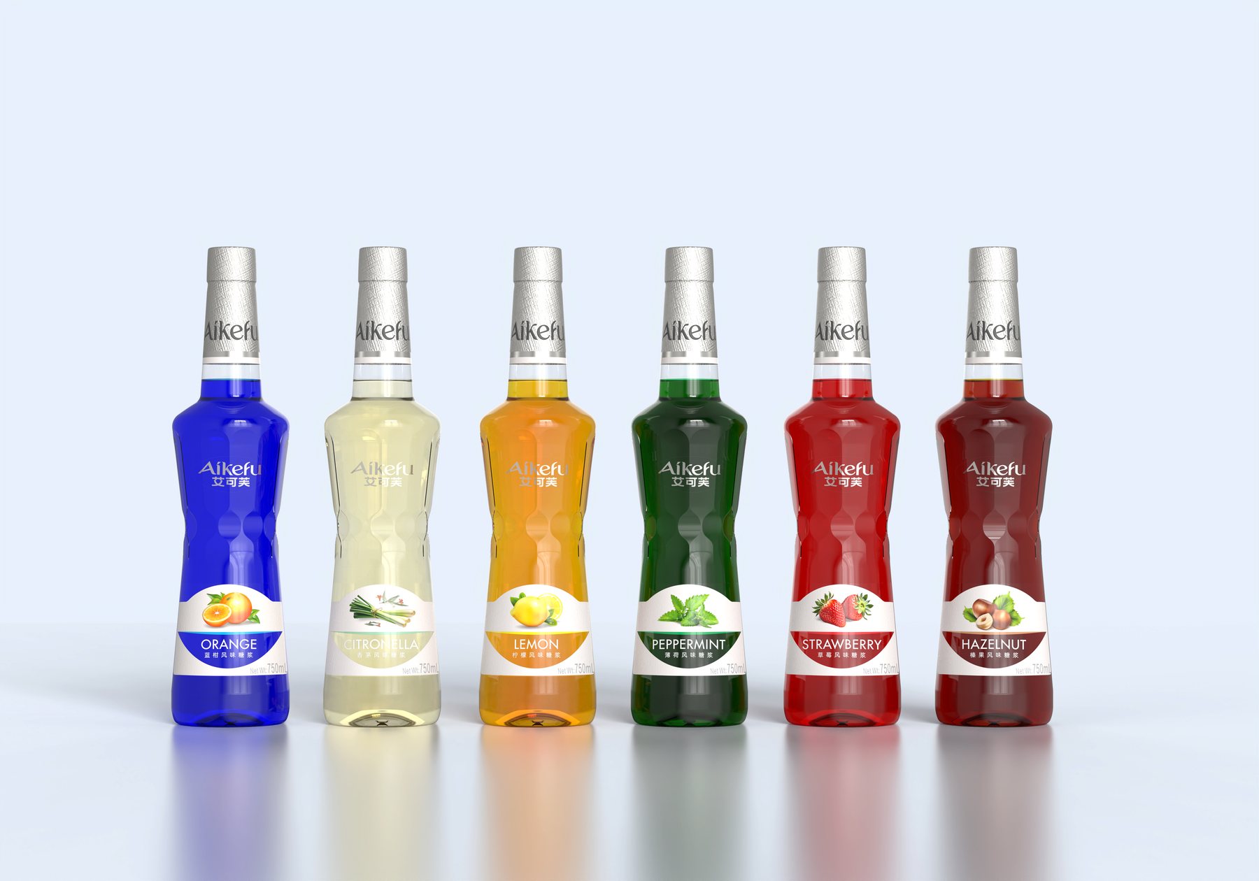
You can’t just change the name of a syrup flavor on the bar counter.
A row of syrups sits on the bar counter, posing two questions: Are they all from the same brand, and what flavor is this particular bottle? If only the text is changed, they can easily be confused at a glance; if each bottle features a different design, the series loses its cohesion. The packaging design for Aikofu syrups addresses this dilemma.
Meilin treated the bottle, flavor labels, bottle neck, and pump head as a single design unit. The packaging needed to convey a cohesive brand image while also ensuring that the various flavors were distinguishable when displayed side by side—rather than simply creating a visually appealing label.
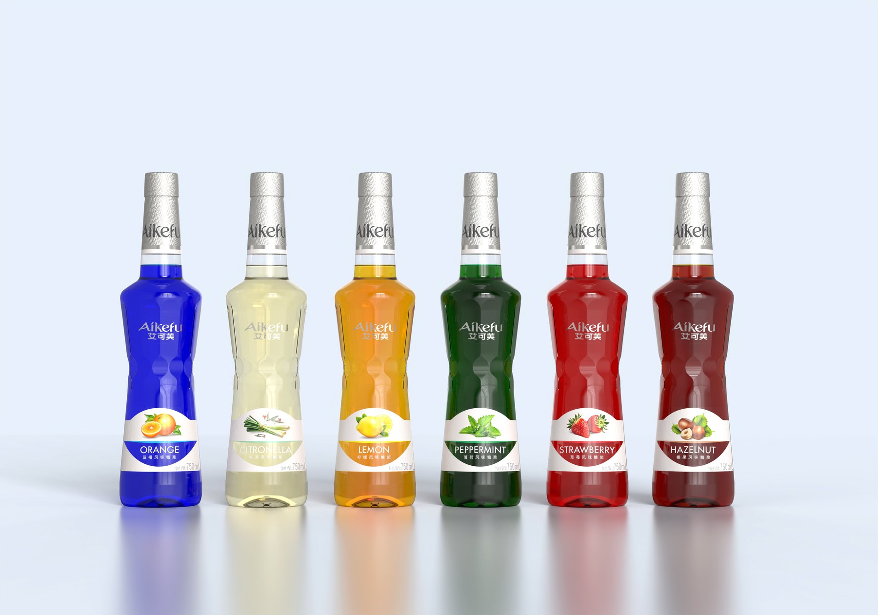
Establish the brand first, then leave room for flavor variations.
The series is based on a uniform white main label. Fruit and plant graphics indicate the flavor, while the colored bands and names below further distinguish the products. The colors—blue, light yellow, orange, green, red, and brown—are arranged side by side, creating a clear visual contrast while maintaining a consistent layout.
With this layout, consumers can get a general idea of the product category just by looking at the colors and graphics, and then confirm the specific flavor using the text. When new flavors are added, the brand placement and information sequence can be carried over, eliminating the need to redesign the entire packaging.
The labels are primarily concentrated on the lower part of the bottle. This leaves more space at the top to showcase the bottle itself, while the brand name appears on both the body and the neck of the bottle. The flavor information is clearly displayed, and the brand name isn’t overshadowed by the fruit illustrations.
A tapered silhouette—so the bottle isn’t remembered just for its label
The bottle features wide shoulders, a tapered midsection, and a series of gentle curves toward the bottom. The shoulders provide volume to the upper section, the tapered midsection creates a visual transition between the upper and lower parts, and the lower section forms a relatively complete display surface for the main label.
If the shape is just a standard straight cylinder, the distinction relies primarily on the label. This design incorporates distinctive features into the silhouette, ensuring that the bottle retains the series’ signature look even when viewed from the side or when the label isn’t fully facing forward.
The design does not distribute the pattern evenly across the surface. The variations are concentrated on the shoulders, waist, and lower section, and the labels are arranged along the bottle’s contours rather than covering the entire design. This allows both the bottle’s shape and the graphics to stand out on their own.
Two Approaches to Handling Bottlenecks: A Comparison of Their Overall Impact
The bottle design proposals explore two different approaches. One exposes more transparent areas, making the upper portion appear lighter. The other expands the silver coating, creating a more concentrated brand message and a more complete upper contour.
The silver area is not merely an additional decorative element. It connects the cap, the text on the neck, and the lower part of the bottle. When multiple bottles are placed side by side, this unified upper section creates a sense of order, while the variations in flavor remain in the lower section.
Both designs adhere to the main bottle shape and labeling guidelines. The comparison should focus on the balance of elements in the upper portion, brand visibility, and overall proportions; there is no need to scrap the entire series over a single detail.
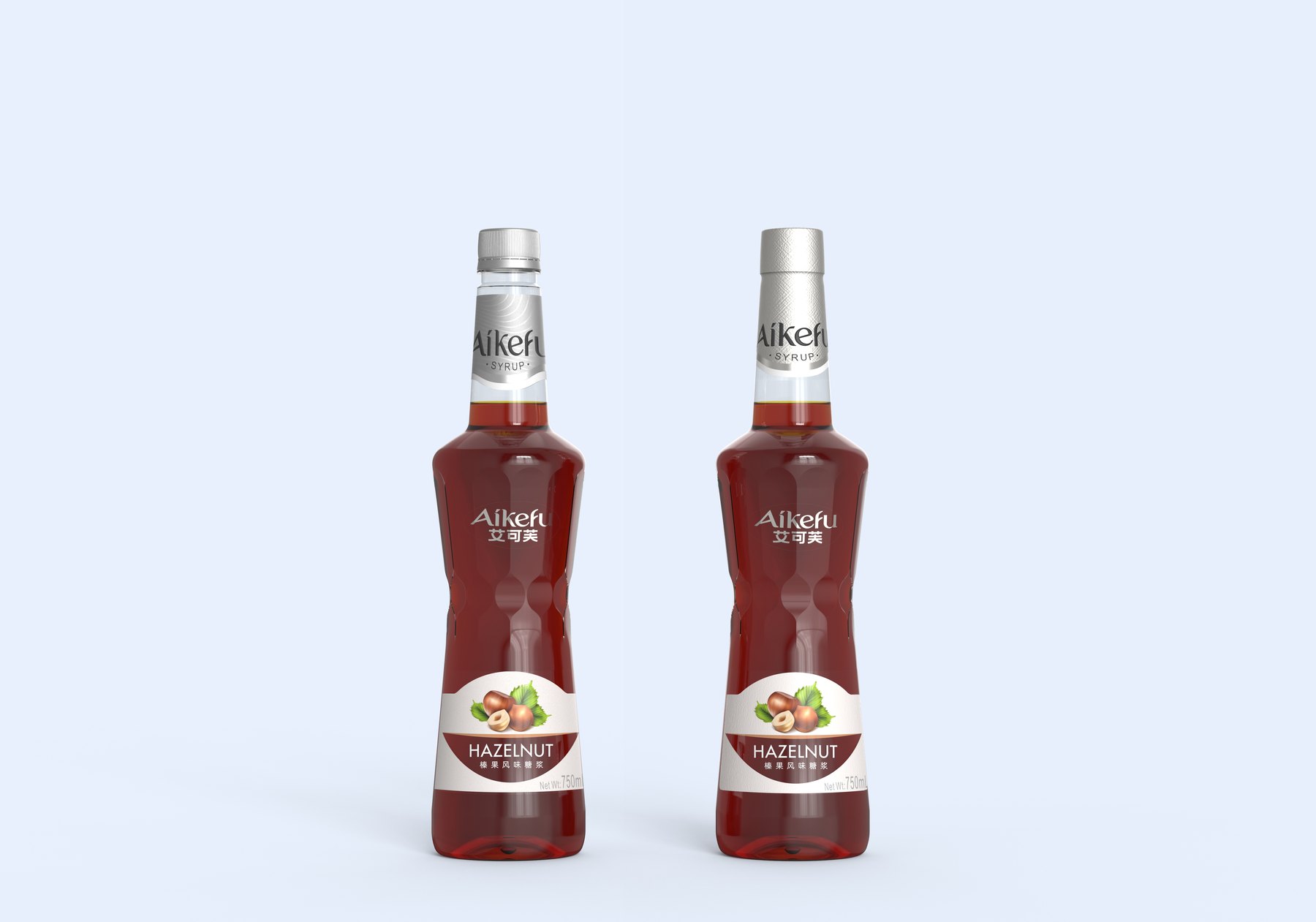
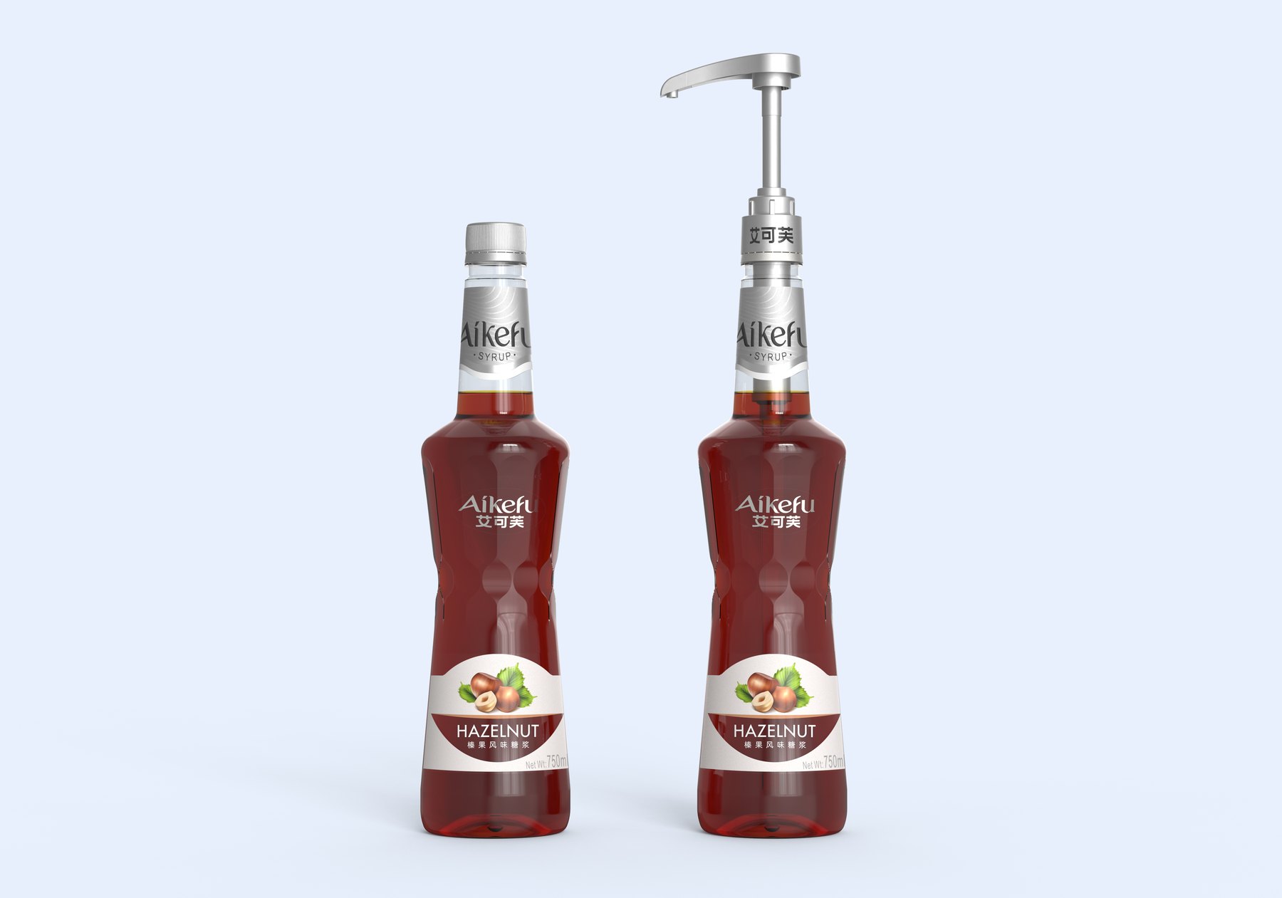
When switching to a pump head, the brand shouldn't just focus on the front.
The design also showcases a combination of the screw-top cap and the pump head. The screw-top cap maintains a relatively clean top surface, while the pump head features prominent operating components, shifting the visual center of gravity upward. Both combinations should be evaluated as complete units; it is not enough to simply attach the pump head and call it a day.
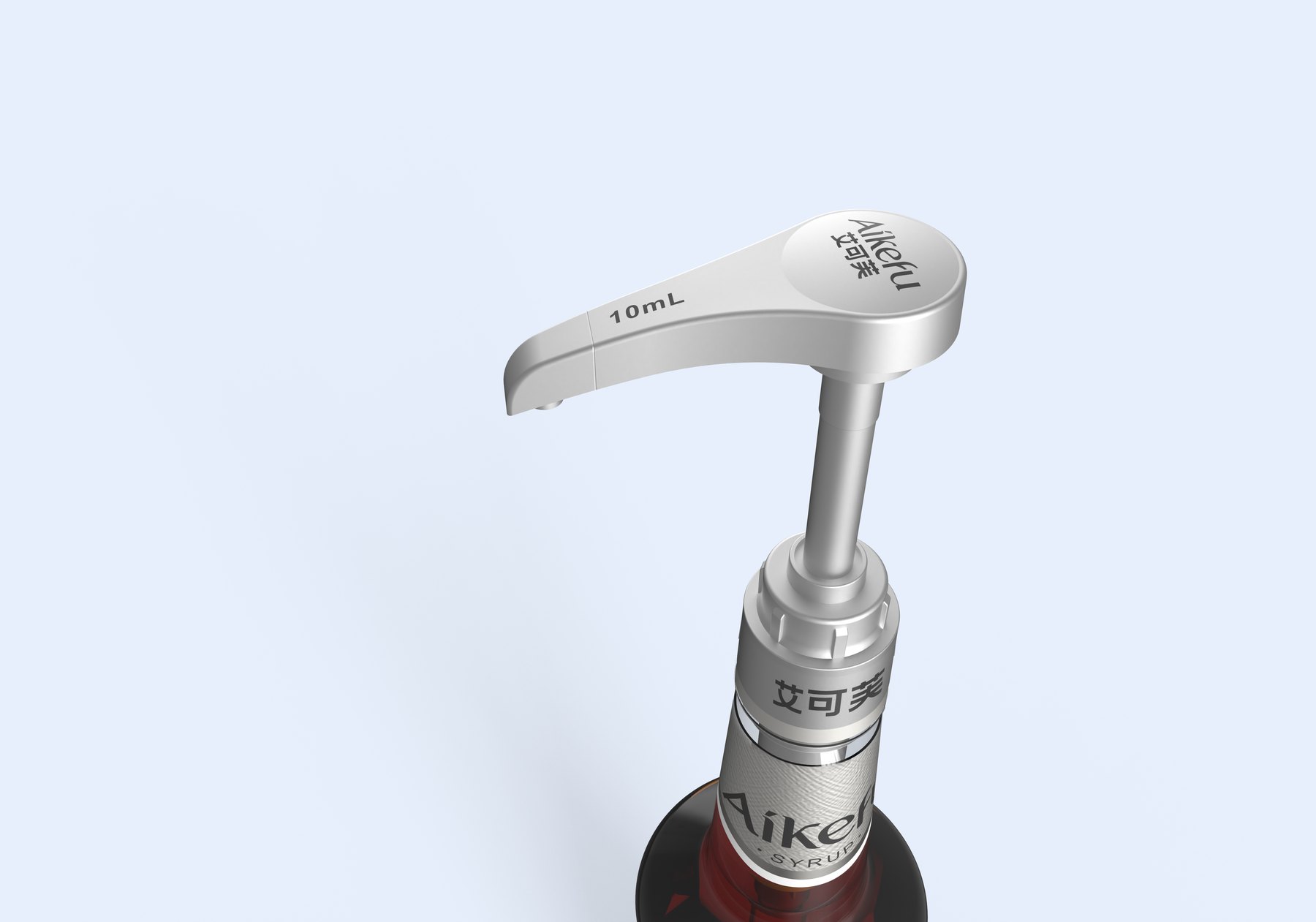
The brand name is featured on the top of the pump head, the neck ring, and the bottle neck, ensuring visibility from all viewing angles. The silver upper section complements the bottle neck, making the pump head appear as an integral part of the packaging rather than an afterthought.
Make the packaging part of the product experience
This design concept encompasses the syrup bottle’s appearance, visuals for six flavors, labels, the bottle neck, and a combination of screw caps and pump heads. The core of the series lies in maintaining a consistent brand identity and typography while varying the flavor graphics and colors.
For similar food and beverage ingredients, packaging design should first determine which elements must remain fixed and which need to be adjusted. When bottle cap attachments are changed, the proportions, brand placement, and label layout should also be reviewed accordingly.
If your product requires different flavors or needs to unify the series with pump-top packaging, please contact Meilin. Clearly define the intended use and product range, and then design packaging that can be easily expanded in the future.
Related Services:Packaging Visual Design Services. You can also learn moreBeverage Packaging Design。
Continue reading:What materials are needed for the design of a new bottle shape?;How to Choose Between Custom Bottle Designs and Off-the-Shelf Solutions。
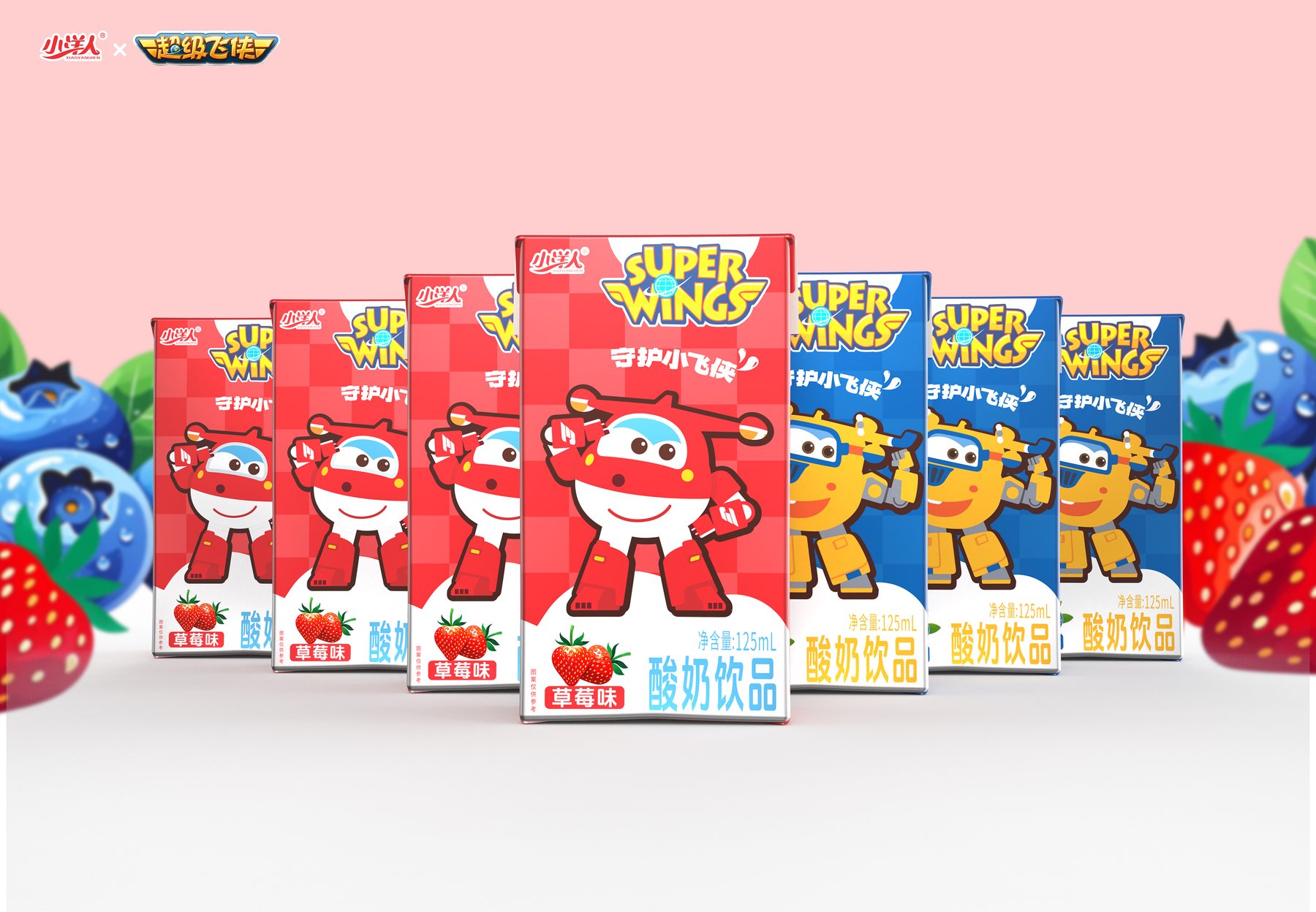
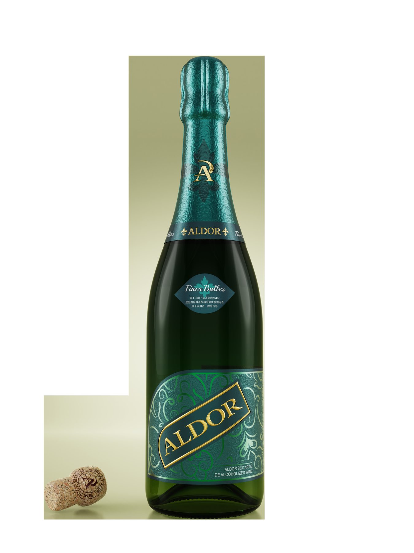
Similar Projects:Packaging Design for the "Little Foreigner" Dairy Product Series;Aldor Non-Alcoholic Wine Bottle and Packaging Design。
PROJECT GALLERY
More Project Photos
MORE CASES
More Related Cases
Do you have a clear plan for new products? Start with a project assessment.
Please submit information on the product category, capacity, material, filling method, launch date, and reference materials. Meilin will discuss suitable bottle designs, packaging, and implementation strategies based on the specifics of your project.

Shenzhen Meilin Industrial Design Co., Ltd.
Establish brand identity through the aesthetics of original bottle designs,
Ensure the successful implementation of designs through engineering expertise.
We specialize in innovative bottle and packaging design for mineral water, fruit juices, alcoholic beverages, cooking oil, personal care products, and household cleaning products.
Design Services
Industry Solutions
© 2026 Shenzhen Meilin Industrial Design Co., Ltd.