
PROJECT CASE
Tianbo LADY SHOW 270 mL Intimate Care Product Container Design
How to Display Intimate Care Products in a Natural Way
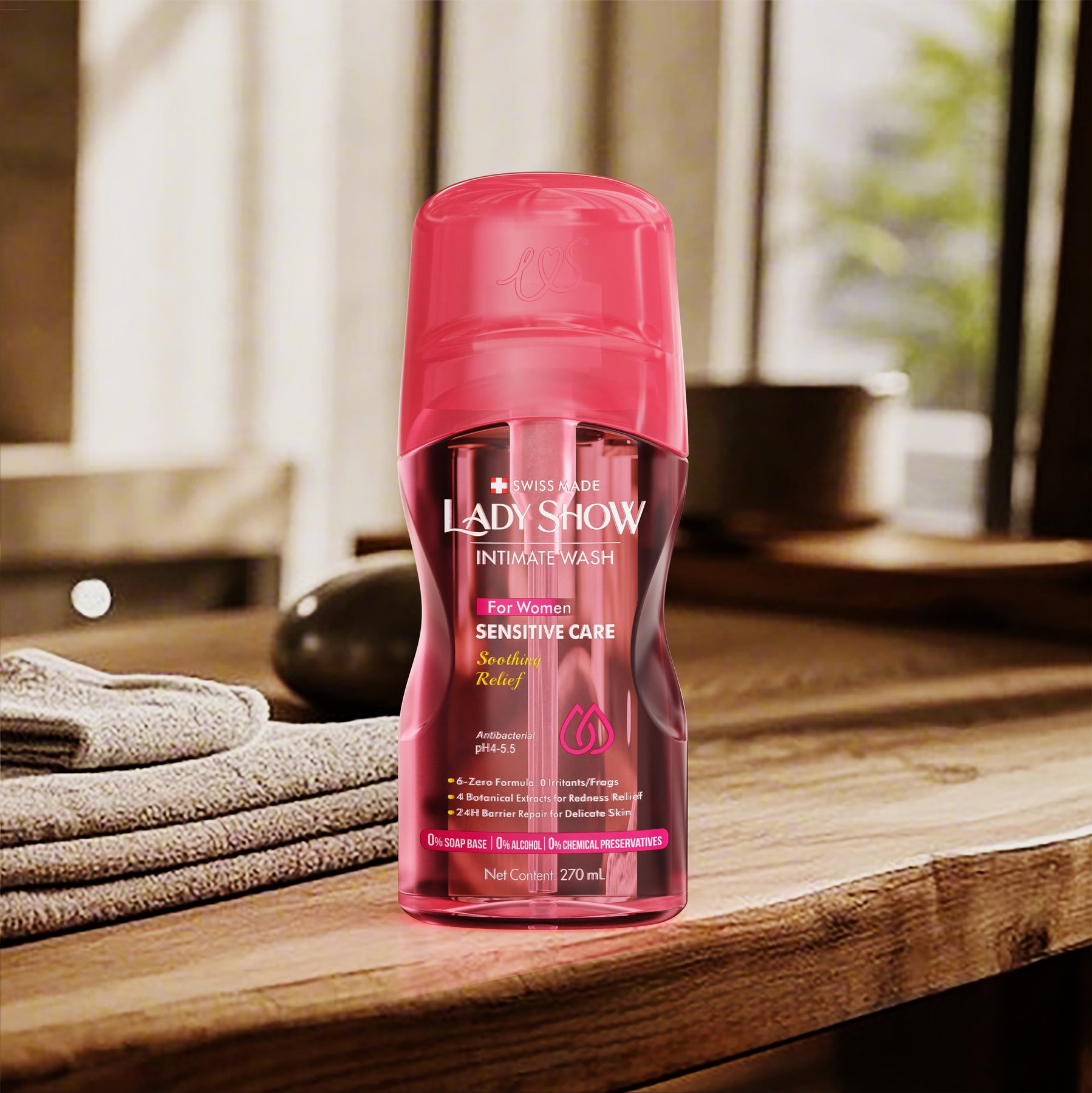
When it comes to intimate care products, packaging often tends to swing between two extremes. If the focus is on efficacy, the product can end up looking like a medication; if the emphasis is solely on aesthetics, the packaging fails to clearly convey the product category. The design of the LADY SHOW 270mL intimate care container focuses on striking the right balance between these two extremes.
Meilin’s design focuses on the bottle, the pump head cover, and the visual identities of the three collections. The challenge goes beyond simply making the bottle look good. Its overall appearance when placed on a bathroom countertop—as well as how to distinguish between the different styles—is equally important.
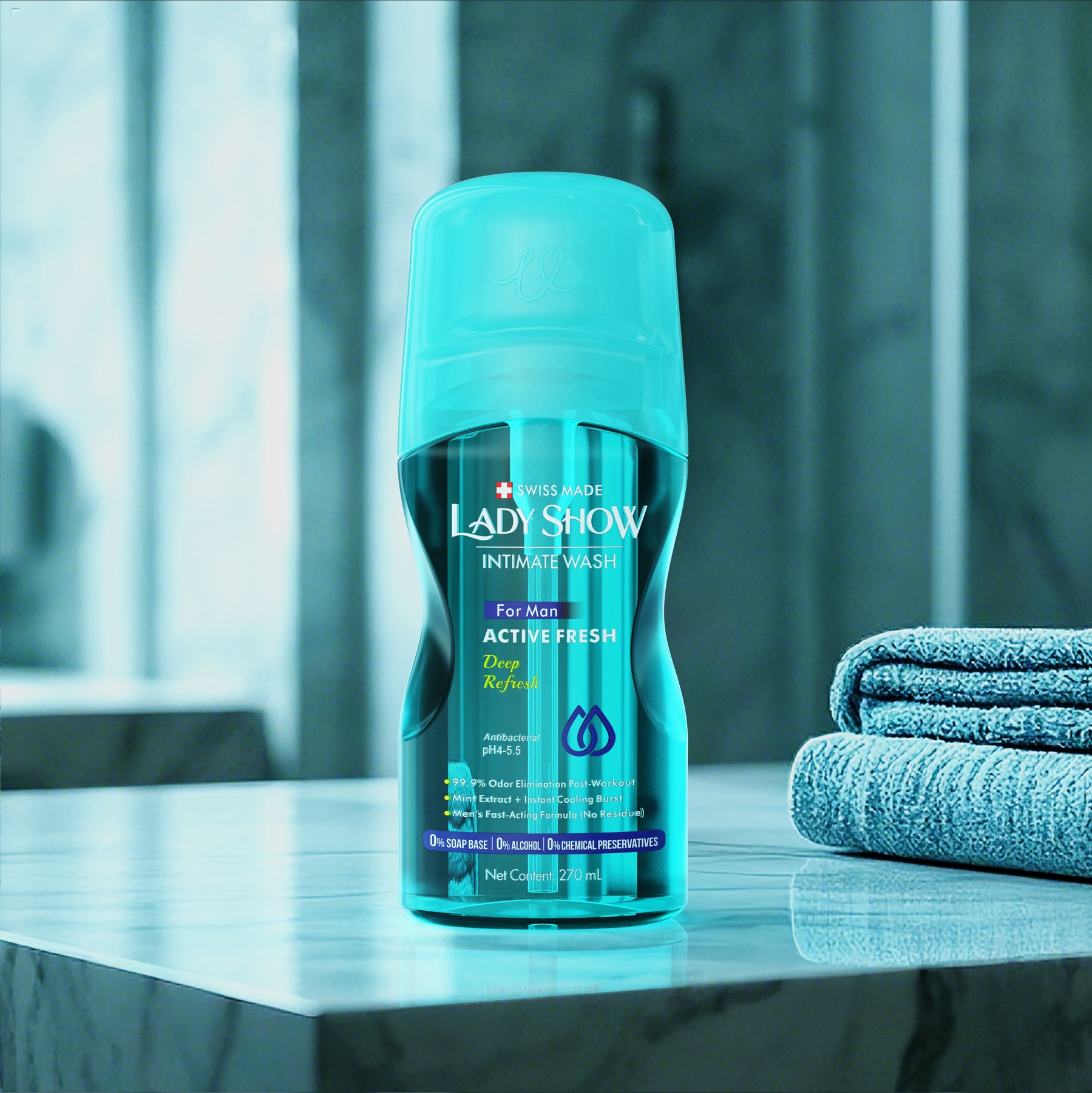
First, give the bottle soft contours
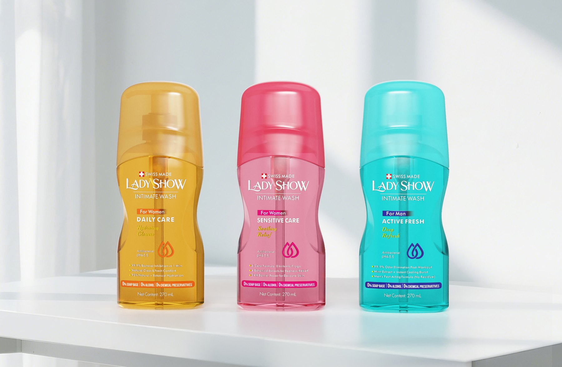
The design does not follow a straight, cylindrical shape from top to bottom. The middle of the bottle tapers slightly inward, with the shoulders and lower section connected by curved lines. The front still features a sufficiently large, unbroken area, providing a clear space for the brand and product names.
The cinched waist isn’t just an additional decorative element. It creates a transition between the upper and lower sections of the bottle, reducing the stiffness of the straight, cylindrical shape. The elongated, flat silhouette also allows the brand name to be arranged vertically, rather than crammed in a circle around the bottle.
The semi-transparent design allows the color to vary in depth. Compared to a completely opaque bottle, this treatment is lighter and aligns with the soft contours.
A cover that tucks in the top to create a complete look
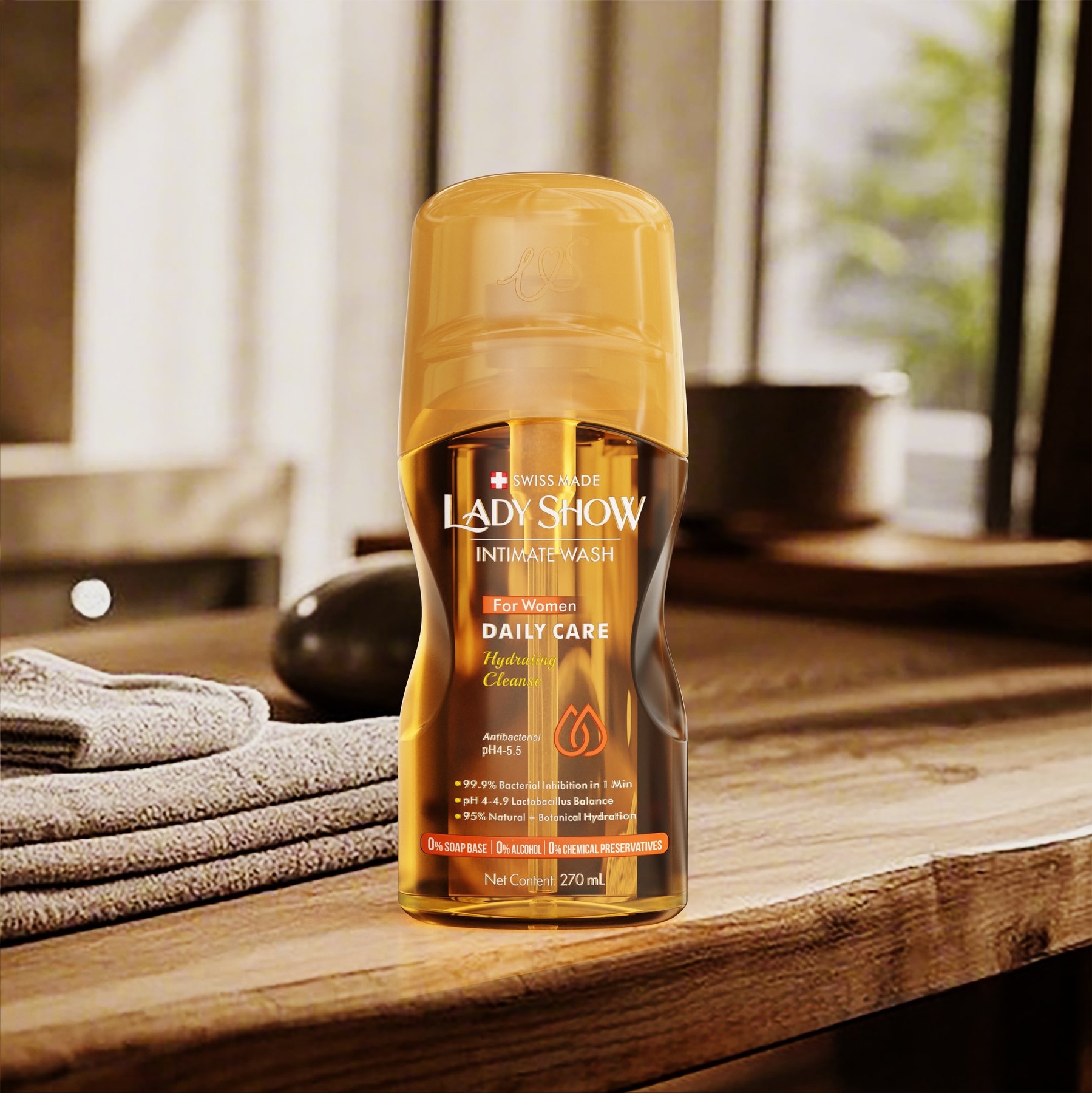
The pump head itself has a distinctly utilitarian look. Rather than making it the first thing you see, the upper part is enclosed in a rounded cover. The cover connects to the bottle’s shoulder, creating a more cohesive top contour.
With this design, the first thing the eye notices is a seamless container, followed by the pump assembly inside. The upper part no longer has any scattered protrusions, and the curve of the bottle is no longer interrupted by the protruding pump nozzle.
The outer sleeve features the letters "LWS," ensuring the brand isn't solely reliant on the text on the front. Even when the bottle is viewed from a different angle, the distinctive details at the top remain recognizable.
Three products: first distinguish them by color, then confirm by name
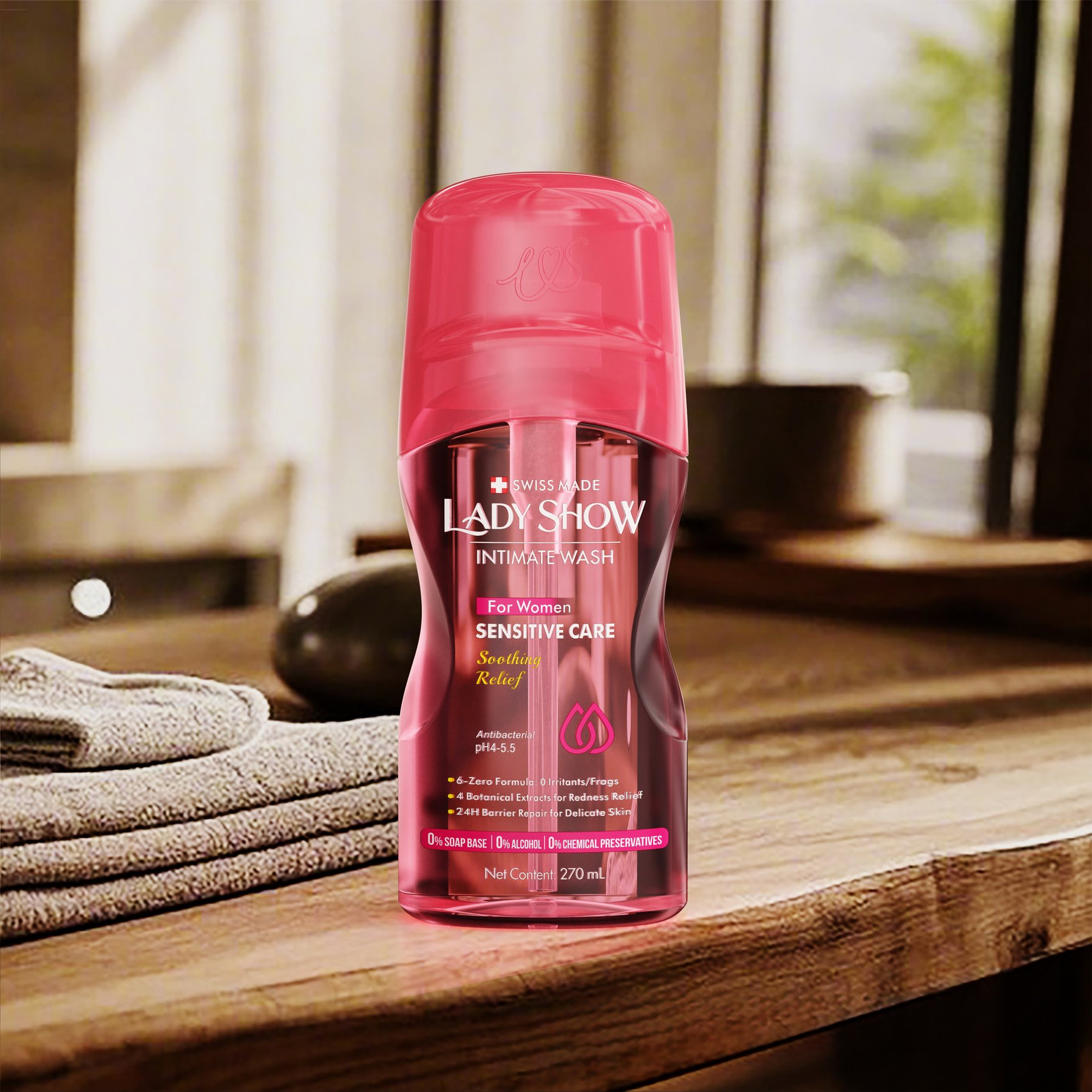
Yellow, pink, and teal are the main differences among the three collections. The bottle silhouettes remain consistent with the brand’s design language, with variations focused on color and collection names. Consumers can tell at a glance that they belong to different versions without having to read through an entire paragraph of descriptions.
However, color cannot replace text. “Daily Care,” “Sensitive Care,” and “Active Fresh” each have their designated positions. Color helps distinguish them at a glance, while the names provide further confirmation. When the three are placed side by side, the overall design does not appear as three unrelated packages.
Arrange product information vertically along the front of the package to avoid enlarging all the content. List the brand, style, and other details in order so that the packaging remains clear, rather than having every line compete for attention.
Why Does This Approach Work?
The value of this design lies not in making the skincare products look more elaborate. The tapered waist changes the visual impression of the straight-sided bottle, while the outer sleeve refines the upper portion of the design. The three-color series achieves both unity and differentiation.
The three designs address three different issues but all lead to the same result. LADY SHOW presents a comprehensive, gentle skincare line. The brand doesn’t need lengthy text to explain itself; the silhouettes and colors already convey part of the message.
From containers to collections, making sure every piece fits together
The project resulted in the design of a 270-mL container, a pump head cover assembly, and three visual themes. The bottle, upper assembly, and front labeling were not designed separately and then assembled; instead, they were arranged around a unified skincare image.
For personal care products, you can first determine the desired brand image, then decide on the bottle shape, outer packaging, and layout of the information together. For multi-product lines, you should first establish the brand’s core positioning and then decide which elements will vary across different versions.
If you are developing new hair care or pump-style personal care products, feel free to discuss specific product details with Meilin. Start by specifying the specifications, number of product lines, and packaging combinations so that the container design can be tailored to your actual needs.
Related Services:Industrial Design Services for Bottle Shapes、Packaging Visual Design Services. You can also learn moreDesign for Personal Care and Household Cleaning Products。
Continue reading:What materials should be prepared before starting a bottle design project?;How to Choose Between Custom Bottle Designs and Off-the-Shelf Solutions。
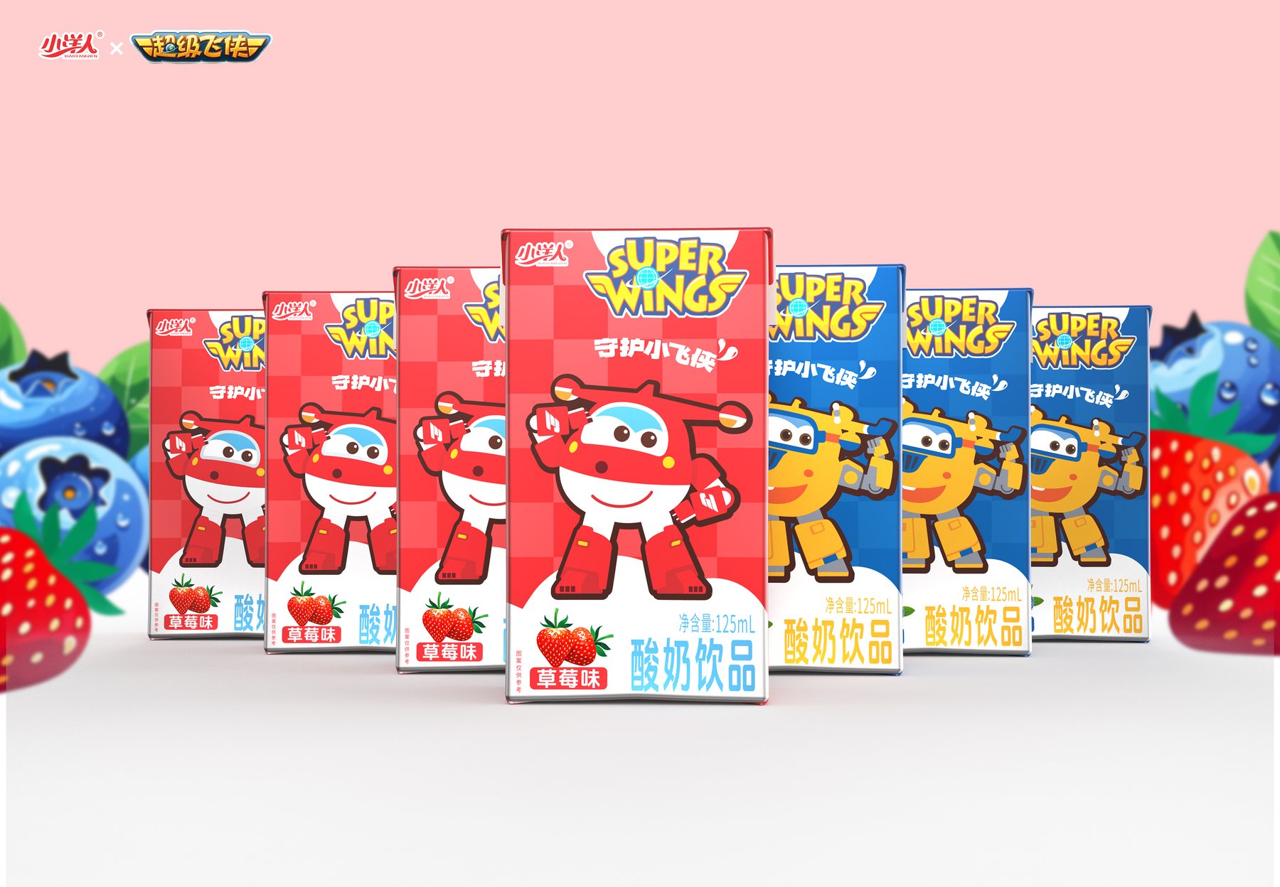
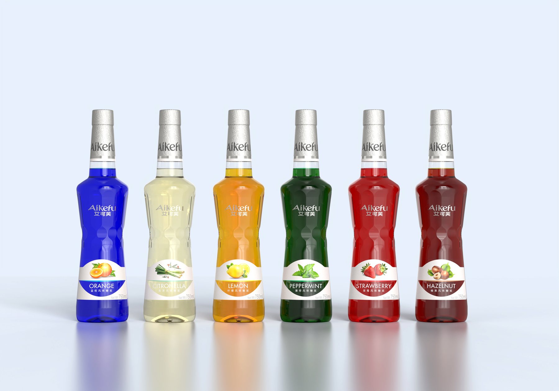
Similar Projects:Packaging Design for the "Little Foreigner" Dairy Product Series;Design of the Aikofu Syrup Packaging System。
PROJECT GALLERY
More Project Photos
MORE CASES
More Related Cases
Do you have a clear plan for new products? Start with a project assessment.
Please submit information on the product category, capacity, material, filling method, launch date, and reference materials. Meilin will discuss suitable bottle designs, packaging, and implementation strategies based on the specifics of your project.

Shenzhen Meilin Industrial Design Co., Ltd.
Establish brand identity through the aesthetics of original bottle designs,
Ensure the successful implementation of designs through engineering expertise.
We specialize in innovative bottle and packaging design for mineral water, fruit juices, alcoholic beverages, cooking oil, personal care products, and household cleaning products.
Design Services
Industry Solutions
© 2026 Shenzhen Meilin Industrial Design Co., Ltd.