
MEILIN · CASE DETAILS
HydroZhou Natural Mineral WaterBottle Design
Using a unified design language and packaging identity across all sizes, this presentation showcases the visual identity of the 520 mL, 5 L, and 12 L natural mineral water series.
Natural Mineral Water
520 mL / 5 L / 12 L
Bottle Shapes and Packaging Design
01 · BRAND POSITIONING
Let's Start with Brand and Market Issues
First, let’s clarify how the project is defined, and then move on to discussions about aesthetics, design, and engineering.
Brand or Market Positioning
Based on the available materials, we can confirm that this is a natural mineral water series offering three different bottle sizes. The different sizes are presented with a unified visual identity through similar bottle textures, front-facing visual contours, and packaging copy.
Project Background and Design Challenges
The 520 mL, 5 L, and 12 L products differ significantly in capacity, size, and usage. The current visual identity uses recurring design motifs and packaging language to present the three sizes as part of a single series while preserving their individual forms.
02 · AESTHETIC STRATEGY
Visual Aesthetics Track
Aesthetic Strategies
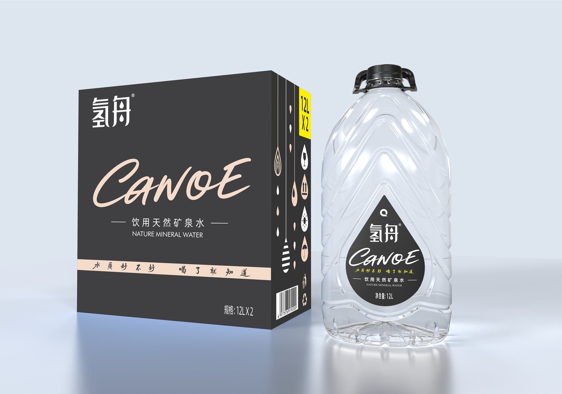
The transparent bottle and the black-and-gray outer box create a clean, understated visual tone; the off-white text and yellow capacity labels establish a clear hierarchy against the dark box. This description is based solely on existing project images and does not replace an unverified brand strategy.
Transparency and Restraint
Dark-Colored Outer Box System
Off-White Information Hierarchy
Capacity Color-Coded Identification
03 · FORM LANGUAGE
Design Language and Proportional Silhouettes
Original Styling Language
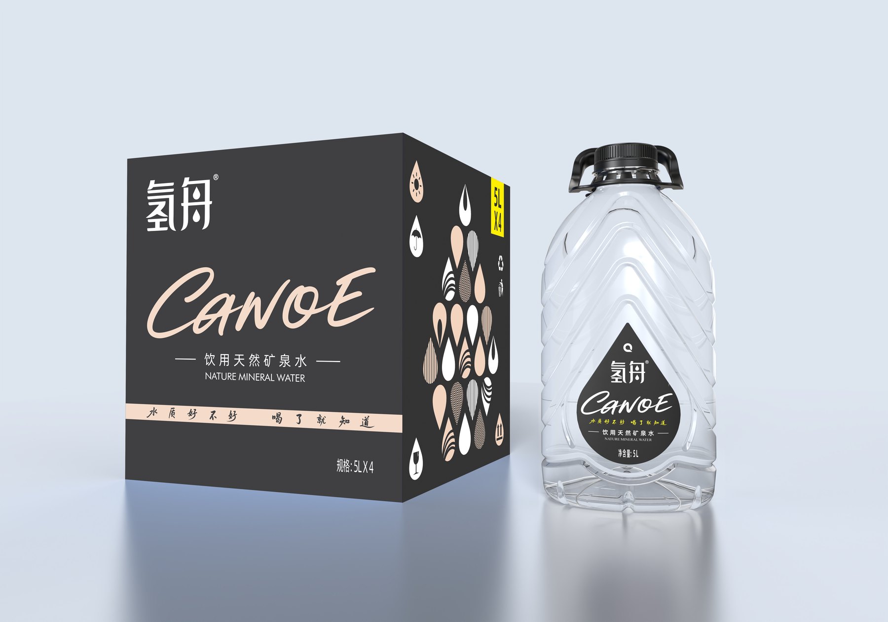
As seen in the current visuals, a texture resembling slanted folded surfaces runs along the bottle’s body, with the label information converging at the front in a teardrop-shaped main visual area. The same design motif is applied across different sizes, creating a cohesive family identity.
Proportions and Contour Design of the Bottle Shoulder and Body
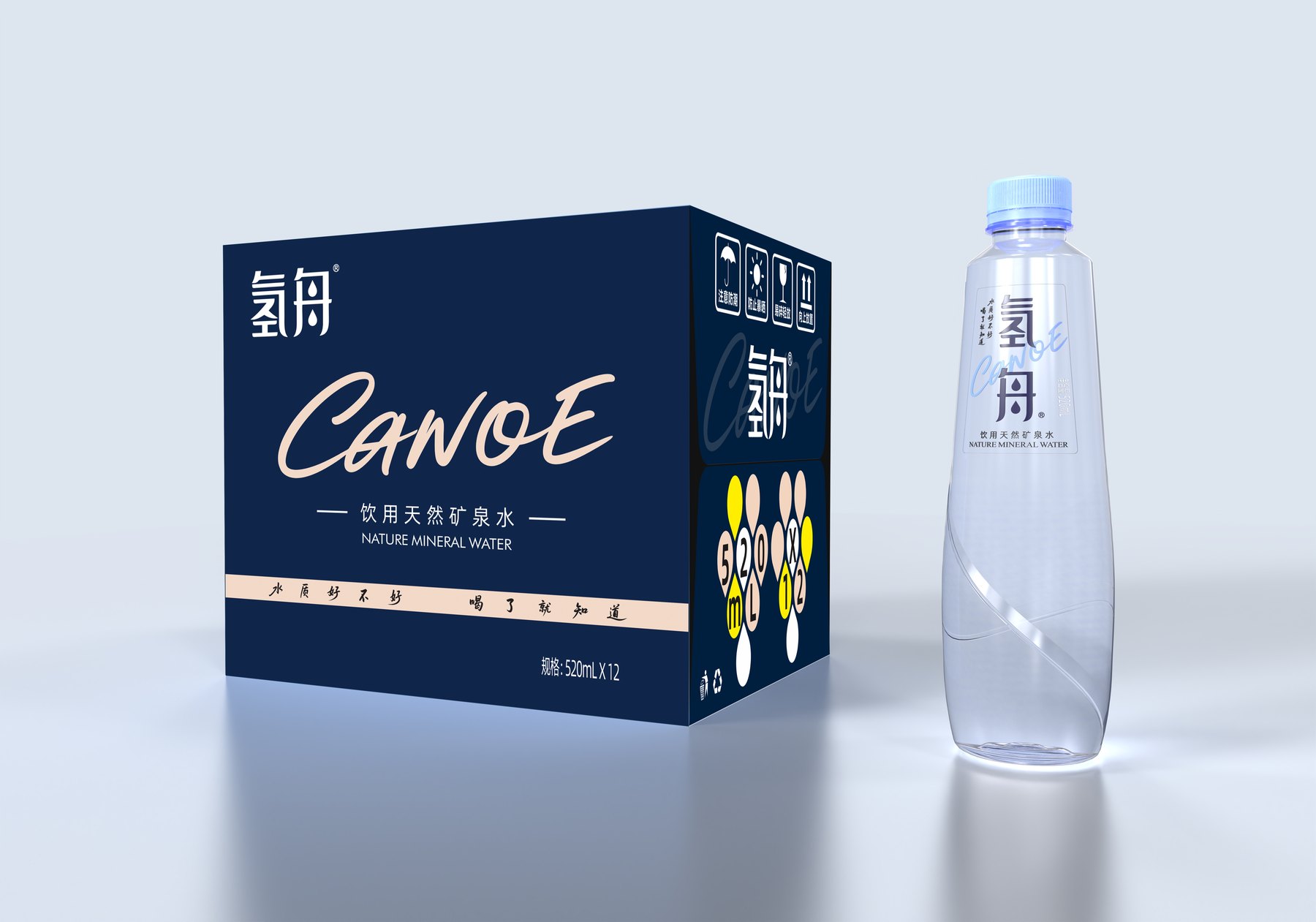
The 520 mL size features a relatively slender, portable design; the 5 L and 12 L sizes have larger bottle bodies and include a carrying handle at the top. The overall silhouette of each size is adjusted according to its capacity, while maintaining consistency in the diagonal texture and the visual elements on the front.
04 · SHELF RECOGNITION
Label Display, Shelf Identification, and Product Line Organization
Label Display and Shelf Identification
The teardrop-shaped front section creates a stable visual focal point, while the diagonal texture produces shifting light and shadow effects on the transparent bottle. The black-and-gray outer box, off-white text, and yellow volume markings further enhance the series’ brand recognition.
Approach to Series Design
The three sizes are not simply scaled proportionally; instead, their contours and top shapes are adjusted based on their volume and intended use, while retaining the same texture, front visual area, and hierarchy of packaging information to ensure consistency across sizes.
Project Visual Design
07 · RELATED CASES
Continue browsing related real-life case studies
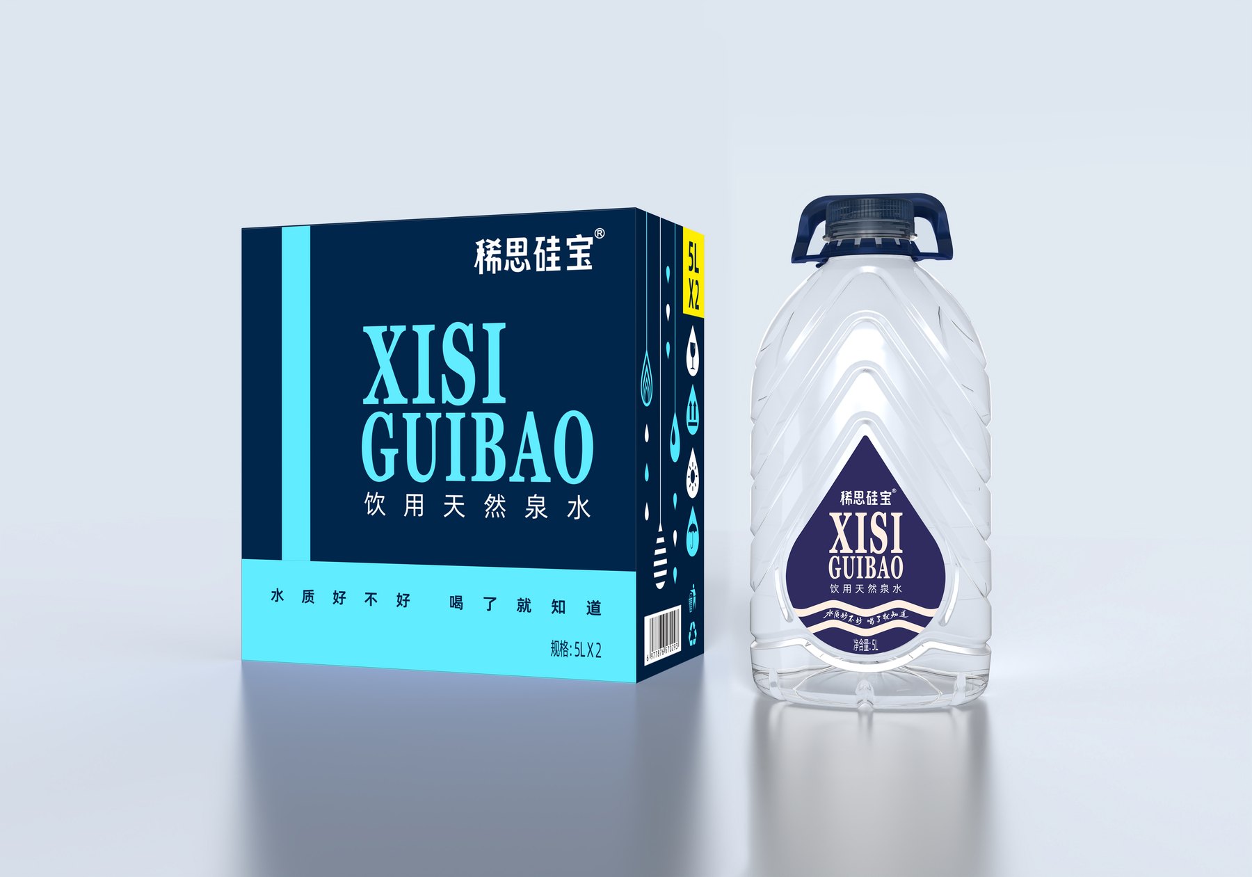
Xisi Guibao Natural Spring Water
Existing real-world examples from the same drinking water category.
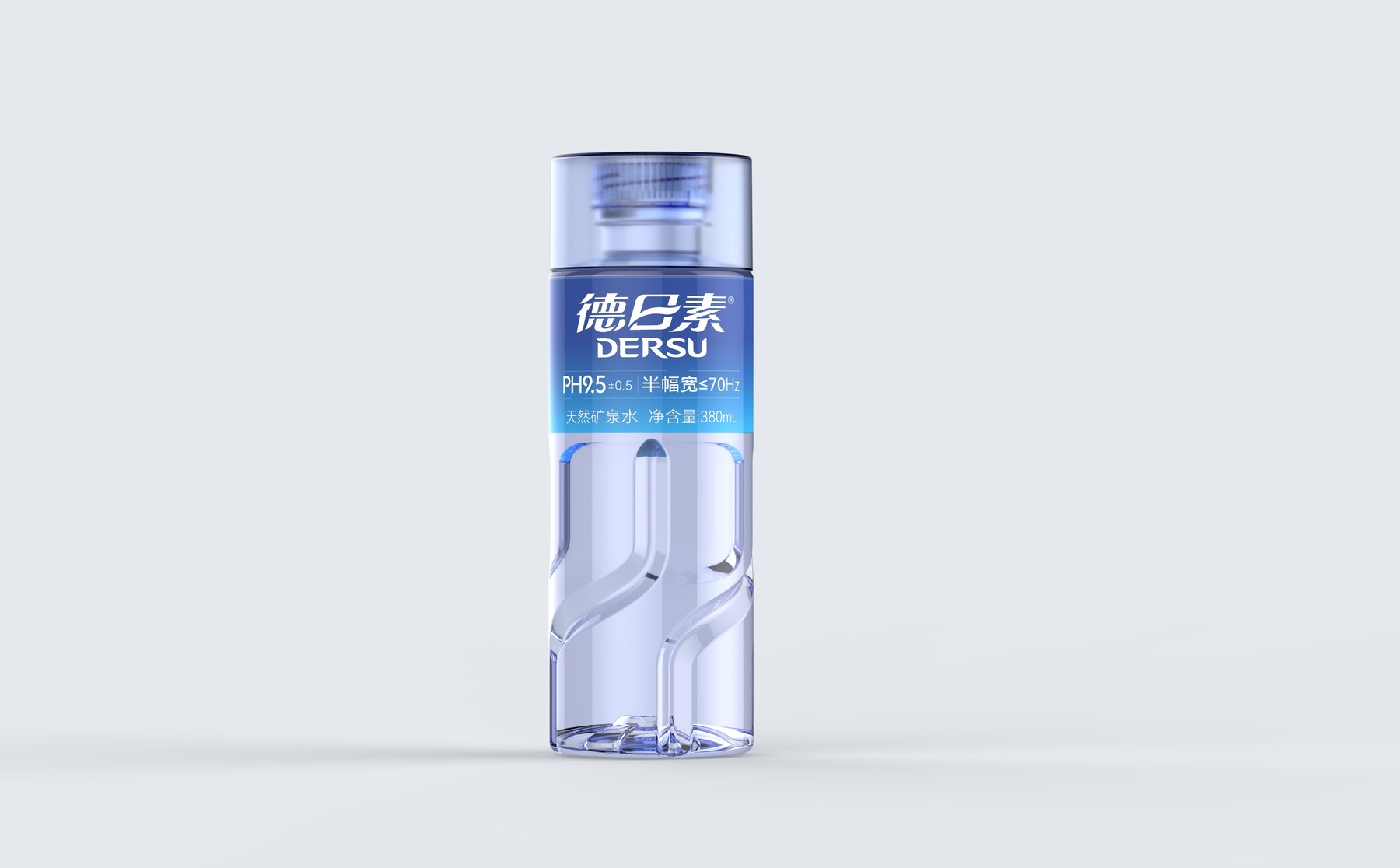
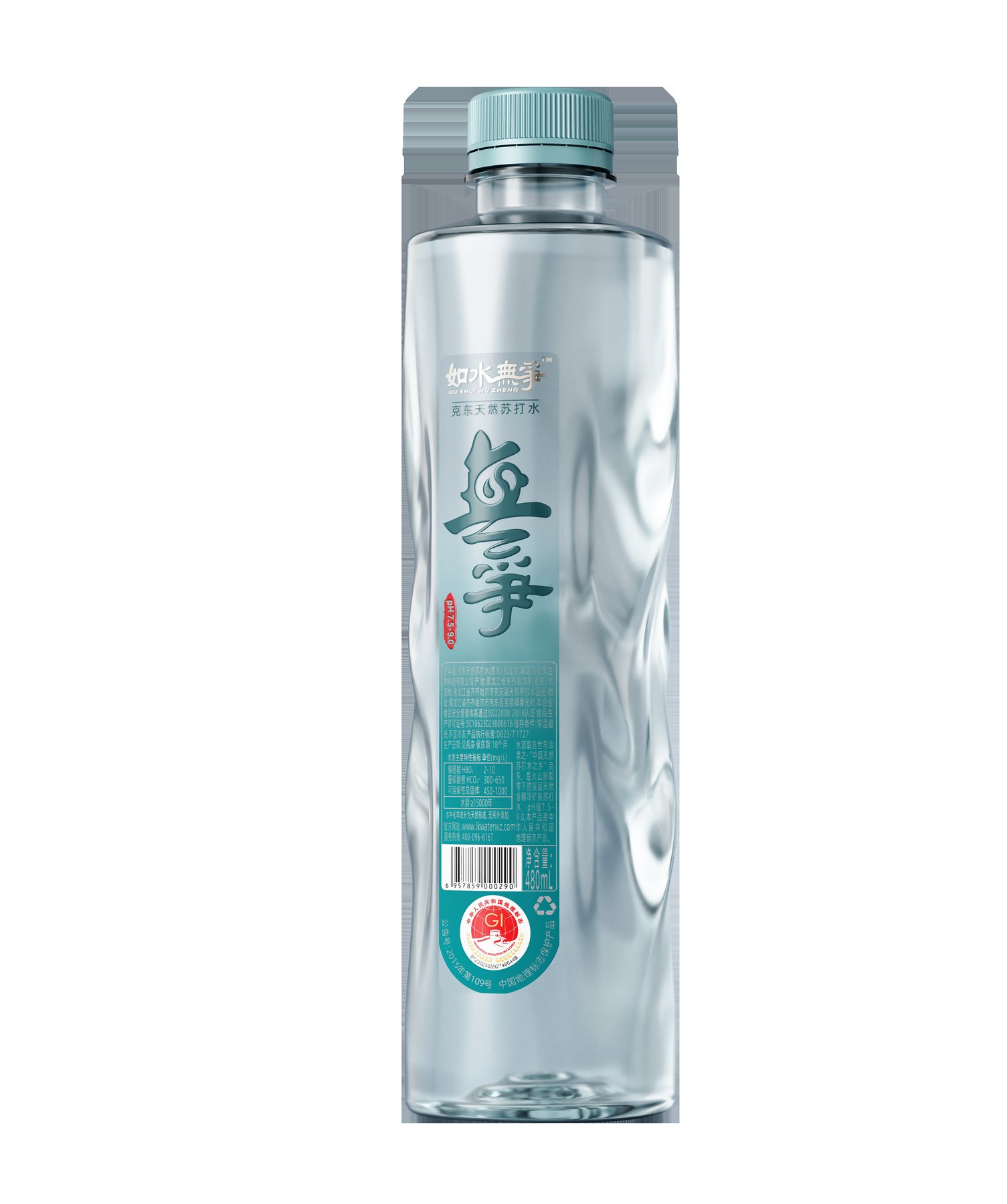
Like Water, No Strife Natural Soda Water
Case studies on drinking water packaging already published on this site.
Let’s build brand recognition for our next product, starting with the bottle design
Whether it’s mineral water, fruit juices, alcoholic beverages, cooking oil, or personal care and household cleaning products, we welcome you to submit your project requirements and discuss them with the Meilin Design Team.

Shenzhen Meilin Industrial Design Co., Ltd.
Establish brand identity through the aesthetics of original bottle designs,
Ensure the successful implementation of designs through engineering expertise.
We specialize in innovative bottle and packaging design for mineral water, fruit juices, alcoholic beverages, cooking oil, personal care products, and household cleaning products.
Design Services
Industry Solutions
© 2026 Shenzhen Meilin Industrial Design Co., Ltd.