
Breaking and Reinventing: Breaking the Visual Fatigue of Traditional Baijiu
Under the current trend of consumer upgrading, the traditional “red and gold stacking” of liquor packaging is already difficult to impress the high net worth group. In this project, Meilin Design was commissioned by a leading liquor brand to create a super symbol for its new series with a very “high unit price” texture. We abandoned the complicated traditional elements, and redefined the visual standard of high-end liquor with an extremely restrained dark minimalist aesthetic.
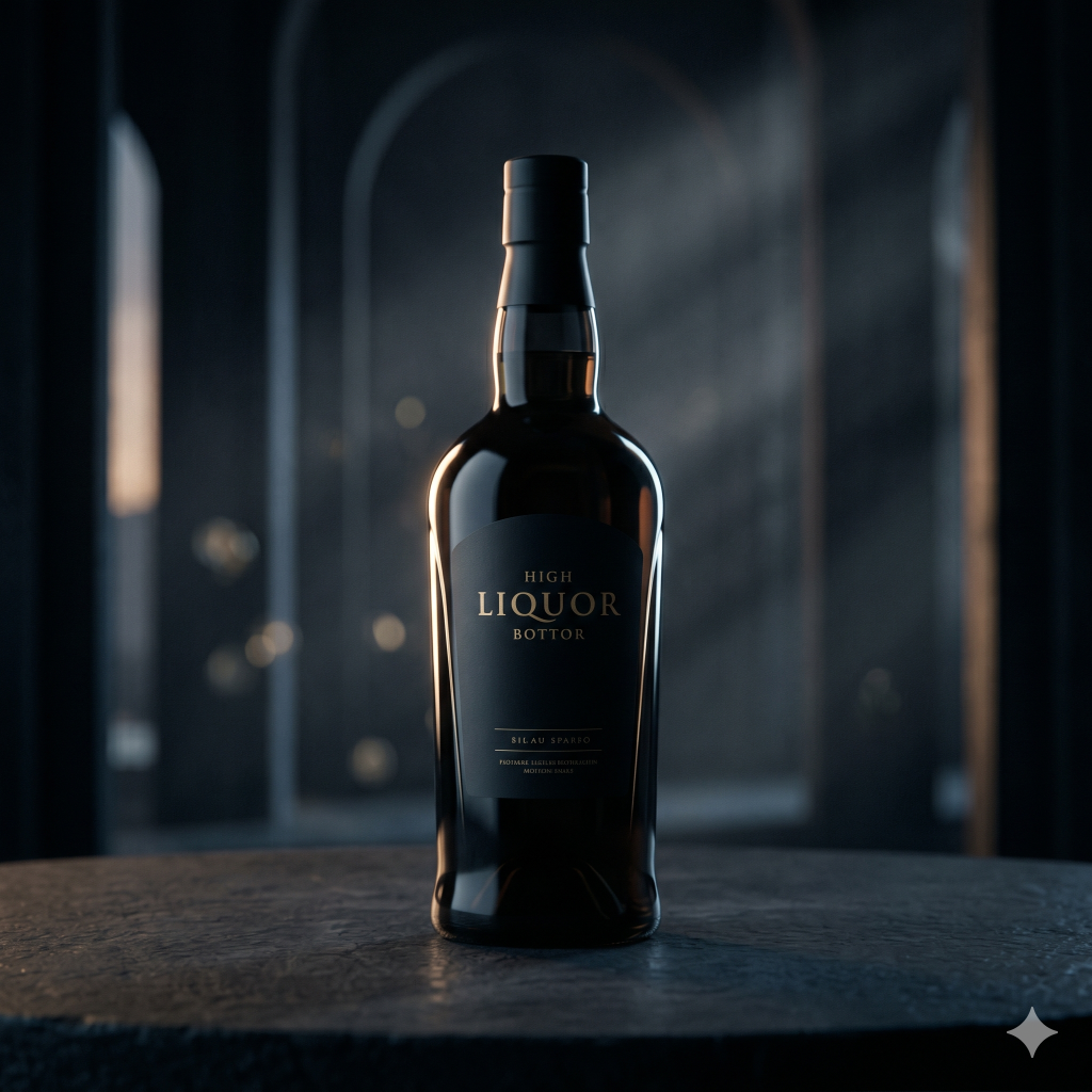
Craftsmanship on the ground: the extreme collision of shaped molding and baking process
Design excellence does not stop at the drawing board. In order to present the extremely elegant curvature of the bottle and the heavy texture of the bottom, the Meilin team challenged the extremely difficultShaped open molding.technology, which precisely controls the wall thickness ratio of the glass to ensure a perfect center of gravity for gripping. For the presentation of the brand logo, we used high temperatureBaking processThe matte gold fonts are fused to the deep, dark glass bottle, making it durable, scratch-resistant and scratch-resistant, and delivering on the promise of a 15-year design veteran's “reliability” in every tactile detail.